The BRAWL² Tournament Challenge has been announced!
It starts May 12, and ends Oct 17. Let's see what you got!
https://polycount.com/discussion/237047/the-brawl²-tournament
It starts May 12, and ends Oct 17. Let's see what you got!
https://polycount.com/discussion/237047/the-brawl²-tournament
Wild star fan art: feedback requested
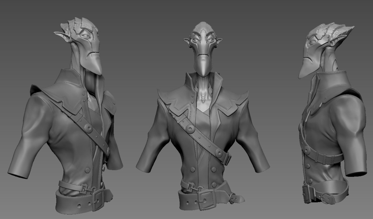
I'm making a bust of this character from Wildstar in my free time. It will be a fully textured game res piece. Would love some feedback on him as I go through the process.

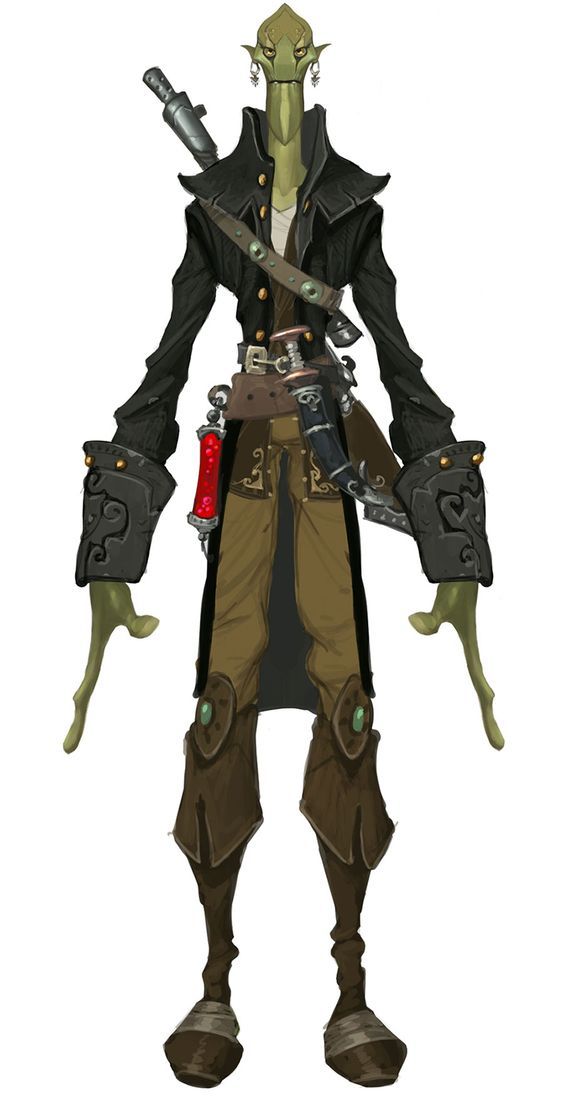
This is my WIP of a concept I found for Wildstar. There's still a couple more things to model before I dive into the low poly retopo.

Concept: Unknown Artist (if anyone knows please let me know so I may credit him/her.)

This is my WIP of a concept I found for Wildstar. There's still a couple more things to model before I dive into the low poly retopo.

Concept: Unknown Artist (if anyone knows please let me know so I may credit him/her.)

Replies
I started retopoing my decimated mesh
Ended up finishing the retopo. Next UVS
I finished UVing. Took my Low and High poly meshes and baked them using substance painter. Time to get started on texturing
I started texturing this guy today. I still have to go back and check out whats going on with the normal map.
Did a quick render of this guy. not quite done with this bust yet.
As a character artist we need to match the model to the concept as best as we can. And looking at your highpoly model I can see that there are some inconsistencies between the concept and your model.
I am assuming that the angle of the head is not matching because of perspective, but I have marked the silhouette (in red) of the head to point out that it is not matching, along with the collar and the arm as well. Likewise the chin in the concept seems to have a strong face from his lower lip to the bottom of his chin. In purple I have just circled that the buttons are not the same, as in the concept we can see both upper and lower buttons above the buckle, and the pit of the clavicle seems to be bigger in the concept. Green I circled because in the concept it looks as if there are only two pieces, where as you buckle seems to be more of a chain, and your bucks is much smaller/thinner then the buckle of the concept (last thing on the buckle I swear) Also the buckle in the concept has the belt going behind it, as your model the belt is going in front of it.
But I think the biggest thing that I first saw as a mistake when comparing your model to the concept is the folds in the leather jacket.
I quickly scribbled the blue lines on the concept art showing some of the folds of the jacket, giving a slight indication of where and how the folds of the jacket lay. The high poly you modeled though has little to know indication of the folding on the arms, and does not have the big folds on the chest above the upper button. As of right now I feel this is the biggest failing point of the model.
But with that said I am really thinking this was very successful. You captured the idea and the likeness pretty well, and as you push the texture the model is looking better and better.
Like I said I am coming late to this thread and honestly my feedback could have been used back when you posted this in February but, hopefully even though it is a little to late to go back and correct the things I might have pointed out, you can use this example to better self critique your concept to model workflow next time.
I will definitely use this feedback in the future, for now i'm going to implement your feedback that I could fix in the texture and see where that gets me.
Thanks again
At this stage it is really a matter of how 100% close do you want to be the the concept because right now, the character works super well. Very good crit by dand3d.
If I may add, the only minor thing for me is the expression isn't exactly the same; He generally looks a bit nicer/softer than in the concept. His brows could be lowered and eyes smaller to push the angry look. Other than that I think its spot on!
Very inspiring work and Im looking forward to more work from ya. cheerz
I will be re-texturing a lot of the jacket and a couple others spots as well as working on the shaders in marmoset to set up my scene for a final render. I think I will play with the low poly as much as i can get away with to better fit the overall silhouette of the concept. I will also do a rough pose for this guy (as much as i can get away with from a bust) for the final render. I should have an update by tonight.
I've tried my best to apply all the feedback I've received without having to re UV anything. I very happy with the results thus far. I still feel like there are more tweaks to be done but thank you to everyone who has helped so far, really appreciate how far I've pushed this one with your help.
More to come, and of course feedback is welcome.
Finished with my bust for now. I would love to continue this guy and make him a full character. Thanks everyone for all the feedback.
My late to the party nitpicking:
-the final angle looks a little weird to me because it hides his right arm, a bit more to the front would read better.
-you could tweak the roughness on his skin inside the collar so you dont get those weird reflections on areas that are supposed to be dark.
-his eyes could use some gradients both in the white area and in the iris, the yellow washes out when combined with the highlights.
I know you are done, so just things that may help for next time!