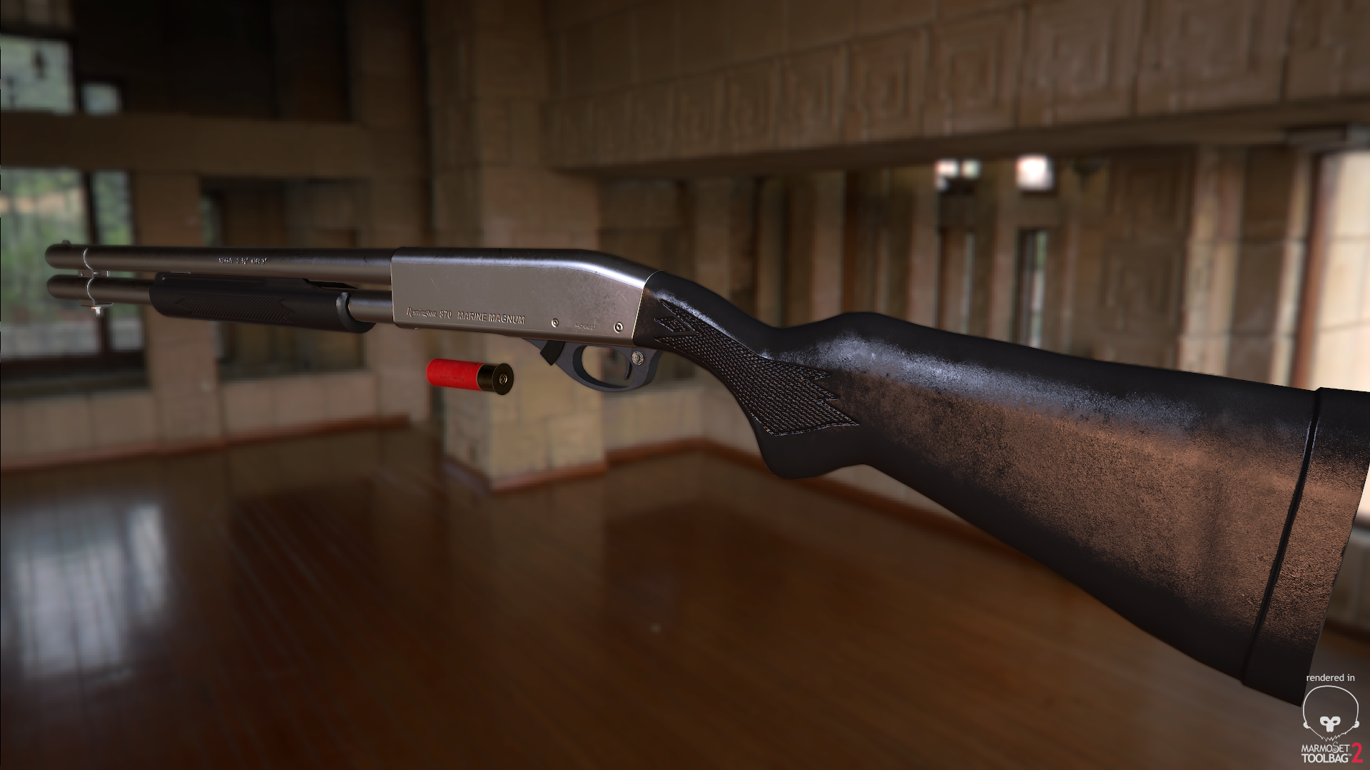
Remington 870 Marine Magnum
Thought I'd post this. Been meaning to do a shotgun for a while.
With many Remington shotgun versions available, I chose the Marine Magnum as I haven't seen many CG interpretations of this done before. I've always enjoyed using shotguns in games, so I set about producing one myself.
I'd call this one almost complete; but I'm keen to know what you all think. Comments and crits are welcomed.


Replies
Your polymer/composite material looks overtly "wet" that needs to be toned down.
The rifle butt on the top looks oddly lumpy, make sure this has a nice streamlined silhouette.
Show your textures as well.
@3Dreaper: You raise a very valid point there, most of which I agree with. Firstly, I wanted to create the impression that someone has had their hands all over the shoulder stock hence why there are moisture marks all over. But toned down you reckon? Might be a better option in the future. Your criticism is worth noting.
Second; as for the lumpy part, I had to add a lot of polygons to this being wary of not including too many. Being next-gen a mesh this is, maybe us artists do have some lee-way, in a professional setting you do not always have the luxury of choice adding in too many polygons in your models. A technical restraint I bear in mind sometimes. The lines for the silhouette could look smoother right?
The textures are almost finished; I'll reveal them soon.
Yes the silhouette could be smoother.
The trigger area looks like it could use a bit more detail as well. It feels hurried and less resolved than the rest of your gun.
I've altered the roughness of the rubber stock and grip down more, so they should appear less shiny now.
So far, I'm quite pleased.
Looking at this reference image the specular highlight is softer than in your render suggesting your map needs to increase the roughness values.
https://www.gunsamerica.com/UserImages/177404/995352241/wm_7883886.jpg
Generally the gun is a dulled metal and also the end strip on the back is noticeably smoother than the main stock material.
Overall good work just needs that little bit of polish and some final render shots
I've re-adjusted the roughness values and toned down the hues, making them altogether slightly more dark. Hopefully the metal is a bit more dull looking now without compromising too much detail.
Anyway, I've enjoyed producing this one. The extra bit of polish was worth it.