Looking cool so far! I feel like the colours and values are too weak for the moment, make it pop! Waiting for more update Also, there's a black outline beneath the hoofs and it's bugging me xD
A few notes. I can't help but feel like the pants are too bright. You have an obvious top down gradient applied but it feels like the pants are textured on a layer above it. It makes the torso get dark, get bright for the pants, and then get even darker for the legs. I would adjust the brightness of the golds especially. The wings start to look black towards the bottoms. It just makes them look dirty. I would take care to not just multiply a top down gradient on your textures but to consider what color the wings would naturally become in a darker environment. When using AO or masking in general I sometimes use multiple versions colored to compliment the material they are resting upon. Or rather than multiply a top down gradient directly, invert it and use it as a mask for a HSB layer to drive color changes without applying a flat color.
While not mine, I saved out this image from another thread a while back and it seems like a good guide for things that fall into the HotS style.
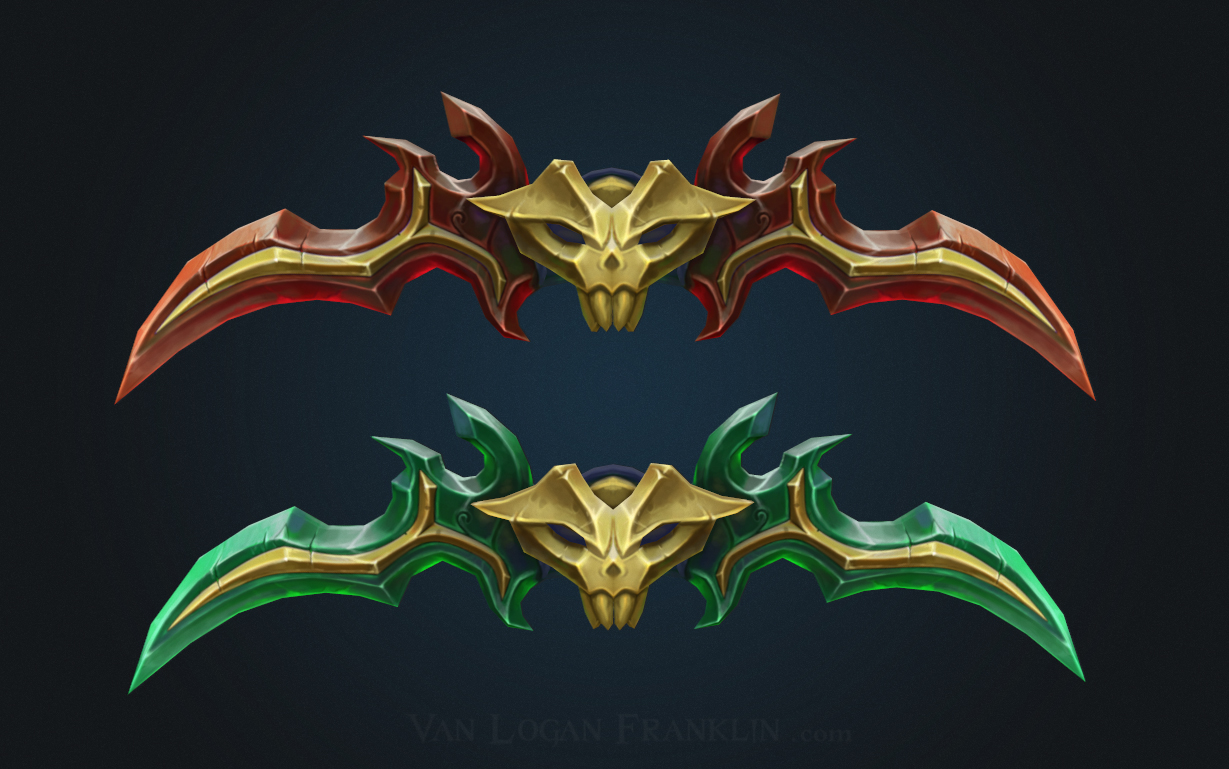
Hey guys thank you for the awesome feedback! I've got a bunch of updates as I have not been on in a while. I tried to apply the feedback from here as well as posing the model. After this stage I got some further feedback from my awesome mentor Katia Bourykina to do a color variation so it didn't seem as normal nightelf demon hunter. I also added some shader work and put up a marmoset viewer on my artstatoin. https://www.artstation.com/artwork/3wOGm
Replies
Also, there's a black outline beneath the hoofs and it's bugging me xD
While not mine, I saved out this image from another thread a while back and it seems like a good guide for things that fall into the HotS style.