Home 2D Art Showcase & Critiques

Britney's Illustration Improvement Thread

Hello everyone,
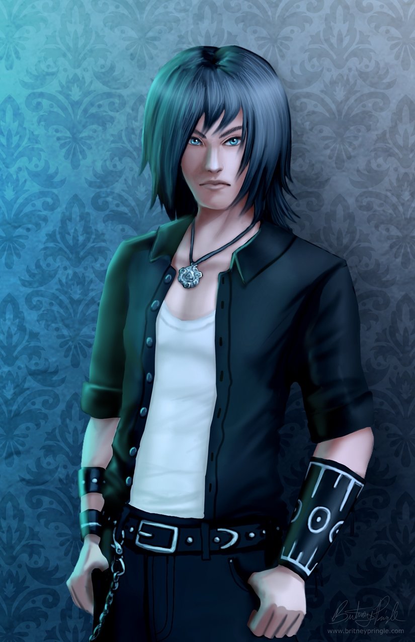
I feel like I need to strengthen my art skills and take them to the next level, so I wanted to get some solid feedback from others on how I can improve. Here are some examples of where I am currently.

He is a character of mine named Gabe.

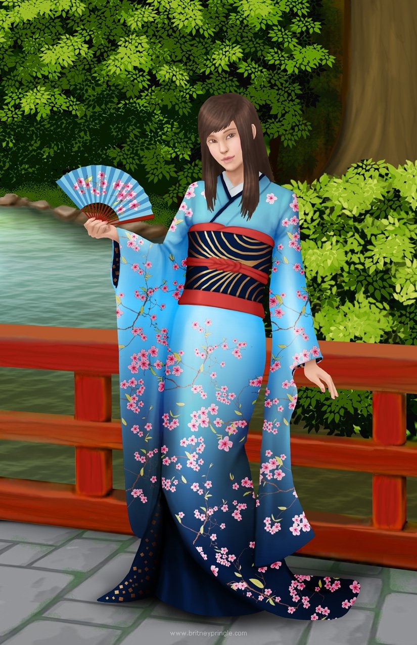
I wanted to design a kimono, so a drew a girl out in a Japanese garden.

This is Kuja from Final Fantasy 9.


And this is Lightning from Final Fantasy 13.


I have more stuff in my portfolio.

Any advice is greatly appreciated! Thanks for taking a look. :)


Replies

  • Wendy de Boer
    Offline / Send Message
    Wendy de Boer interpolator
    Hi Britney! I think you're trying to paint the hair as too many threadlike separate strands, which gives the hair a busy, feathered look. It would be better to visualize the hair as bigger shapes, such as ribbons, that interlock and interweave. James Gurney made an interesting post about this on his blog, hopefully it helps: http://gurneyjourney.blogspot.my/2008/04/hair-ribbon-secret.html

  • lutzbot
    Offline / Send Message
    lutzbot polycounter lvl 3
    I like that these all hit a nice level of resolve- all of your exterior edges are pretty crisp and you're working the entire image, which is helping these feel focused. I would hone in on your rendering a little more though; the light feels a little bit non-specific... things to do might be to put down a more specific, bold shadow pass on all of these- really carve out what's in the light and what's in the shadow- and to reserve the highest contrast for the focal point.
    cheers
  • sapphireLight
    Sorry for the late reply. Thank you for your advice!

    Wendy de Boer
    I have a habit of putting too many lines in the hair. The link had some really helpful information that I've been trying to incorporate in my new pieces.

    @lutzbot
    I really want to get better at making more distinct shadows.

    So, anyway, here's the latest piece I've been working on. It's not finished yet, but hopefully the things you both suggested are coming through in it. If anyone has any ideas on how to make it better, I would really appreciate it. Thanks again! :)


  • VeryCrunchyTaco
    Offline / Send Message
    VeryCrunchyTaco polycounter lvl 7
    I really like the chalky style on that last one! I think you could maybe push the pink/purple lighting from the sides.  Let them rim lights shine!  But I really like the work in here, keep it up!  :)
  • princette
    Offline / Send Message
    princette vertex
    very nice work!! I agree with @VeryCrunchyTaco on the rim lights in that most recent piece. also it doesn't seem to be so much of an issue in that picture, but based on the first ones you posted it looks like you might need practice drawing hands. find some good reference photos or draw from real life and try to figure out how they work and the shapes that make them up! ^^
  • beccatherose
    Offline / Send Message
    beccatherose ngon master
    Already seeing great improvement in that last piece! :) The chalkier blending is definitely making it look more painterly. Keep drawing and keep looking at references!
Sign In or Register to comment.