Sparks (Tv Head)
Hello and welcome!
Sooo, this started out as a quick thing to get me back into the groove of thing after being away from modeling for so long. I was going off of an old concept that I did back in college. I was just going to make it really simple and not deviate from my old concept.
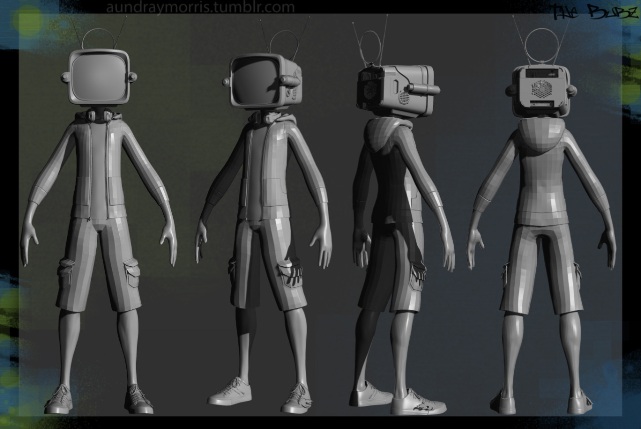
But I got really excited, and I've decided to take it further. I have some really interesting ideas. Here is a quick ref sheet:
Two of the biggest inspirations were David D Jimenez Killer Robot and Lord Conti from FLCL

Most of the stuff is referenced from things that I actually have. For example, the back/inside of the Tv head, are the parts inside my home computer. The bitch'en Converse with the flames on them, I wear those almost every day....They also make me go faster.


Any feed back is greatly appreciated. I have this bad habit of not finishing things, mostly because of work. But I hope to kick that habit and actually finish this.
Sooo, this started out as a quick thing to get me back into the groove of thing after being away from modeling for so long. I was going off of an old concept that I did back in college. I was just going to make it really simple and not deviate from my old concept.
But I got really excited, and I've decided to take it further. I have some really interesting ideas. Here is a quick ref sheet:
Two of the biggest inspirations were David D Jimenez Killer Robot and Lord Conti from FLCL

Most of the stuff is referenced from things that I actually have. For example, the back/inside of the Tv head, are the parts inside my home computer. The bitch'en Converse with the flames on them, I wear those almost every day....They also make me go faster.


Any feed back is greatly appreciated. I have this bad habit of not finishing things, mostly because of work. But I hope to kick that habit and actually finish this.

Replies
I'm not sure how much is to much or to little. I'm not really sure what the plan is either but I'm leaning towards just a cool render. My first idea was to take it all the way through the game modeling and texturing pipeline so that I could learn how to use Quixel 2.0. And my texturing skills are lacking so I wanted to get better. But everything, so far, has a high and a low model.
I decided that I'm not going to mess with the proportions anymore. I edited them slightly from last time, but not very much. After I flush out the wrinkles a bit more, I can get on to making all of the accessories.
If you have any input, goooo for it. Anything helps.
Eventually, its going to have all the nerdy junk that I have dangling off of my backpack. Im getting pretty close to being “done” with all of the models!
Ok, the backpack accessories are done. Not gonna add any more or it might start to look as cluttered as my actual backpack lol
And these are the dangly bits that are on the pack.
Holy crap. I replied to this a while ago but for some reason it just kept it in as a draft and didn't actually send it!
Long time no update for this guy. But Im still working on it. I actually managed to get his polycount down a bit more but have things looking better….I dont know how, fucking magic. As it currently stands, everything is 44267, but I still have to add the wires for the Rockband Guitar and the Nintendo Zapper.
Look at all those damn UV’s. I was thinking a total of 4096 texture res. So each squar using 1024. It might be a bit excessive, but it will look good!
Good lord, how tired was I when I uploaded my uv's before. Before I said that I was going to do a max of 4096 texture res, each being 1024....with 5 uv sets. I FORGOT HOW TO MATH.
Well, I've updated the uv's and they make more sense for there mesh groups and are more optimized.
The baking process is such a pain in the ass and is so tedious. Definitely my least favorite step. I had to re-organize my UV's too because things didnt bake down properly. I don't know what I was thinking. I should have done some test bakes to start off with, and it would have gone a ton smoother for me.
Thank you to everyone that is still following this. I know I don't update much, but its getting there. Im on a mission to finish all the models that I've started, so if you're interested in this, maybe you'd be interested in some of the other models I have going. They should be getting updates soon too.
The head so far without the alphas on. Because I dont know how to work with transparancy in Quixel yet. Final renders will be in Toolbag 2 anyway. I think Im gonna call the head done, or close too it lol. Gonna add a little more scratches
Still gonna end up modeling a little speaker companion for him later on. Just thought I'd focus on getting him done first, and then do more modeling.
Hope you guys like it. Feedback is always welcome.
Im on the homestretch now! He is now completely textured. Still have to tweak some stuff. BUT IM ALMOST THERE!
Closer look at all the nerd stuff
this is the little Speaker companion Fortississimo. There was another version, and there were originally 2, but they didnt come out right. And having 2 just put too much on the screen, with already sooooo much going on.
Last shot before the posing. So sooo close. THE END IS NEAR! Hope you guys like it!
Maybe drop the opacity a bit or and add a slight brightened radial falloff from behind your character to separate the two.
I feel the jacket could do with a little more variety in design... since it's all just one colour it seems a little dull, maybe the hood could have a baby blue inner lining instead of yellow? because I don't feel like the yellow makes much sense on the jacket unless maybe you make the sleeve/hoodie ends the same colour as well? just seems like his head is pretty flashy and his essence altogether is quite brash and the jacket just seems like it's any casual hoodie he picked up from a on the corner merchant shop... seems like he would be wearing something a little more hipster if you get what I mean haha... but this is merely personal preference though so discard at will.
Fortississimmo's arms have very low segments on the shoulder section, I'd definitely add some segments back to it since it's really obvious when you compare them to any other cylindrical features on all your models.
Other than that I'm really feeling this man, good job (Y)
With the jacket, it's kinda dull on purpose because I didn't want it too look cluttered and it's sort of the breakup between elements. I was going to put feathers around the rim of the hood like in Dead leaves. But it didn't quite right. With the head being so flashy and the headphones, it was beginning to be too much. As for the colors, it's actually my own hoodie that I wear haha. Take a look.
A lot of the stuff is actually based on my own stuff...the character is basically me at this point XD. But I was thinking of adding some elbow patches. I'm sort of more tacky and less hipsteresk.
You're definitely right about the segments in Fortississimo's shoulder. I noticed that right away and I should have changed it right after the first bake, but I was it a rush and just left it. I keep thinking to myself, "ehh, is it really thaaat noticeable. Maybe I'm just looking at it to much." But now I know that's not the case.
Just to really cement it into it's environment and style.
Always a shame to see amazing characters only t pose lol
Well, here it is. The final turn around image. It was A LOT harder to pose then I thought it would be. I didn't to take the time to do all of the actual rigging, so I found my old autorig script and just post it the best I could with joints, and then took the rest into Zbrush and moved some stuff around. This has been a really great learning experience for me. What started out as just a project to get me back into the groove of modeling again, turned into coming home from work, staying up until 2am everyday, and a lot of pain in the butt. But it was worth it.
I'll be starting up another thread for the continuation of this model here. There was a whole slew of issue with this before. Mostly because I was straying too far from the concept. So Ill be going back and and changing it and actually finishing it. So keep a look out if you're interested.