Female Character Work Thread - Modern Celtic Hero
Latest Update:


Original Post:
Hey! So I'm an environment artist but it's been far too long since I've gone through the character art pipeline, so I've been developing this character from a story/setting that's been kicking around in my head for a while. She has some background and history and lore and all that garbage that no one but me really cares about, but basically she's a 20th century girl who takes up the mantle of an ancient mythical hero. Basically a badass every-girl type hero.
Here's some of my design/pose sheet stuff. I'm not a painter really, so you'll have to settle for my lineart:


I've started the sculpting process and I need some help with appeal in the face and head.
Body went ok:

But the face is kicking my ass:

I really like where the concept landed, but as I tried to match the facial proportions in the drawings, I realized that the drawings are too cartoony. They have the feel that I like, but not the proportions, so I restarted. I really like (as do we all) the look of jfletcher's Huntress project. I also pulled some images of Saoirse Ronan into my ref boards for this forever ago.
Here's a truncated version of one of my ref boards: https://www.pinterest.com/mutatdjellyfish/causeway-ref/
The face as it is moving in the right direction, but I'm really struggling with appeal. I'm not really going for sexy or hot, but I want her to be attractive and appealing from a design perspective. As it is now, she's pretty skeletor and too pouty. I think I'm making some amateur mistakes but it's getting difficult to dial into what exactly I need to change. The old "looking at it too long" problems.
Any thoughts or advice?


Original Post:
Hey! So I'm an environment artist but it's been far too long since I've gone through the character art pipeline, so I've been developing this character from a story/setting that's been kicking around in my head for a while. She has some background and history and lore and all that garbage that no one but me really cares about, but basically she's a 20th century girl who takes up the mantle of an ancient mythical hero. Basically a badass every-girl type hero.
Here's some of my design/pose sheet stuff. I'm not a painter really, so you'll have to settle for my lineart:


I've started the sculpting process and I need some help with appeal in the face and head.
Body went ok:

But the face is kicking my ass:

I really like where the concept landed, but as I tried to match the facial proportions in the drawings, I realized that the drawings are too cartoony. They have the feel that I like, but not the proportions, so I restarted. I really like (as do we all) the look of jfletcher's Huntress project. I also pulled some images of Saoirse Ronan into my ref boards for this forever ago.
Here's a truncated version of one of my ref boards: https://www.pinterest.com/mutatdjellyfish/causeway-ref/
The face as it is moving in the right direction, but I'm really struggling with appeal. I'm not really going for sexy or hot, but I want her to be attractive and appealing from a design perspective. As it is now, she's pretty skeletor and too pouty. I think I'm making some amateur mistakes but it's getting difficult to dial into what exactly I need to change. The old "looking at it too long" problems.
Any thoughts or advice?
Replies
The nose looks perfect, as do the eyes for the most part. Perhaps the preorbital puffiness (thanks wikipedia!) could be toned down as well, I don't think the drawing makes them so prominent.
Daveyploo, thank you as well. Here's my latest that I worked on last night (before I saw Davey's post). I think it looks much more human and less like an adult fetus, but the eyes are definitely still too far apart (too small as well?) and she's still a bit too pouty in the mouth? Something about the mouth area I can't quite dial in yet. I think I lost the overall face shape too at some point. I'll post this in the interest of showing progress, but please feel free to critique any version; I greatly appreciate it, this is helping a ton!
These are just a few spots but you're on a good way.. Keep it up, I like it!
Folowing this thread
Latest:
I threw in some block-in, throw-away hair (I'll be trying to actually sim it in the final game art) and a throw-away bust for the hair to rest on, just for visual context. Instead of working from version 2, I went back to a previous save from version 1 (with the skinnier face and the bug eyes) and worked forward from that using feedback from version 2. Starting over in that way was actually really nice! It let me split the difference, I think, and redo what I liked in version 2 and include the new feedback without having to dial back mistakes made in version 2.
Anyway, I think she's finally kind of starting to look like herself! At this point the front face ortho drawing is more of a guide and I'm generally ignoring my profile ortho completely. I think she looks much closer to her actual race as well, which is Irish/Celtic. More importantly, this is the first that I've started having that feeling where I'm "meeting" the character for the first time in 3D, which is a good feeling.
I reckon the eyes are too high still, and there's still some uncanny things going on with the mouth and some areas of the eyes. If anyone has anymore feedback, I'd love to hear it. You guys have been amazingly helpful. From here I think I'll save out this version, try a round of adjustments on it, then reload the save and try another round etc until she feels solid.
I like where you are going with this.
But be careful with those sharp edges on nostrils and lips.
Thanks a ton for the help, you guys! Please feel free to keep commenting, it's already made a huge difference.
Thanks! Yeah, the ears were definitely glossed over. I will put them on the list for the next pass.
@Ged
Thanks! Yeah, I am purposefully walking that line, and we'll see if I'm successful! I have a sample of my reference images here: https://www.pinterest.com/mutatdjellyfish/causeway-ref/ but my full board is private due to some images I'd rather not share (my main reference, actually
@Tectonic
Thanks, man!
Beginning Marvelous Designer tailoring. I used the pattern drafting method Andrei Cristea outlined in Vertex 3 to derive the pattern from a blockin sculpt I extracted from the body sculpt. Tonight I'm going to pull a Pinterest board of fold and seam reference of denim shorts so I can start authoring the fabric's landmarks. My one sticking point is the rolled up leg bottoms (which I unstitched for this screenshot, you can see them in the pattern, but the pieces are lying in heaps on the floor.
MD is really nutso-crazy. A really cool tool.
I can give you one advice that someone gave me a while ago. Do not start using MD to learn drapery. It is a great tool to create the base shape, but you still have to sculpt on it and without correct knowledge of how materials flow, you won't get a great result.
I'm sure you guys will let me know if it's not working out!
I think you're right! I was trying to make it work in the name of learning the ropes of the program, but I need to move on for now. The cuffs will be zbrushed!
Raw import from MD after dynamesh and such. No sculpting or real clean up yet. I've also blocked in the cuffs as per my concept.
It's looking close to the concept, but I'm open to any suggestions for details that really make it feel old and solid. I'm going to get rid of the oval shapes on the blade as I think they really take away from the blade detailing. I'm also going to pull a bunch of reference tonight and see what I can glean from that.
Thoughts?
You can see the finished sword above.
For the scabbard I built an inside mesh to use as an avatar in Marvelous Designer and then using pins and simulation pausing, I wrapped it in a big long rectangular piece of fabric that was laid out on the bias. Then I used morph targets to add the straps, and did the zbrush thing. The mouth of the scabbard is sherpa cloth and a metal lip so she can angle the blade out since the draw length is so big compared to her arms. It's a shorter scabbard for that same reason too.
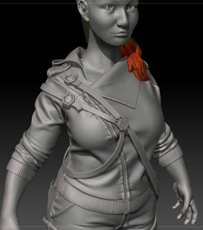
Picking up momentum again on this after things have settled down post-holidays. Here's the hoodie! Base built in MD and now I'm starting the detailing/cleanup phase on the clothing.
Face could use some more tinkering, especially at the cheek to nose area I think it looks a little too concave.
We're looking at a female with a thick body, yet the neck and facial features are closer to that of a female with a thinner body frame.
I would tone down the definition of the neck and make it a little thicker.
As for the face, I agree with @Firith. There are some areas, expecially around the eyes that feel a bit concave and can benefit from adding some fatty tissue.
**bonus** I didn't go in and measure, but the shins feel a bit short to me. That or the thighs a bit long. Either way, the knee feels too low on the leg.
Ok, I filled in the face a bit and smoothed out the neck a bit. Subtle changes.
Before:
After:
Animated:
I'd love to hear your thoughts! I'm mainly trying to fill out the face without changing the features too much. I know that features change and get pinched as fat increases, but yeah. Trying to walk the line kinda.
Did a sculpting pass on the hoodie and shorts drapery and indulged in some details like stitching. Blocked in the main masses for the boots.
I hope you don't mind that I redlined a little! The boobs look like they're planets apart in the jacket, try using the nipple as a landmark to finding the plane changes. Also, keep in mind straights against curves when sculpting a body, it makes for a more appealing design. Here's a really good guide.
Also, Marvelous Designer looks fun! I'll have to give it a try! The patterns look really nice!
Boot detailing coming along slowly.
More boots! Plaid pattern is super duper temp, just to get a feel for the fabric versus leather bits.
Initial modeling pass on the harness.
It's been hard to find big blocks of time to work since we're trying to get a project out the door at work, but I'm still working away!
Starting with a proper base mesh you'd have a full control with subdivision levels and polygroups while sculpting. In this stage of your sculpt, you could still retopo a new base mesh on top of this and project all the details back, and continue sculpting.