RIOT GAMES ART CONTEST 2014: Winning Entries
CHARACTER ART
1st Place - Goldo_O
The artistic style of ‘El Braum’ aligns closely with the character style of League of Legends. It has a great in-game read and takes our camera angle and character scale into account. The sculpt has the right amount of detail and the chunky shapes resonate well with our style. The material breakups in the texture are handled well. The design choices throughout are very appealing and cohesive. In every aspect, this feels like a skin you’d see in LoL.
WIP Thread: http://www.polycount.com/forum/showthread.php?p=2162511
Final Entry Image:
2nd Place - DmitryGrebenkov
The Caitlyn entry has very beautifully rendered textures. While staying true to the original design, this version subtlety improves on many aspects of the costume and accessories. There is also a very nice material separation in the texture. The materials are clean and well painted throughout. The style is just a tad more realistic than what we have in LoL and the scale of detail are a bit smaller than what reads best in game but these were only minor issues.
WIP Thread: http://www.polycount.com/forum/showthread.php?t=141885
Final Entry Image:
3rd Place - JRancourt
One of the strongest aspects of the Cho’Gath entry is the high resolution sculpt. It has large chunky shapes that are very true to our style. Overall, it is clear that the artist has a solid understanding of the character. There was very thoughtful handling of the model changes as he scales up. More time spent in the rendering of the textures would have made this entry even stronger. The color palette was striking but possibly not the best fit for Cho’Gath.
WIP Thread: http://www.polycount.com/forum/showthread.php?t=141474
Final Entry Image:
Honorable Mention - Hellstern
Sun Goddess Leona was a very strong entry but unfortunately this entry was disqualified because Hellstern is employed by a partner company that Riot Games works with. However, this entry did really impress us.
WIP Thread: http://www.polycount.com/forum/showthread.php?p=2165700#post2165700
Final Entry Image:
ENVIRONMENT ART
1st Place - Owl
Creature camp: This is truly a fantastic piece. The most impressive part is the near seamless integration. You nailed the colors, the mood, the majority of the shapes and the transition into the ground plane is awesome. It is great to see how much work you put into pushing the details. Everything from the individual grass blades and bush leaves to the lily pads and flowers are all well rendered. The aggressive shapes of the rocks and tree bark are well contrasted by the soft curves of the water and shrubbery. Outstanding job!
Turret: Your pose is clear to read from all angles and feels powerful. The final design is a bit weaker than your concepts. His original pose of chest up and head forward feels like he is focused on an enemy in front of him who is about to get destroyed vs praying to the sky. The larger head of the final model makes him feel like a little guy. The hands being closer together, the larger cloth sleeves and the 3 tassels hanging off the owl head all read great, show good balance, push strong silhouette and convey a more powerful vibe. The modeling and topology is solid and the texture is well painted. Good use of values. The main issue we have with the texture is that you don't have enough overlapping colors living within the different materials.
Overall: You generated a ton of solid content here. Your hard work, determination and skill have earned you the top spot in the Environment Art Contest. Bravo, sir. GGWP!
WIP Thread: http://www.polycount.com/forum/showthread.php?t=142258
Final Entry Images:
2nd Place - Daniel Duy
Overall scene feedback:
Figuring out a way to incorporate the entire contest into a singular scene shows a lot of creativity. Bonus points for challenging convention. ![]()
From a design standpoint, this is a well-crafted scene with a lot of cool ideas. The integration of the statue motif and the story telling floor pattern is pretty awesome. It's cool to see a different take on the crashed airship shop. The way you created an overall cool scene and used warm hits to identify focal points is fantastic. Everything from the subtle pink cast on the statue and ground to the soft purples and teals in the shadow is incredibly well done. A couple of small things that could improve the colors: Adding a bit more color variation between the bronze and the wood. They blend together a bit too much in some areas. Also, you can do something to make the ground feel a bit different from the walls.
From a modeling and texturing standpoint, your work is incredible. You have just enough geometry to make use of the paralax in the scene while ensuring none of the geo is too obvious. If your goal was for your final model to look like a painting, you nailed it.
Overall, this is really amazing work that you should be proud of. It has been an absolute pleasure watching your progress. GGWP!
WIP Thread: http://www.polycount.com/forum/showthread.php?t=143303
Final Entry Image:
3rd Place - anglorum
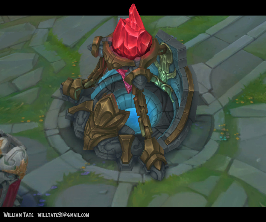
Inhibitor: The bold, chunky shapes and artistic brass plating do a great job of framing and reinforcing the importance and power of the crystal. The small owl on the back wall of the well, is a great touch. It would have been nice to see the own motif taken a little further, especially in the front. Your primary materials (stone and brass) are too close in ratio. Nearly 50/50. If you look at the majority of great designs, you will notice that they have clear primary and secondary elements. We generally like to use the 70/30 or 80/20 ratios. The model looks pretty solid. Good even topology across most of the model. The back wall is a bit on the low poly side creating an overly blocky silhouette and the brass plates around the crystal rim are vastly different from each other. The painting of your texture is fairly well done. The technique is solid it just needs some refining to push it further.
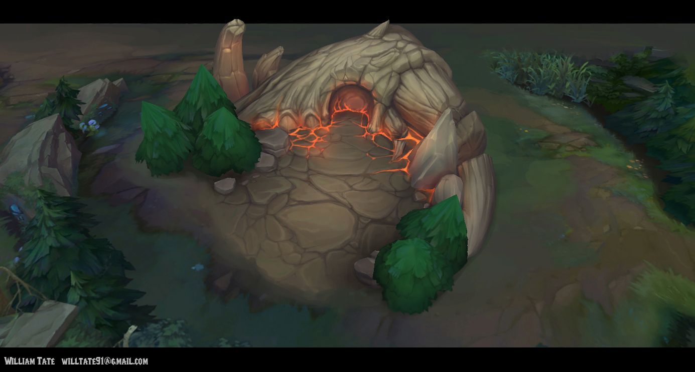
Creature camp: This is a really fun and creative concept with a cool theme and story. The idea of an epic beast that died in Summoner’s Rift is pretty awesome. We feel like the concept is much stronger than the model from a shape and composition standpoint. This is because the concept head has a really great shape with a lot of interesting silhouette undulation. It turned into a single smooth hill shape in the model. The model is decently built, but there is a lot of excess geometry in the skull. The extra bones in the back are a good idea, but they lack integration.
The texture is working quite well. The most impressive part is the integration of the skull into the ground and the blend into the existing ground around your scene. While the ground rock shapes are too soft and round for SR, the color, value and scale variety are solid. It’s great to see the gameplay space staying low contrast. The trees feel very rushed and lack integration or relationship with anything else in the scene. The overall colors are working fairly well. Our favorite addition to the pallet is the hot orange. This adds a lot to the mood and dangerous vibe of the scene as well as a great bounce light color to tie elements together.
Overall very nice work!
WIP Thread: http://www.polycount.com/forum/showthread.php?t=143325
Final Entry Image:
ILLUSTRATION
1st Place - mr.Roboto
That team fight though! This piece does just a stellar job of communicating champion personality and capturing the pinnacle moment right before a 5v5 team fight. Its obvious Minkyun understands each of these champions' nuanced personality traits. The sense of motion and gesture in the execution of each champion's pose is both exciting and in many ways character defining. As a side note, it was also awesome to see some of the considerations in the early process thumbnails as well.
WIP Thread: http://www.polycount.com/forum/showthread.php?t=144593
Final Entry Image:
2nd Place - Skyzocat
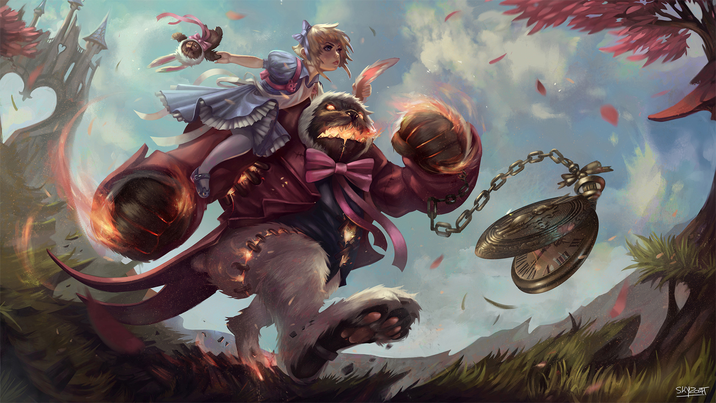
Capturing the idea of a League of Legends champion and clearly injecting the alternate fantasy of a skin is not easy. Marie does this in such a great way with balancing the relationship of Annie and Tibbers as well as mixing in just the right amount of that journey through an otherworldly/whimsical environment. The demonstration of craft in the image's sense of motion and composition make this really stand out.
WIP Thread: http://www.polycount.com/forum/showthread.php?t=143869
Final Entry Image:
3rd Place - denstarsk8
This image really is a trip! We look at Mundo in a different way now because of it. Not only is this image dripping (literally) with awesome character motion and narrative, but it does such a great job of explaining just what's going on in Mundo's head. This was a really creative adaptation of Mundo's abilities and the execution and personality in all areas of the image (those poro/agony flame-balls of doom!)
WIP Thread: http://www.polycount.com/forum/showthread.php?t=143038
Final Entry Image:
Honorable Mention - Afrocream
This was probably the closest image to being an actual splash art screen in League of Legends and we considered this for a very long time as one of the top contenders for the competition. The execution is great with dynamic posing, a great balance of warm and cool colors, interesting representations of the in game abilities and the Zed helmet on the hip is a nice touch. All in all, a really exciting image to look at, and a lot of us were really rooting for this image, but ultimately we didn't feel like it conveyed enough of a story or personality relevant to Shen to justify a spot above the other contest winners. We really felt it was worth showcasing.
WIP Thread: http://www.polycount.com/forum/showthread.php?t=143608
Final Entry Image:
ANIMATION
1st Place – Sotatsu
There were a number of great submissions, and it was difficult to choose 1st place in the animation category. We chose Stephane Videlo's piece for 1st place because it brought together many aspects of animation into one succinct package. Both the walk and the attack demonstrated a wonderful bustle of personality. Everything from the crazy enlargement of the drill bit, to the ridiculous jump height, to the satisfying dirt/rock effects: It all served to strengthen the core theme of the character while making the clarity of the gameplay unmistakable. We already want to play as this little guy- if only to find out how he can smoke that teeny cigar with drills for hands!
WIP Thread: http://www.polycount.com/forum/showthread.php?t=144187
Final Entry Video:
2nd Place - StephenVyas
We chose Stephen Vyas as the second place entry because his work shows great, clear, action and an amazing level of creativity. We really enjoyed the dynamic poses created in the attack move. With the addition of the whips, it really brings something unique to the whole sequence. The character walking in and getting attacked was also a nice touch. The run cycle Stephen created was great as well. It shows a great flow and an understanding of looping sequences with great timing and a natural bounce. Overall, this entry was very dynamic and creative.
WIP Thread: http://www.polycount.com/forum/showthread.php?t=141169
Final Entry Video:
3rd Place – Rafael
Rafael Gonzalez’s animations show an appealing combination of character and prop. The animations feel polished and have some good varied timing. It was nice to see the subtle use of smear frames in the attack move along with core principles such as squash and stretch. The walk demonstrated some good acting and whilst it comes across as more of a locomotion variant, it was a bold attempt of thinking outside the box.
WIP Thread: http://www.polycount.com/forum/showthread.php?t=144979
Final Entry Video:
VFX
1st Place – Klemen
We chose Klemen as the 1st place winner. This is a great example of doing a lot with a little. It’s a beautifully executed display of strong fundamentals in timing, motion and shape language. We love the creative use in color in the lightning effect. The buildup on the cast effect successfully communicates when the spell is going to fire off. The spell itself feels dangerous even though the colors are whimsical. It’s a well-executed contrast and we wouldn’t want to get caught in its line of fire. We also love the attention to detail like the flashes of aqua in the hit effect. The shapes in the fire spell are simple and elegant while retaining its danger. We love the flow of this entire spell from its cast all the way to the follow through in the hit effect. It tells a cohesive story and it’s the kind of spell we’d waste our mana on just so we could see it again. Bravo.
WIP Thread: http://www.polycount.com/forum/showthread.php?t=141656
Final Entry Video:
2nd Place - Aryo_Darmawan
These effects are a solid demonstration of creativity and imagination. The timing on each effect feels punchy and impactful while leaving room for a nice amount of fall off and follow through. We also think these effects demonstrate a fantastic use of color depth. Where these effects could improve is the noise amount and level of detail. Every element is equally as visually commanding. We’d like to see more distinction between the primary focal point of each effect and the secondary elements that support it. Separating these elements more through saturation, brightness and level of detail will go a long way in helping to guide a player’s eye to the gameplay information they need to know most.
WIP Thread: http://www.polycount.com/forum/showthread.php?t=141706
Final Entry Video:
3rd Place – Toafer
These effects are fun, well defined, clear and readable. We like the play in color depth in the Varus Q missile as well as the follow through in the hit effect. What we felt needed more work is the timing of each effect. The timing on these effects is linear and could use more weighting. Weighted timing with more of an ease in and ease out would help these effects feel more dynamic. Lastly, we would love to see even more play with color! The Lux inspired effect is very desaturated. For an ability that has the prism of colors at its fingertips, we would have liked to see more play on color and saturation levels.


