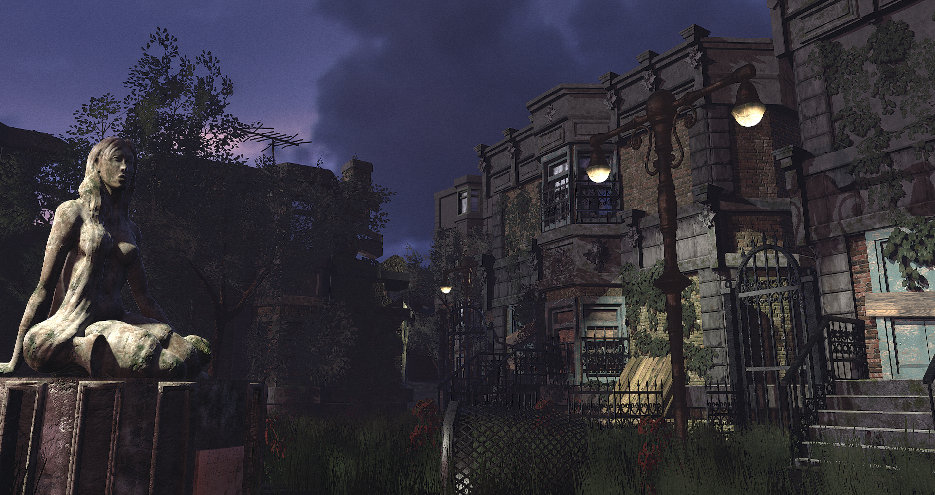
So I've been working on this thing in a vacuum and decided it was more than time to get some other eyes on it to rip it apart. Haven't done personal work on this level in a while and am trying to do things that are different from what I do in my day to day work.
TL;DR, Tell me what you see wrong here. Very much appreciated, thanks!
Thanks guys, agreed the lighting came out crappy and flat. Going to throw some new (hopefully)hotness on it this evening and then go from there. Really appreciate the feedback!
Much better, but I feel like it's all a bit too yellow at the moment.
I took the image into photoshop to see if I could adjust it and get some better color range:
Not perfect, but it gets away from the yellowness that was bothering me a little.
You can create a color-lookup-table for use in UE4, if that's where this is rendered.
To get it where it is, I threw on a levels adjustment layer, with the sliders at 18, 0.93, and 208, respectively. And I also threw on a hue-saturation adjustment layer, with Hue set to -16, Saturation set to +19, and lightness set to -9.
If you are using UE4, I converted those adjustments to an LUT, which you can load into your post processing:
Joopson, you're awesome. Thanks again for taking the time to critique this, just got to the point where I knew things weren't right, but I'd just been staring at it for too long. Now it might be too pinkish..? Not sure with the discrepancy between monitors, will have to take a look with fresh eyes in the morning.Last update for tonight:
Really liking this piece! Getting some nice Last of Us vibes from it! The only thing I can notice right now, is that the antenna on the roof to the left looks really, really big, especially compared to the tree in the scene.
@Stavaas: Thanks! I was playing The Last of Us Remastered when I started this project so it's definitely an influence.
Still plugging away on this. First image with fog, second without, and changed it to dusk/night lighting. I also added some lamp posts and moved some stuff around.
I think you went from one extreme to another here. From fairly washed out to overly saturated with too much contrast.
Lighting is going to be key here. The shadows from the vegetation are causing a whole lot of noise that makes the building facade look really busy. Your vines along the building are throwing a really hard shadow...it makes them look like a very solid mass vs translucent leaves. I thought they sat on the building much better in your original post.
If I were you I would shy away from throwing a custom LUT on here for now, and maybe just focus on getting getting some good value with lighting first.
Thanks for the feedback, I think it's obvious(especially on this scene), that lighting and I are not best friends. I'm never involved in lighting in my day job and have found I'm rusty as hell. So, here's an update for now trying to get away from getting too much contrast and saturation and getting everything to sit right again. Might step away from this for a week to work on a vehicle I've been wanting to work on and come back with fresh eyes. Thanks again for all the feedback!
Looking a lot more solid Em.! I do however think the blur on the building in the back is a bit strong, but other than that there's not much I can critique.
Replies
The models look solid enough, and I like the subject matter a lot.
I feel like just adding some bold lighting could really knock this up a few levels.
I took the image into photoshop to see if I could adjust it and get some better color range:
Not perfect, but it gets away from the yellowness that was bothering me a little.
You can create a color-lookup-table for use in UE4, if that's where this is rendered.
To get it where it is, I threw on a levels adjustment layer, with the sliders at 18, 0.93, and 208, respectively. And I also threw on a hue-saturation adjustment layer, with Hue set to -16, Saturation set to +19, and lightness set to -9.
If you are using UE4, I converted those adjustments to an LUT, which you can load into your post processing:
Still plugging away on this. First image with fog, second without, and changed it to dusk/night lighting. I also added some lamp posts and moved some stuff around.
I think you went from one extreme to another here. From fairly washed out to overly saturated with too much contrast.
Lighting is going to be key here. The shadows from the vegetation are causing a whole lot of noise that makes the building facade look really busy. Your vines along the building are throwing a really hard shadow...it makes them look like a very solid mass vs translucent leaves. I thought they sat on the building much better in your original post.
If I were you I would shy away from throwing a custom LUT on here for now, and maybe just focus on getting getting some good value with lighting first.