Critique for WIP portfolio
Hi there, I've being around this site for a while but never posted anything, it's time I start showing some work for constructive criticism as well as giving others feedback. Any feedback to help me get better is welcome/ Don't hold back.
I graduated from Teesside University (UK) with a 2:1 (a in 2012. I've since mainly been working in a warehouse for money, but really want to be a game artist either freelance or local-ish (Sheffield/Yorkshire). With working in a crappy crappy warehouse job full time I don't get all that much time to work on my portfolio really, But here are the odd bits I've been doing this year.
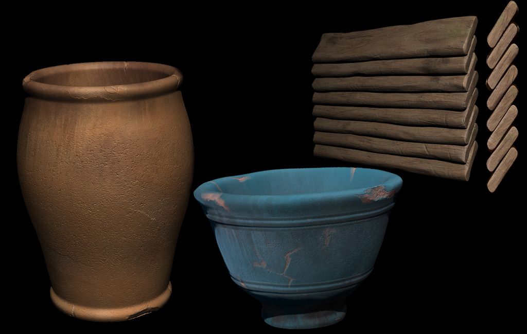
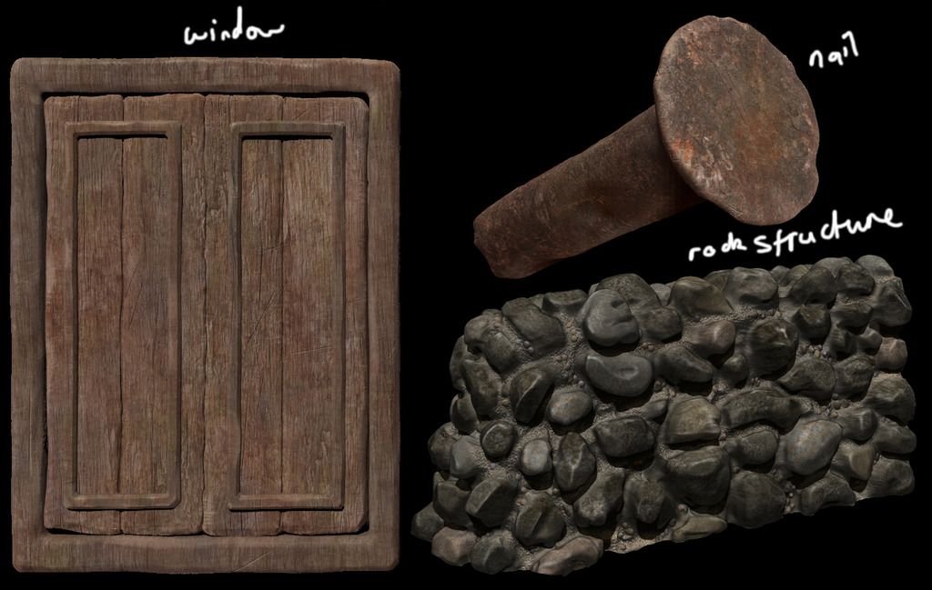
First images are from an indie game I helped worked on (not going to be released for a while) earlier this year. The concept is a destroyed house in Afghanistan. Everything is WIP and are just renders from inside ZBrush.
[URL="[URL=http://s1380.photobucket.com/user/TomWoodArt/media/1_zpsyoybjvh6.jpg.html][IMG]http://i1380.photobucket.com/albums/ah164/TomWoodArt/1_zpsyoybjvh6.jpg[/IMG][/URL]"][/url]
[URL="[URL=http://s1380.photobucket.com/user/TomWoodArt/media/2 - Copy_zpsdfmzig2u.jpg.html][IMG]http://i1380.photobucket.com/albums/ah164/TomWoodArt/2 - Copy_zpsdfmzig2u.jpg[/IMG][/URL]"][/url][URL="[URL=http://s1380.photobucket.com/user/TomWoodArt/media/4 - Copy_zpsst7udqh1.jpg.html][IMG]http://i1380.photobucket.com/albums/ah164/TomWoodArt/4 - Copy_zpsst7udqh1.jpg[/IMG][/URL]"][/url][URL="[URL=http://s1380.photobucket.com/user/TomWoodArt/media/6_zpsikpcgtnn.jpg.html][IMG]http://i1380.photobucket.com/albums/ah164/TomWoodArt/6_zpsikpcgtnn.jpg[/IMG][/URL]"][/url]
I graduated from Teesside University (UK) with a 2:1 (a
First images are from an indie game I helped worked on (not going to be released for a while) earlier this year. The concept is a destroyed house in Afghanistan. Everything is WIP and are just renders from inside ZBrush.
[URL="[URL=http://s1380.photobucket.com/user/TomWoodArt/media/1_zpsyoybjvh6.jpg.html][IMG]http://i1380.photobucket.com/albums/ah164/TomWoodArt/1_zpsyoybjvh6.jpg[/IMG][/URL]"][/url]

[URL="[URL=http://s1380.photobucket.com/user/TomWoodArt/media/2 - Copy_zpsdfmzig2u.jpg.html][IMG]http://i1380.photobucket.com/albums/ah164/TomWoodArt/2 - Copy_zpsdfmzig2u.jpg[/IMG][/URL]"][/url][URL="[URL=http://s1380.photobucket.com/user/TomWoodArt/media/4 - Copy_zpsst7udqh1.jpg.html][IMG]http://i1380.photobucket.com/albums/ah164/TomWoodArt/4 - Copy_zpsst7udqh1.jpg[/IMG][/URL]"][/url][URL="[URL=http://s1380.photobucket.com/user/TomWoodArt/media/6_zpsikpcgtnn.jpg.html][IMG]http://i1380.photobucket.com/albums/ah164/TomWoodArt/6_zpsikpcgtnn.jpg[/IMG][/URL]"][/url]


Replies
The vertical wooden sticks are to be moved about and used as a fence
[URL="[URL=http://s1380.photobucket.com/user/TomWoodArt/media/6_zpsikpcgtnn.jpg.html][IMG]http://i1380.photobucket.com/albums/ah164/TomWoodArt/6_zpsikpcgtnn.jpg[/IMG][/URL]"][/url][URL="[URL=http://s1380.photobucket.com/user/TomWoodArt/media/4 - Copy_zpsst7udqh1.jpg.html][IMG]http://i1380.photobucket.com/albums/ah164/TomWoodArt/4 - Copy_zpsst7udqh1.jpg[/IMG][/URL]"][/url]
[URL="[URL=http://s1380.photobucket.com/user/TomWoodArt/media/4 - Copy_zpsst7udqh1.jpg.html][IMG]http://i1380.photobucket.com/albums/ah164/TomWoodArt/4 - Copy_zpsst7udqh1.jpg[/IMG][/URL]"][/url]
Personally I wasn't keen on the idea of the rock structure thingy, or having a skirt of rocks go around the bottom of the building, but that is what the client wanted
I will be doing another building as well as more assets, the floor and rock faces for the environment scene
[URL="[URL=http://s1380.photobucket.com/user/TomWoodArt/media/house_finished_03_zpsutmb1ddk.jpg.html][IMG]http://i1380.photobucket.com/albums/ah164/TomWoodArt/house_finished_03_zpsutmb1ddk.jpg[/IMG][/URL]"][/url]
[URL="[URL=http://s1380.photobucket.com/user/TomWoodArt/media/STEPS04_zpscdasjsh7.jpg.html][IMG]http://i1380.photobucket.com/albums/ah164/TomWoodArt/STEPS04_zpscdasjsh7.jpg[/IMG][/URL]"][/url]
[URL="[URL=http://s1380.photobucket.com/user/TomWoodArt/media/rocks_zpsbfmiiimg.jpg.html][IMG]http://i1380.photobucket.com/albums/ah164/TomWoodArt/rocks_zpsbfmiiimg.jpg[/IMG][/URL]"][/url]
[URL="[URL=http://s1380.photobucket.com/user/TomWoodArt/media/Ewe_zpslfatcm1d.jpg.html][IMG]http://i1380.photobucket.com/albums/ah164/TomWoodArt/Ewe_zpslfatcm1d.jpg[/IMG][/URL]"][/url]
[URL="[URL=http://s1380.photobucket.com/user/TomWoodArt/media/Ewe_Exras_zps5muy8haa.jpg.html][IMG]http://i1380.photobucket.com/albums/ah164/TomWoodArt/Ewe_Exras_zps5muy8haa.jpg[/IMG][/URL]"][/url]
[URL="[URL=http://s1380.photobucket.com/user/TomWoodArt/media/Ewe_Fence_zpskw5jvbro.jpg.html][IMG]http://i1380.photobucket.com/albums/ah164/TomWoodArt/Ewe_Fence_zpskw5jvbro.jpg[/IMG][/URL]"][/url]
I still need to do the floor and walls, as well as some other small assets to keep the scene interesting.
[URL="[URL=http://s1380.photobucket.com/user/TomWoodArt/media/HalfPipeSide_zps5pnszrem.jpg.html][IMG]http://i1380.photobucket.com/albums/ah164/TomWoodArt/HalfPipeSide_zps5pnszrem.jpg[/IMG][/URL]"][/url]
[URL="[URL=http://s1380.photobucket.com/user/TomWoodArt/media/General_zpsq8d6omkd.jpg.html][IMG]http://i1380.photobucket.com/albums/ah164/TomWoodArt/General_zpsq8d6omkd.jpg[/IMG][/URL]"][/url]
I'm not too keen on the girder. I feel I may have over done it with the rust and that the scratches aren't realistic enough. There wouldn't be that many scratches on it (if at all) as it's padded away anyway and wouldn't realistically get damaged
The shutter door too, I'm aware the colouring between the door and the sides and top are different. I need to change that. But again, I think I went a bit OTT with the rusting on the front of the door, I may tone it down. It might end up less visually interesting, but more realistic.
Because it's an old warehouse I've made some artistic choices in having different and brighter colours on certain asses to make it more visually interesting:
red padding
blue girder/door
green exit sigh
yellow pipe
I may add a few other colours for like a poster or such on the wall so it doesn't look too dull and drab. I kinda like how Uncharted 2 did that. With all the rubble around it still had bright and primary colours among the environment assets.
So yer, it's all WIP, but I'm hoping anyone can give me feedback for changes or even knowing it would be good enough to go in my portfolio (when the entire scene is finished, put together and rendered obviously), whether the sculpts/assets themselves are actually decent or not.
Thanks in advance
Also dont make screenshots in ortographic mode, its just strange and distracts from the object
Aside pretty solid all around, would be good seing something in a more normal environment with real lighting however
Since you said time is tight, I'd recommend the former. Take as many weeks or months on one or two things as it takes to really knock them out of the park.
Shrike - Yer I did the images like that because personally it does my head in when I have to wait for someones post to load cause of all the images, I will do what you said next time though lol
Also, yer I know what you mean about Orthographic, I realized that myself after already screenshotting half of the objects lol.
Arkaria - That about the house won't be hard to do, cheers for the advice. I hate the rocks around the bottom but it was what the client wanted. I may even get rid of them completely if changing (just for my own portfolio showcase) doesn't look all that better.
Meloncov - Thanks for the input! I won't be showcasing these images like this, this is just WIP that I was wanting feedback for. They will all be put in their own environment/scenes and properly rendered with good lighting. One scene in Unreal and one in Max/Mental or VRAY. I am going to be doing a couple of quick projects anyway that will hopefully be "standout" pieces on their own.
Thanks for the feedback so far guys, I will be showing more updates when I have more assets completed/scenes put together and hopefully showing completely new projects for opinions
Some of the major issues at this point is that you are a bit sloppy with the sculpting of the mesh and materials look off too. It is very important at your stage to use a lot of references. Please use marmoset to showcase your creations and follow their PBR guidelines and materials will be easy peazy lemon squeezy! ^^ Best of luck! http://www.marmoset.co/
What part of the sculpting would you say is sloppy if you could give me a few examples? What do you mean by materials? I only used MatCap White01 or BasicMaterial for the renders. All of these WIP renders are done inside Zbrush so I haven't took any occlusion, normals, diffuse, specular or anything for them yet until the sculpts are complete and I'm happy with them. Is that what you mean? Or do you mean something else? Thanks for the advice
Take a minute and look at the renders of your favorite environment artists or go on artstation.com and study the ways these artists present their work. None of them use plain black backgrounds or label their pieces using their own handwriting. Also, signing in the bottom corner is unnecessary. Make a nice template in photoshop with a simple gradient or subtle textured background with typed text. Make it consistent with all of your presentations and your work will immediately improve.