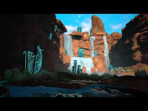
Personal Project: Desert Falls
Hi everyone! Long time no art post. The last time I had any new personal environment work was in early 2014. Since then I've been freelancing full time and I struggled for a while to get any personal work done. If I'm not doing client work, I'm not making any money and money is something I never have had much of.
To keep it short, I currently live in Philadelphia and have started teaching at Drexel University, which in conjunction with my other gigs (including writing for Gametextures.com and freelance work at a nicer schedule) gave me the opportunity to really hit this project hard. I'm ready to showcase it here and get some feedback from the community. I'd like to thank Josh Rife and Josh England (of Boss Key and Funcom respectively) for some earlier feedback I got from them a few weeks ago as I kept working. It definitely helped me push this to a higher level. And I'd like to thank any of you who post here!
Beauty shots first, then a second post that'll be a wip to completion post.


Video Fly-Through
[ame] https://www.youtube.com/watch?v=8FixD7RMaLk[/ame]
A few of the tiling Materials I made for this as well. I started out using Zbrush in conjunction with Substance Designer but later in the project for the 3rd or so cliff face revision (shown here), I went straight Substance and it worked fairly well.


My brother is going to put together the video of this all in motion from Matinee that I rendered out. I'll post it when it's done (hopefully tomorrow morning).
Thanks!
To keep it short, I currently live in Philadelphia and have started teaching at Drexel University, which in conjunction with my other gigs (including writing for Gametextures.com and freelance work at a nicer schedule) gave me the opportunity to really hit this project hard. I'm ready to showcase it here and get some feedback from the community. I'd like to thank Josh Rife and Josh England (of Boss Key and Funcom respectively) for some earlier feedback I got from them a few weeks ago as I kept working. It definitely helped me push this to a higher level. And I'd like to thank any of you who post here!
Beauty shots first, then a second post that'll be a wip to completion post.


Video Fly-Through
[ame]
 https://www.youtube.com/watch?v=8FixD7RMaLk[/ame]
A few of the tiling Materials I made for this as well. I started out using Zbrush in conjunction with Substance Designer but later in the project for the 3rd or so cliff face revision (shown here), I went straight Substance and it worked fairly well.


My brother is going to put together the video of this all in motion from Matinee that I rendered out. I'll post it when it's done (hopefully tomorrow morning).
Thanks!

Replies
This is one of the very early images. I actually started this in the summer of 2014 with the plan of making it large, open, and sell-able on the marketplace.
I shrank it down in scope once I started the project back up again over a year later. Here's the block out.
Progress shot from July. My approach to the cliff face/stone textures was...evolving shall we say.
This shot was after I tried a more mesh, more modular approach. Still wasn't working but I didn't see it right away. It was all about the shapes and type of stone textures I had.
This was the WIP01-Final that I sent out to a number of friends. Most were too busy (as was I) but Josh and Josh got back to me and along with my brother's feedback definitely helped me improve the piece. I knew this wasn't final but I need a few days away and some eyes and feedback.
And now the final shot from above. With a few exceptions, this was a pretty hard push over the past two weeks. Timing with a few jobs worked out just right so that I was able to get this done.
A few other fun notes:
-This is my first personal work in UE4, but I've been using it a lot for a few jobs this year.
-I decided to light this 100% dynamically. It's got real time GI from the Light Propagation Volume plus a number of placed lights
-Once the video is up, you'll get to see stuff in motion. Most of it's subtle (except the water)
-All of the splash and particle effects were done by Epic Games. The water I did on my own but did follow some of their guidance and the guidance of a few tutorials. River Fog and stuff is my work.
-I'll post on my blog a long form Post Mortem in a few days. I used a lot of the Material Function system and have some opinions on it's viability for a larger project and ways I could have used it better.
the rock texture in your post from today is amazing but the rock textures in the final peice seem muddy and lacking in detail
@Cglewis: Thank you. I'm blending 3 different materials on those cliff faces, which might be contribuiting to it. I'll look into the mask sharpness to see if that can reduce the muddiness a bit.
No video yet, thanks Comcast for breaking!
I think that the DoF on the camera should just be nuked. To me it takes away from a lot of the image, and especially that last one, the up close blur is distracting and I can't help but focus on it.
Second is the emissive strength. It feels incredibly overpowering and forced in a way. I'm looking and comparing the strength and forms to the concept and seeing how some of the forms are broken up – imperfect. Pushing back the intensity and maybe getting the color value of the stone to exist better within the environment would relax my eyes from jumping stone to stone.
All in all, sweet stuff!
I'd rework the color of your rocks, skydome, and really attempt to find an arrangement of ruins that sells it, I'd try cluster them together a bit more. Relax the emissive greatly and work on the subtle tilt of all the ruins in the concept. You could use a bit of point light coming off the ruins (subtle, don't overdo.) Your missing the broken bits at the bottom of the ruins that'll sell it as a broken rock. I'd work from there, getting floating rocks looking good, then turn on the emissive.
good luck.