Thomas Bagshaw 2D Improvement Thread
_
_
_
_
I'm still trying to make a break into industry in the UK, if you are looking for a concept artist or illustrator, please get in touch.
_
_
_
Thomas Bagshaw 2D Improvement Thread
Hello Polycount 2D artists, I'm working on improving my ability in 2D concept art and illustration.
Here's some of my work, i'll try and keep posting stuff in here to keep you up-to-date with my progress. I'd love any feedback or critique on my work. I really want to keep pushing my art ability to the next level, so please feel free to be as critical as you like.
I'm still trying to make a break into industry in the UK, if you are looking for a concept artist or illustrator, please get in touch.


Replies
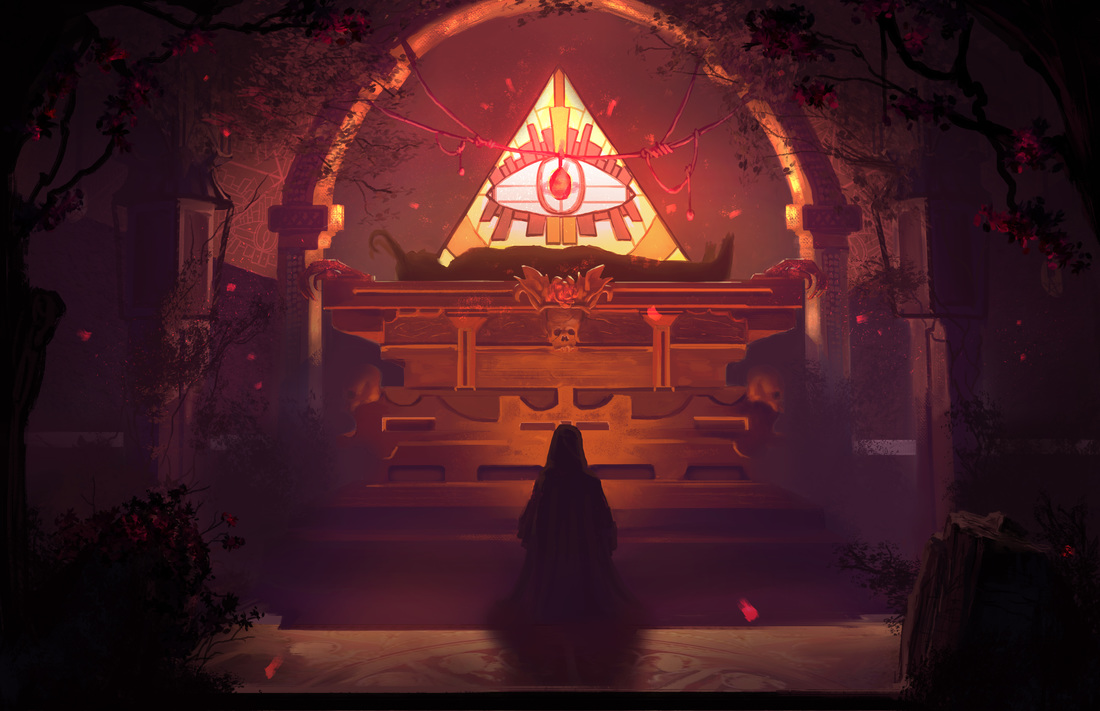
Values: You had something strange going on with the front face of the altar being that high in values, not being hit directly by the light source it wouldn't make much sense to be that bright.
On the other hand the character was silhouetted and he wasn't being lit at all. Try also to avoid going black, pure blacks and whites are to be saved as accents to be used sparingly.
Try to group more your values, squint your eyes and if stuff that shouldn't pop out jumps to your eyes, it's a good sign you should tone it down.
Also remember that cast shadows are usually defined and not blurry (unless really far from the source)
Also remember SSS for the leaves.
Colors, the monochrome scheme fit the image and the color choice is nice imo.
Composition: Most of the compositional problems of the image where concerning values so one you group and "invert" the character and the altar it already reads better. I just added simpler dark ground plane that helps leading the eye toward the main focal point (our eye is naturally drawn toward the vanishing points, so having elements with visible perspective lines on them reinforce that).
The demon dude (idk if it's a statue or what) was barely visible and I noticed it after a while, tried to silhouette him a bit more but it's a position that makes that quiet tricky.
Hope this helps!
I'm not sure if the image quality has been crushed on upload but the blacks should be dark purples, I never try and use black, it's a dangerous colour.
Could you elaborate on 'SSS' for the leaves? I assume it's something like shadow, sun, shaded? I dunno.
It was useful to see a different take on the image though, thanks for your thoughts! I'll definitely consider my value groups a lot more in future.
No worries! For the candle illumination, it's pretty hard to pull it off in that setting cause you wouldn't be able to see the candle (and the radius of the light would be really small), so maybe if he was holding a lantern that could work (just play around with glow and make the illumination still quite low with a fast falloff). With SSS I mean subsurface scattering. Surfaces like skin, leaves, wax etc. that have translucency will have the light scatter through them rather than blocking it.
This is a pretty nice example:
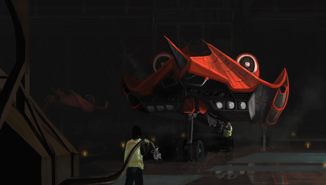
A quick sketch/photobash thingy.
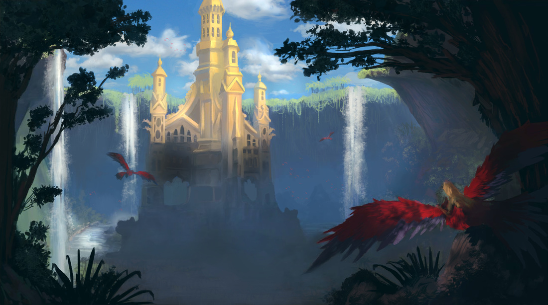
Here's a new piece I was working on and hopefully this will be a new art series!
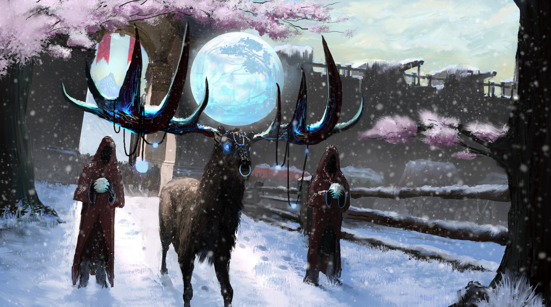
New image.