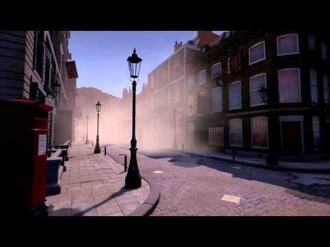
[UE4] Victorian Modular Environment
Hello poly friends!!
This is the result of the thesis I made during this summer for the MSc 3D Computer Games Design at Staffordshire University.
First of all, I would like to link my progress thread where I got a lot of awesome feedback and there you can see how the project started
http://www.polycount.com/forum/showthread.php?t=154805
Video:
 https://www.youtube.com/watch?v=JZoJpBAZDk0[/youtube]
https://www.youtube.com/watch?v=JZoJpBAZDk0
Some screenshots to show you the project!!


Here it is also the link to my artstation where I'm slowly uploading my other works
https://www.artstation.com/artist/carlosbermudez
Finally I would like to add that I will post the UE4 project for free too, I just need to change some lighting and maybe make a night scene.
Regards,
Carlos
This is the result of the thesis I made during this summer for the MSc 3D Computer Games Design at Staffordshire University.
First of all, I would like to link my progress thread where I got a lot of awesome feedback and there you can see how the project started
http://www.polycount.com/forum/showthread.php?t=154805
Video:
 https://www.youtube.com/watch?v=JZoJpBAZDk0[/youtube]
https://www.youtube.com/watch?v=JZoJpBAZDk0
Some screenshots to show you the project!!


Here it is also the link to my artstation where I'm slowly uploading my other works
https://www.artstation.com/artist/carlosbermudez
Finally I would like to add that I will post the UE4 project for free too, I just need to change some lighting and maybe make a night scene.
Regards,
Carlos
Replies
I will do the night version soon, problem is that windows may look a little bit dark and I can't place lights "inside" the windows to give it a dynamic look.
Any specific recomendations about the "day" lighting? Thanks!!
https://cdn1.artstation.com/p/assets/images/images/001/269/821/large/carlos-bermudez-de-castro-muela-5.jpg?1443359529
This picture kinda showcases it.
The round pathway should be darker because of lack of direct light.
It makes the lightening stand out as bland. Also the lack of shadows from objects or extruding brick or curvature of buildings. finally windows also contributes to the look and feel of lightening and your windows have a rather glossy/rough reflection. They all look the same (brightness wise) regardless of whether they are in direct light or not.
for example:
http://www.artofpatrickstone.com/art/pstone_alley_001.jpg
Just my peasant pennies.
Hello Bladers. Yeah, the pathway should be way darker, I think I can fix that lowering the intensity of the skylight.
Regarding the windows, I will try to make some rough variations but one problem is that translucent materials are not affected by exponential fog in UE4 so I had to make a small trick using emissive (depending on the distance) or otherwise they were almost black and not affected by the fog.
The lighting setup is static lighting with lighmaps baked. Here it is an explanation of the setup:
1- Main Light (sun light)
2- Secondary Light, oposite direction of the main light that light everything.
3- Skylight:
4- Lightmass settings:
5- Post process settings:
Thanks!
Here's a couple more pennies.
I think you should pick a scene/location. It makes things easier. (this is mainly why interior lightening is easier)
Set the sun in a location where its bridging a gap in the middle of the street.
Atleast where its hitting some of the building in the left while the right is in the shadows.
Reduce your skylight.
Try enabling DFAO. Should give you nice shadows.
Adding some bright point lights/ spotlights at the top of the buildings where the sun is hitting.
Adding some point lights, here and there to break apart the light (where you think light should bounce to).
Play around with volumetric cloud (end of kite demo for examples).
TLDR:
Add DFAO
Reduce Skylight
Add Point/Spotlight
Add Volumetric
Do a Day/Night timelapse
?????
Profit / Make it on kotaku front page
Thank you very much!!
Ok here it is the progress.
- I reduced the skylight from 2.0 to 0.2 intensity.
- Enabled DFAO with Occlusion Max Dist to 1500, contrast 1 and min occlusion to 0
- Added some point lights on the gray building to light it up
- Decreased the Ambient Cubemap from 1 to 0.2 intensity (this was lighting up the level too much)
- Changed the sun directional light from static to movable (if I am going to do a day and night timelapse, I cant use static lighting with baked lighmaps..)
- Changed the windows material to opaque. Problem?? Some of the windows look too black...
I will research a little bit about volumetic clouds and the window setup from assassins creed
I dont know, there is something about it I dont quite like and I dont know what...
Yeah it looks abit off and it may just be the windows that are killing it.. try doing some pp and also try increasing the exposure when you get a chance and see how it looks.
Comparing it to The division windows pane at https://www.youtube.com/watch?v=njfj6KwEAfg#t=45s (if you have the HQ clip like i do, its even better)
maybe use a 2d screencapture
There is also alot of compression in the picture.
Could you try uploading a png to a lossless site like this: http://abload.de/
EDIT: Btw if you are not using 4.9 the reflection-capture won't work when you turn on DFAO (just seems like your materials are lacking in relectiveness). As state below, the shadows are too harsh in light. also try using Ray Traced Distance Field Soft Shadows.
I hope you will play Assasin's creed syndicate because your style is similar
I tweaked the exposure part of the post process
Min exposure: 0
Min exposure: 0.5
Min exposure: 1
Windows with translucent shading model, look better but really dark...
Thanks!! Yeah it was my main inspiration. I'm looking forward to play it (in fact, I was in an expo yesterday and I was trying to play it but the line was a 3h lane
I don't really know where that is. I think that because of using movable lights there are not light bounces generated from them :S Maybe I can increase the brightness of the shadows increasing a little bit the skylight right?
Oh I see, so why use moveable lights? if you have a set sun direction you can use lightmass and get lovely global illumination.
Yeah thats why I used until now but now I want to be able to make a day and night cycle so thats why I am using dynamic lights
I bought a cool day and night blueprint in the store. It works nice but I have a problem that I can't figure it out what it is so I emailed the creator of the blueprint.
I had a stupid error in the last pictures... They lighting was not rebuilt so the lightmaps were still there ( I thought changing the lights to dynamic would clear the lightmaps but that doesn't happend)
Im going to try to fix that problem and start placing lights for the night (the bp turn on and off all the lights you select depending if its night or day) It also controls the fog colours.
[ame]
I can't really tell which assets are metallic, cloth or wood.
Particularly the street pole, lamb and building side.
Heres comparison from your inspiration
wood siding
http://abload.de/img/ex2jqu6z.png
building cover
http://abload.de/img/ex35bu69.png
water is also dark and alot more reflective.
http://abload.de/img/ex4jku60.png
finally your road seems to be sealing your focal point. better looking water puddles and more water puddles and maybe leaves and more paper would break apart its whiteness.
some of your brick material also have abit of excess textile normals on it. idk if its by design or not. Plus i know you have alot of dirt everywhere. but the parts without the dirt should be more pronounced.
like with this picture from the vr demo.
i can make out every material type.
http://abload.de/img/ex1i7uom.png
just another 2 cents.
last day of vacation so probably wont be hearing from me in a week.
Some updates in the illumination:
And some gif's of the Day and Nigh cycle:
I just did a print screen grab of the gif and made a couple of tweaks to the image to increase the brightness and get a nice feel from it. Something like this.
It can be really tough to capture a good shot of building especially when the lighting is head onto the building as it make the materials look very flat. So finding a nice slightly lower angle or coming more from the side of the buildings usually helps with that. I see your updates this morning looks like you got some better shots that turned out really nicely
I'm glad you found the breakdown useful and really used the technique to your advantage and ended up doing your own thing with it. Congrats on passing your masters and I'm looking forward to seeing more