The BRAWL² Tournament Challenge has been announced!
It starts May 12, and ends Oct 17. Let's see what you got!
https://polycount.com/discussion/237047/the-brawl²-tournament
It starts May 12, and ends Oct 17. Let's see what you got!
https://polycount.com/discussion/237047/the-brawl²-tournament
Victory Roll Girl +Tutorial
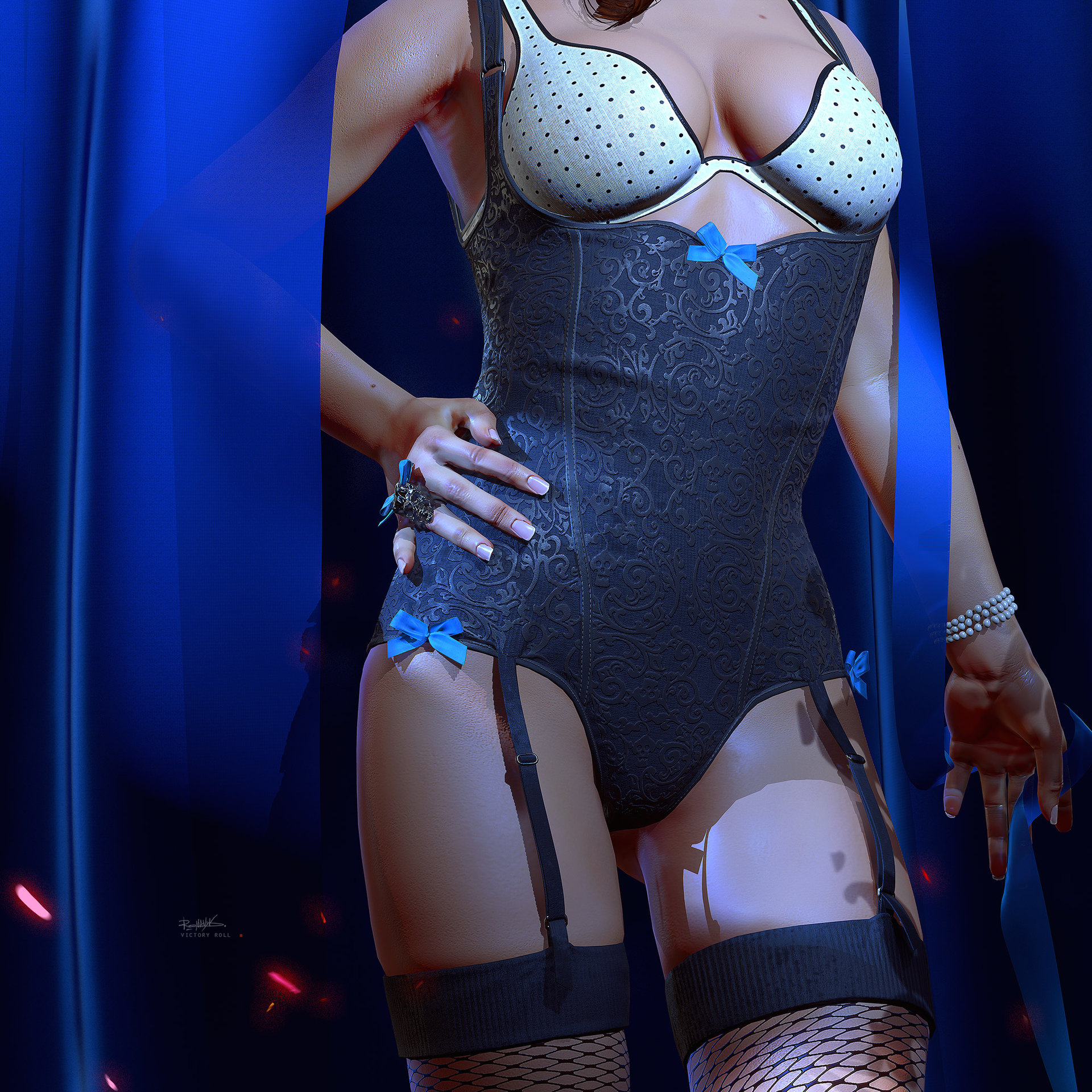
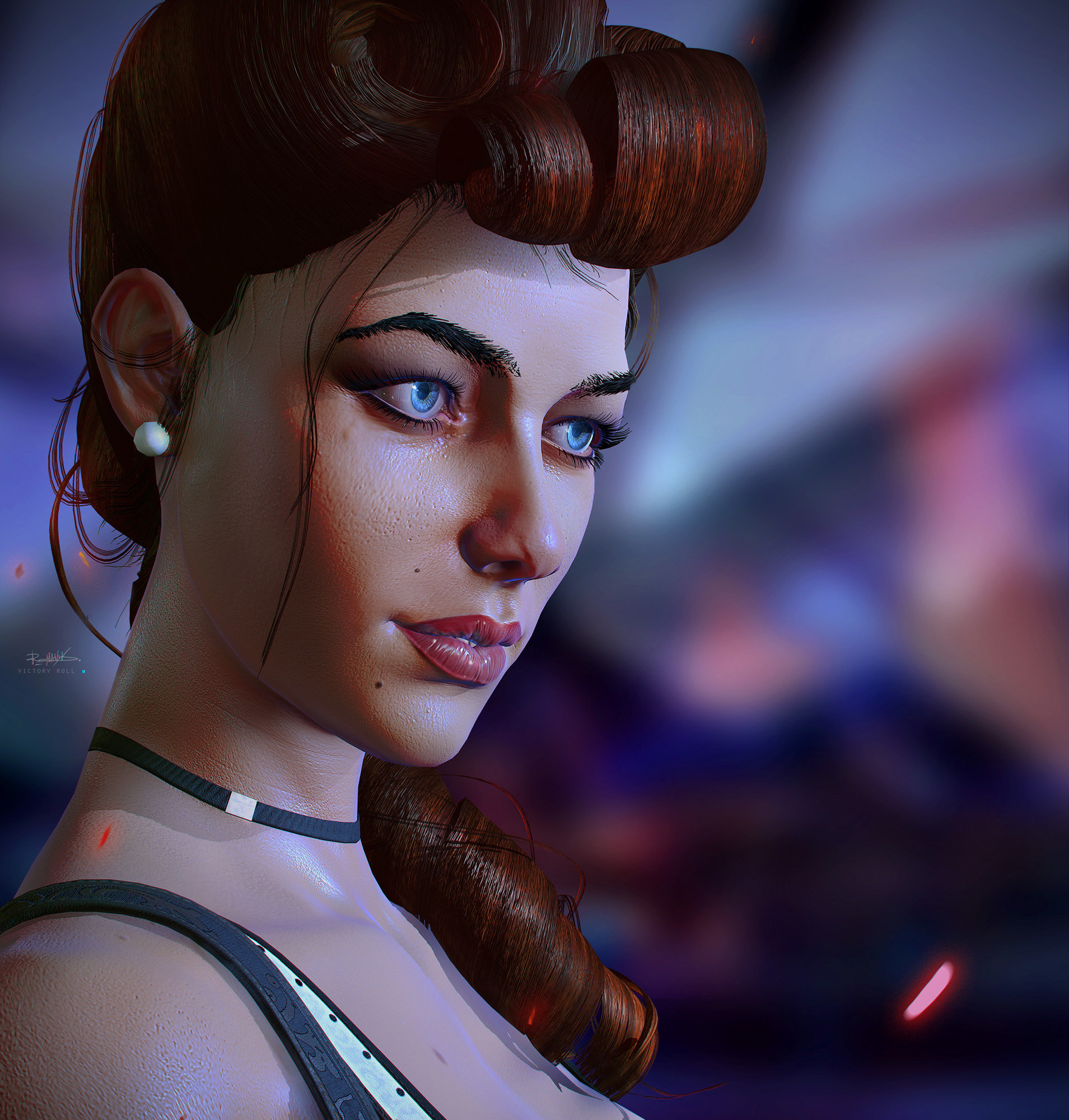
This is the model Victory Roll I made for testing workflow in Substance Designer.
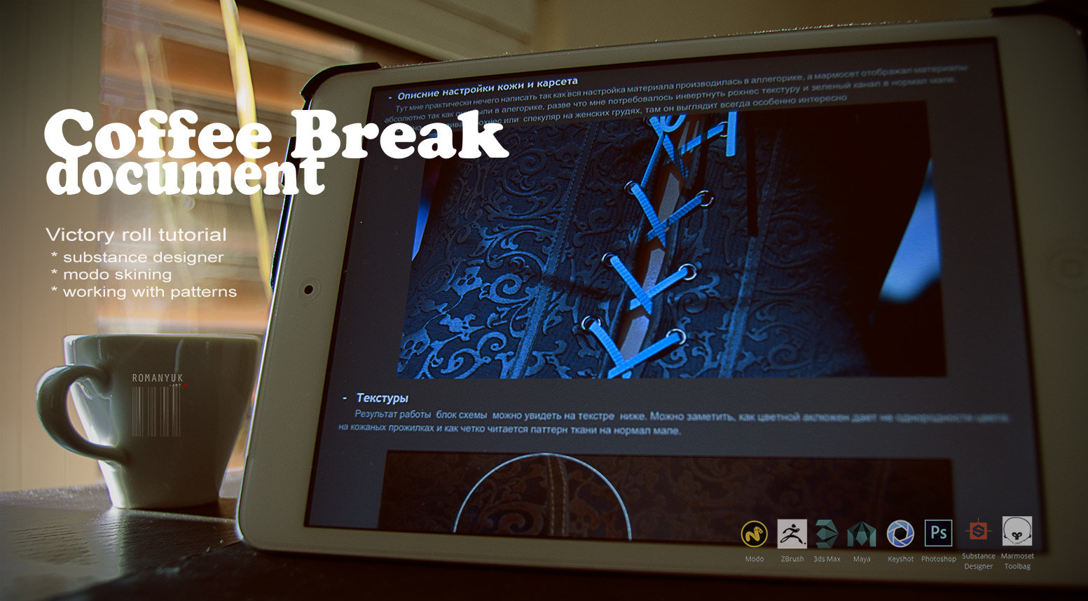
And i just added a tutorial for this character i wrote how i moved my Photoshop workflow
in Substance Designer a circuit block.
360 - [ame]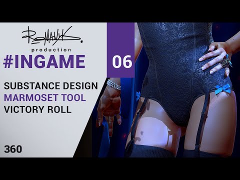 https://www.youtube.com/watch?v=19J8Sf_lvOA[/ame]
You can download here https://gumroad.com/romanyuk



[ame] https://www.youtube.com/watch?v=19J8Sf_lvOA[/ame]


And i just added a tutorial for this character i wrote how i moved my Photoshop workflow
in Substance Designer a circuit block.
360 - [ame]
 https://www.youtube.com/watch?v=19J8Sf_lvOA[/ame]
You can download here https://gumroad.com/romanyuk


[ame]
 https://www.youtube.com/watch?v=19J8Sf_lvOA[/ame]


Replies
Thank you ^__^!
I think it's the pores, they look a bit too sharp and as a result the skin loses its softness
Otherwise that pattern on the main article of clothing is especially excellent! Great work
Great job man
BUT, if you have a chance I would encourage you to go back an rework the skin. Im not sure if your roughness is too low or your reflectivity is too high but I think one of those needs to be adjusted a big more.
Likewise i think you may have overworked the level of detail in the skin pores. Its reading as very loud and noisy right now which is aging her more than i think you intended. Also like Lee said you need to adjust the falloff on the shader. You're getting a lot of red I think.
I agree that the Skin may need a bit of tweaking, when I look at this part...
It feels like the indents/pores are too "deep"? Like if I look at my own arm, and even shine light on it, it wouldn't look that deep
She looks like she'd take the time and effort to make her skin look smooth/silky soft too :P
all the advice and opinions from youI will remember !