My Unemployed Project: Diablo II sutff
So as I search for a job that gets me out of the house I decided to work on this project to improve my skills and broaden my portfolio.
This project is essentially me remaking monsters and NPCs from Diablo II. Some monsters are loyal to the design while others I will be taking some liberties with.
Also if you are expecting mad industry veteran warlock skills in these models then you will be sorely disappointed. Comment if you want to or whatever.
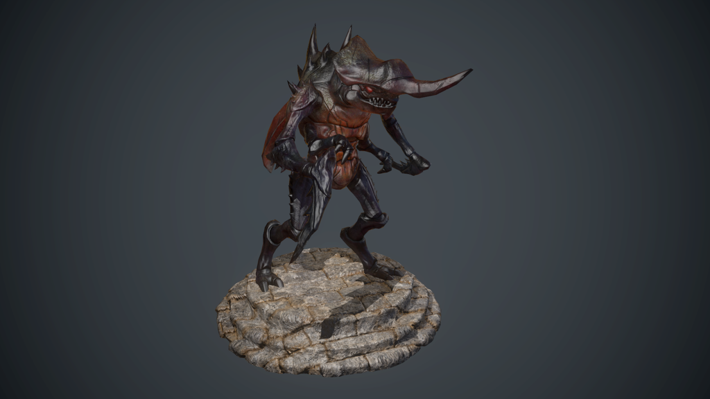
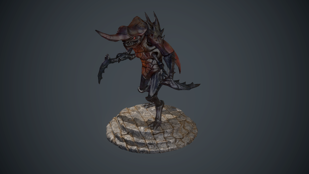
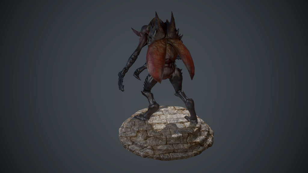
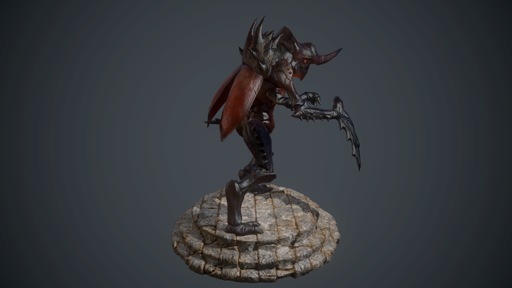
Without further ado here is my first guy: The Scarab Demon! aka lightning-enchanted-multi-shot-rape machine with a stag beetle color theme.
Also first time I did some sort of insect thing so yeah...


Replies
Now I'm not a character/creature guy, but that platform thing is currently drawing my eye more than anything else because of value/contrast. And the tiling texture is pretty cheap too, as it doesn't fit the model at all.. I think some generic rock/terrain would do the trick.
Since the creature is a desert animal from Act II would a sandy like rock texture would do or a simple grey one? The pics are already on my site but rendering and reposting wouldn't take to long.
I personally don't think the stand steals the spotlight. I notice the form of the character first, and the stand 2nd or third. I mean it's prominent but not the first thing I see. Could maybe knock down the brightness on it a little bit would probably help.
the pedistal should be the Horrrradric Cuuube.
http://diablo2.diablowiki.net/images/d/d2/Waypoint1.gif
Yeah it's really small...
Also, you should do bigger renders, and maybe not waste 2/3 of each image with nothing. You can put 2 or 3 views on each, or just do vertical renders.
As for the character itself, others here will probably agree with me because that's something that is commonly discussed, but if you don't go for "crazy veteran-level skills" you'll never get noticed as a character artist, unless you get some luck or have a really good friend in a company, but even then...
Filling your folio with sub-par models won't work, you either need to do some crazy AAA quality, or go for nice stylized mobile assets.
I added a mouth like tongue because according to game animations it seems to be that through a tongue like appendage is how it infects other monsters.
Design is still subject to change in some parts at this point.
It has been busy over the past two days so here is a quick update on the Putrid Defiler sculpt with the limited time I have had. It should be done by tomorrow or early Tuesday.
After a few days of doing other errands and technical difficulties I present you the Putrid Defiler!
The character is at a stage in which I can comfortably leave and come back later. It's not website worthy yet since I feel there is more tweaking to be done, but it is finished enough that I can put it aside as of now.
I rendered the entire thing with 3DO rather than Marmoset. Wanted to try it out and see how it holds up render wise.