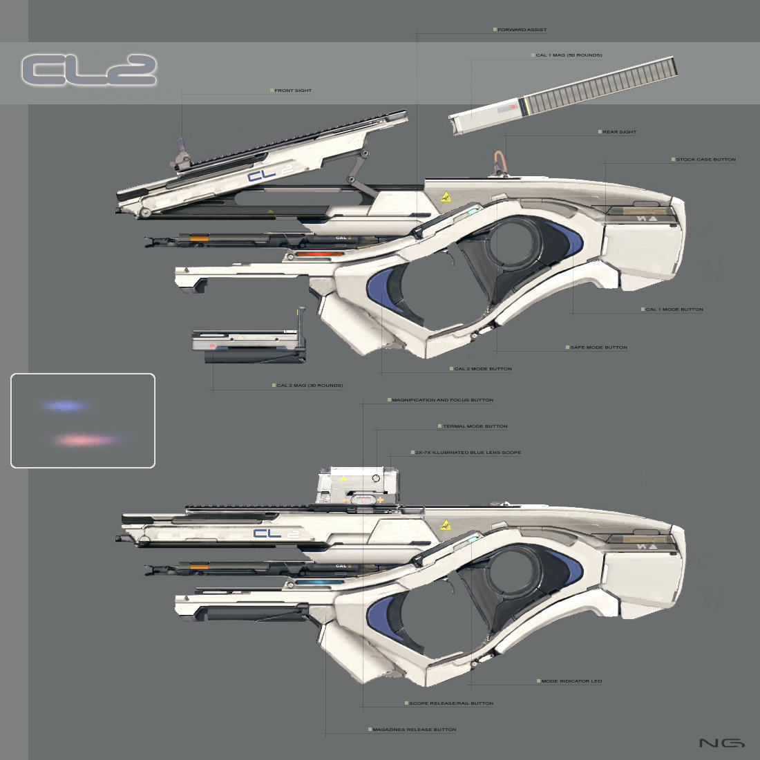
Looks great, Chris. I really love the high poly renders. The stark white and blue really shows the nice smooth edges off well. Thanks for the video on baking as well. Very insightful. P.s. I didn't run into you at Siege haha.
Thanks guys! I hope to have a new video showing how I approach my materials and workflow in Painter but I want to get a bit further in my texturing process.
@Avenali312 - Ya, sorry about that. I should have posted an update on the thread with what I was going to be wearing or something so we could find each other. I only ended up staying there for an hour or two and spent the rest of the night working on this .
I'm not sure, design wise, I "Agree" with that second barrel below and its accompanying gap (of course it's a little late for that) but other than that I love this. Can you share your modelling process for those huge curved pieces of shaped plastic?
Just gonna copy over what I wrote on facebook about it!
Hmm, as I wrote this all I realized that a decent of my process came from Grant Warwicks hard surface modelling class. It really helped my modelling a ton. He has a ton of great info and workflows to use. I ended up using double smooth instead of just all edge loops because I don't like adding that much geo.
Basically I just started with the top part (#1) and figured out what width I wanted to see looking down the sight. I also did that hand grip/trigger early on for proportions.
Then, i moved my way down to the back of #1 into #2 and just kept it all as one piece of geo; however, I put the edge loops in that I would detach later on.
I kept moving around that mesh until I was happy with a basic smooth (very very rough).
Then, I started splitting stuff apart and using the extend borders script from scriptspot.
I also used double smooth a ton to avoid too much geo. I use this in combination with edge loops where needed. Basically, I make my entire mesh 1 smoothing group and then use the double smooth where needed. If a indent is too tight for doublesmooth, i can keep that entire piece smoothed so it just acts like it's using regular edge loops instead.
I'm not sure if I have any super cool method for this. I just kept moving along and trying to keep my geo somewhat clean in the process.
So basically I do the regular doublesmooth technique but I don't use it for the entire object if edges are too tight with it on. The small indents in the rear were done like this.
Hmm, not so sure about the concept Why is there a silencer on a magazine ? You can like clearly see that there is no mechanics aside of the mag in the upper area when its opened, but it ends into a (plastic) silencer. Its one of "those" sci-fi designs and im not sure if it adds so much to your portfolio but thats your choice ofc
About the actual model, the sense of scale is off, it looks a lot like a building or space ship. there are indicators for scale missing, like screws or such that could fix that. The wear also resembles more that of a weathered facade. Also you are missing out on large scale wear, try add some edge definition and real worn places, the small scale details are a good base but having both is what makes textures great and authentic in the end , it still looks very ddo-ish. Submaterials shining through, discoloration, scratches, roughened and worn off places etc.The materials are also very same-y in roughness and reflectivity. Adding some touches like making the ironsights newer or older or use another plastic could also make it more authenthic. The sci-fi font does not help but to make it more generic, try something modern but less stereotypical as font and think about what it is even supposed to represent , company logo, army, identification number and so on and how it would look if it were done in real life. .
Yea looks pretty nice now. Some high reflectivity bits would have been nice probably for diversity sake Id try some other light setups still, the current one is fitting but the weapon is already very matte and the very median low contrast evening lighting is probably overdoing it, maybe something more photostudio style is worth a try with more contrast now that the model is finished or push exposure a bit in photoshop
Those renders are looking ages better! The only thing im not very sure about is the noisy damange near the handle, its looking a bit random at the moment. Other than that great work
Replies
Ed
before: http://chrisstone3d.com/web/wip/0012_progress_007.jpg
after: http://chrisstone3d.com/web/wip/0012_progress_008.jpg
before: http://chrisstone3d.com/web/wip/0012_progress_009.jpg
after: http://chrisstone3d.com/web/wip/0012_progress_010.jpg
and final bakes:
[ame]http://www.youtube.com/watch?v=Z1AiI5l50NE[/ame]
@Avenali312 - Ya, sorry about that. I should have posted an update on the thread with what I was going to be wearing or something so we could find each other. I only ended up staying there for an hour or two and spent the rest of the night working on this .
Hard surface course:
http://masteringcgi.com.au/course/mastering-hs/
Script that I use a ton for getting the lines after I split
http://www.scriptspot.com/3ds-max/scripts/extend-borders
Still need to do decals too..
Why is there a silencer on a magazine ? You can like clearly see that there is no mechanics aside of the mag in the upper area when its opened, but it ends into a (plastic) silencer. Its one of "those" sci-fi designs and im not sure if it adds so much to your portfolio but thats your choice ofc
About the actual model, the sense of scale is off, it looks a lot like a building or space ship. there are indicators for scale missing, like screws or such that could fix that. The wear also resembles more that of a weathered facade. Also you are missing out on large scale wear, try add some edge definition and real worn places, the small scale details are a good base but having both is what makes textures great and authentic in the end , it still looks very ddo-ish. Submaterials shining through, discoloration, scratches, roughened and worn off places etc.The materials are also very same-y in roughness and reflectivity. Adding some touches like making the ironsights newer or older or use another plastic could also make it more authenthic. The sci-fi font does not help but to make it more generic, try something modern but less stereotypical as font and think about what it is even supposed to represent , company logo, army, identification number and so on and how it would look if it were done in real life. .
Id try some other light setups still, the current one is fitting but the weapon is already very matte and the very median low contrast evening lighting is probably overdoing it, maybe something more photostudio style is worth a try with more contrast now that the model is finished
or push exposure a bit in photoshop
Should have some new renders up either tonight or tomorrow.
The only thing im not very sure about is the noisy damange near the handle, its looking a bit random at the moment.
Other than that great work
I'm avoiding the viewer for now since it seems models can be ripped incredibly easily. If that's fixed in the future I'll definitely toss it up!