Frist try with clothes
Hi there,
this is my first post here.
I have to say that I´m a bit cowed cause the most of you are such great artists that my stuff won´t match up with you.
But well I hope that some of you like to give me some advise so that I can get better one day.
I´m a hobbiest and I learned by tutorials and youtube about 3D modelling for 2,5 years now, nearly every evening I can spare for 3-4 hours.
Atm I try to create a kind of fantasy char with clothing like a thief / assassin.
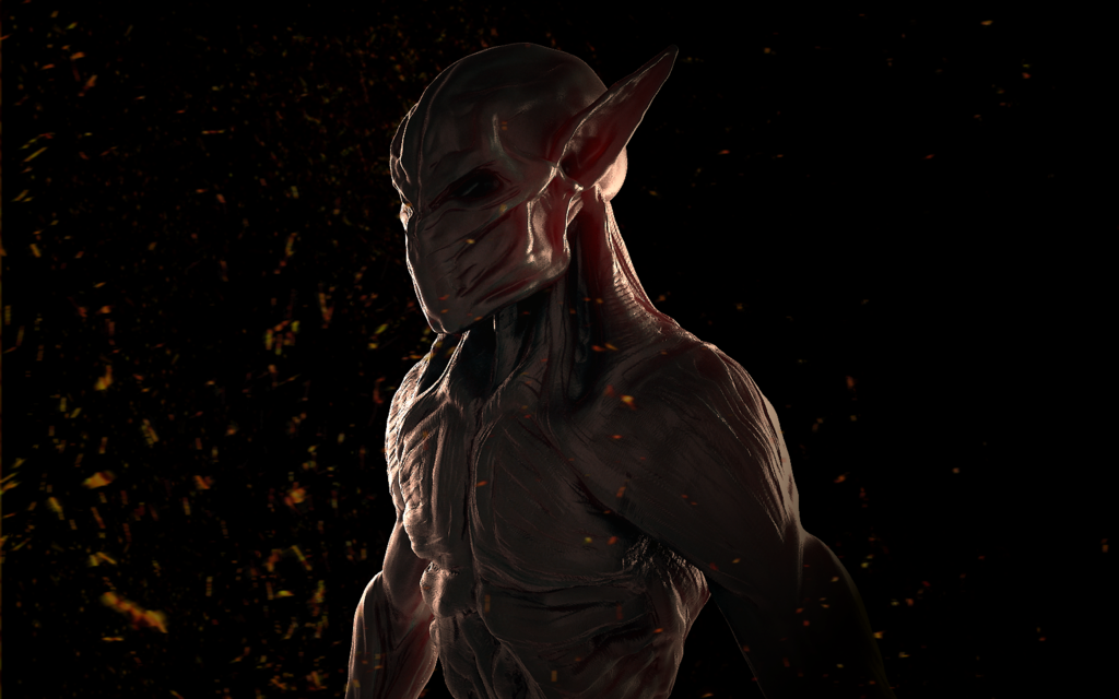
The character I try to create shouldn´t be human, he should be a bit demonic / orc / human style ...hard to explain.
My main challange will be the cloth because I don´t even have a clue how to create good wrinkles.
I started to work out the shape of the char with claybuildup (ZBrush), at this points I didn´t create legs or hands.
Its a bit hard to create the character cause I didn´t know yet how it should look like at the end.
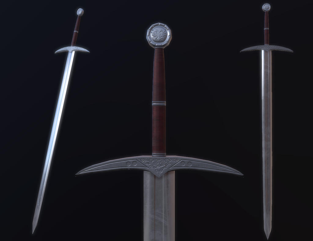
But I made a sword, didn´t know too if the character will use it, depends if it fits at the end.
...sry for the long post and my english, english isn´t my nativ language.
Here are some pics...just from beginning, I hope you can give me some hints later on when I started to work the char out.
Thy a lot for reading, Harlyk
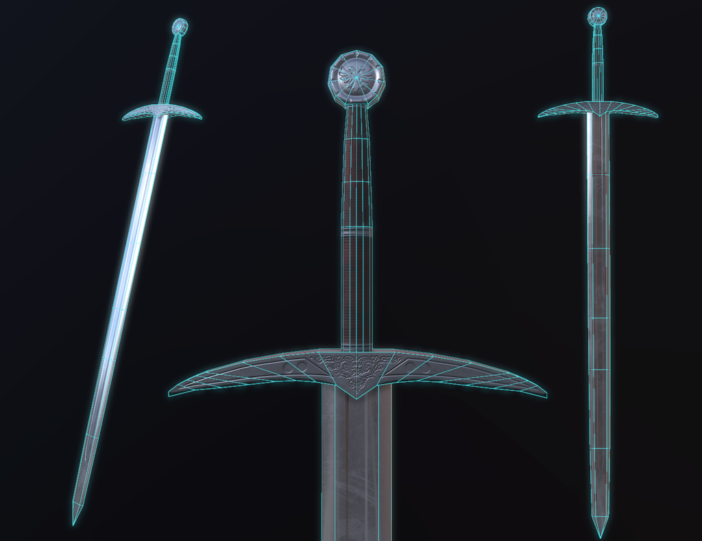
(Longsword = 240 poly)
this is my first post here.
I have to say that I´m a bit cowed cause the most of you are such great artists that my stuff won´t match up with you.
But well I hope that some of you like to give me some advise so that I can get better one day.
I´m a hobbiest and I learned by tutorials and youtube about 3D modelling for 2,5 years now, nearly every evening I can spare for 3-4 hours.
Atm I try to create a kind of fantasy char with clothing like a thief / assassin.
The character I try to create shouldn´t be human, he should be a bit demonic / orc / human style ...hard to explain.
My main challange will be the cloth because I don´t even have a clue how to create good wrinkles.
I started to work out the shape of the char with claybuildup (ZBrush), at this points I didn´t create legs or hands.
Its a bit hard to create the character cause I didn´t know yet how it should look like at the end.
But I made a sword, didn´t know too if the character will use it, depends if it fits at the end.
...sry for the long post and my english, english isn´t my nativ language.
Here are some pics...just from beginning, I hope you can give me some hints later on when I started to work the char out.
Thy a lot for reading, Harlyk

(Longsword = 240 poly)


Replies
Hope the wrinkles are ok and not on absolutly wrong positions.
Feedback is very welcome
Maybe you were just being modest, but everything takes time to improve upon, and a lot of the artwork you see here is created by veteran artists who have really pushed through. But it sounds like you are following the same path by dedicating a lot of time and passion to your projects, so keep it up dude.
So, a few critiques!
1. For your lighting setup for presentation, make sure to use some coloured lighting. I like your current setup positioning - it gives a cool feel on the character model, but some blue & red colour contrast in the lighting will really improve your presentation, which is a very important part of production.
2. Have you got any roughness maps on your low poly sword? I would assume since it's low poly you aren't considering it, but it would durastically improve the realism of the piece. The sword looks very new in the normal map - there are no dents or such, but the diffuse says otherwise as it has some scratches and grazes, so I would advise adding some damage and imperfections in the normal too to push the believeability
3. For the wires on your sword, notice how the verticies on the lower part of the cross guard are very evenly placed, but on the top they are increasingly closer and closer to the end. If you spread the top ones out you will have a much more smooth transition between the verticies.
Keep up the hard work man
The 3D modelling is a absolutly great hobby I have so much fun with it.
I don´t think that I ever will get that good in modelling like the others here, I have never learned it and I´m a bit to old to start buisness with it, but hey its fun and thats what is all about
Thx too for the critiques
I have to mention that I didn´t made myself to much thoughts about presentation cause they are in WIP atm, I just tried to give you a good overview about the process. The hint with the blue/red lights contrast is great I will try it next time, thx.
About the roughness map, yes of cause there is one, I used substance to create the textures so its pbr based, to give the sword some more normal damage is a good point of view, I will try to add some.
Didn´t noticed that the verticles are that dense on the cross ends, thx again for the hint, I will correct this.
I choosed long dagger and throwing knifes for my character now but I will correct the sword anyway.
Very helpfull critiques thx a lot for it
Now I have to define all parts and give them some details. I will spend more time for the rendering as soon as this char is finished.
Here we go, feedback would be great.
I decided to go away from my idea to create a demon rogue. As a demon the body and armor looks to much like a human so I had the choise to change the armor and body or keep the body and change the body to go for a human rogue.
I decided to go for a human, cause I liked the armor and I wanted to do a rogue too. (Made lots of creatures before so time for a change).
I started to detail some pieces but there is much to do.
Gloves, boots, weapons and some small thinks aren´t finished yet but I think that the highpoly will be finished soon.
If you like to leave a comment / feedback I would be very happy about it.
So here we go :
Soon I have to do the retopo, I hope it will be better than my last one
Here some images
Feedback is allways welcome
The stitches are made with a standard brush from Zbrush (named stitches), it´s a alpha brush with curve function.
Your absolutly right about the holes in the belt.
I saw it too after I posted the images so I fixed it allready
So thx a lot for the feedback, happy that you like my work
just a small update for you.
I haven´t got much time to work on this Assassin these days but I had some hours so I started with the retopo.
I started with 2 versions of retopo to compare the results after I finish them.
Both retopos aren´t finished yet, there are some objects that I have to retopo.
The first one has about 8000 tris, I do a retopo for each piece of armour and try to follow the forms of my details. There are about 4-5 pieces that I have to retopo in the next days.
The second one is a very lowpoly version that I created as one piece, I try to use as few as possible polys. This version isn´t finished either, the hood is missing and the throwing knifes also (like in the other version).
I did a test bake (normalmap) to see how the result is, its a 2k bake and caused by test I didn´t mirror the arms and legs yet.
I think the result of the test bake is good and will be better when I mirror the legs and arms.
btw. there are no mesh issues at the 8k model there are just some meshes that shines through the upper one, this will be corrected later.
If you have any hints or feedback pls let me know, would be great to learn from you out there.
I don´t want to bother you out there but I just want to ask if there is someone who can give me some advise how I can improve my work.
I dunno if I can make thinks better or if it´s good like it is right now.
It would be very sad if the advises will come when all work is done and there will be no way back (without doing all work again).
I post my work here to get better in what I do cause its just a hobby that I like and I never had someone who told me how it works.
I do sculpting for 2/2,5 years now, every evening I could spare I have about 3 hours to learn an work on my models.
So I would be very thankfull if some of you great artists can give me some advise or just tell me what I do wrong so I can work out my mistakes.
Thx a lot for reading
Harlyk
I finished the retopo and the texuring for my gamechar.
Now I have to finish the dagger and the then this assassin needs to get rigged.
Would be great if you can give me some feedback out there.
Thx for reading, hope you like it.
Nothing I can do better or something I did completly wrong ?
Or is it good so far ?
Feedback would be awesome, if its bad so tell me pls, if its good than you can tell me that too
I have a question too, perhaps can someone answer me.
I used a single UV Map for the whole character. I saw often that ppl use 2 UVs, one for the head and the other for the body.
Is my suggestion correct that they do this to be able to switch heads later on ?
Or is there a other reason ?
I had some problems with my char either, the baked AO didn´t look that good and the head/eye had not that much space on the UV (and have a bad resolution) caused by the count of straps faces, they took a lot of UV space.
How do you handle such situations ?
Do you shrink the faces of straps so that the important parts have more space ?
Would be cool to get some help so that I can increase my quality
You materials need work as well, it's very very dark and really small highlights all over the place, eye's don't really have a place to rest/an area of focus.
Heads tend to have a separate UV because they usually require a lot of texture space. that's what the player tends to look at closely and it's what end up looking the best. Other reasons would be that it may use a different shader for skin (I've seen hands on Head UVs before as well)It tends to be easier to edit your skin and non skin textures separately.
I tend to split Heads from bodies and I think the general consensus is that you should, it makes work a lot easier and looks better in game.
Sry that I have to say that I didn´t understand what you exactly mean about the composition and that the details aren´t consistent.
I would be very happy if you can tell me how a better composition would look, what do I need for a better composition.
And what do I have to do to have consistent details ? Should I add more or less ?
The materials are dark yes but he should be a "dark" assassin so how could I add more color and highlights when he should be a dark rogue ? Can you give me some hints so I can try to make it better next time.
Thx a lot for answering my UV questions.
Thx again, hope you can help me with my other questions again
8790 quads / 9333 quads with dagger.
Thx for reading, if you like to comment feel free
Wish me luck would be cool to win topogun and substance for my team mate.
https://www.cgtrader.com/blog/game-character-challenge-winners-announced
That is realy a great day