Insurgence Sewers
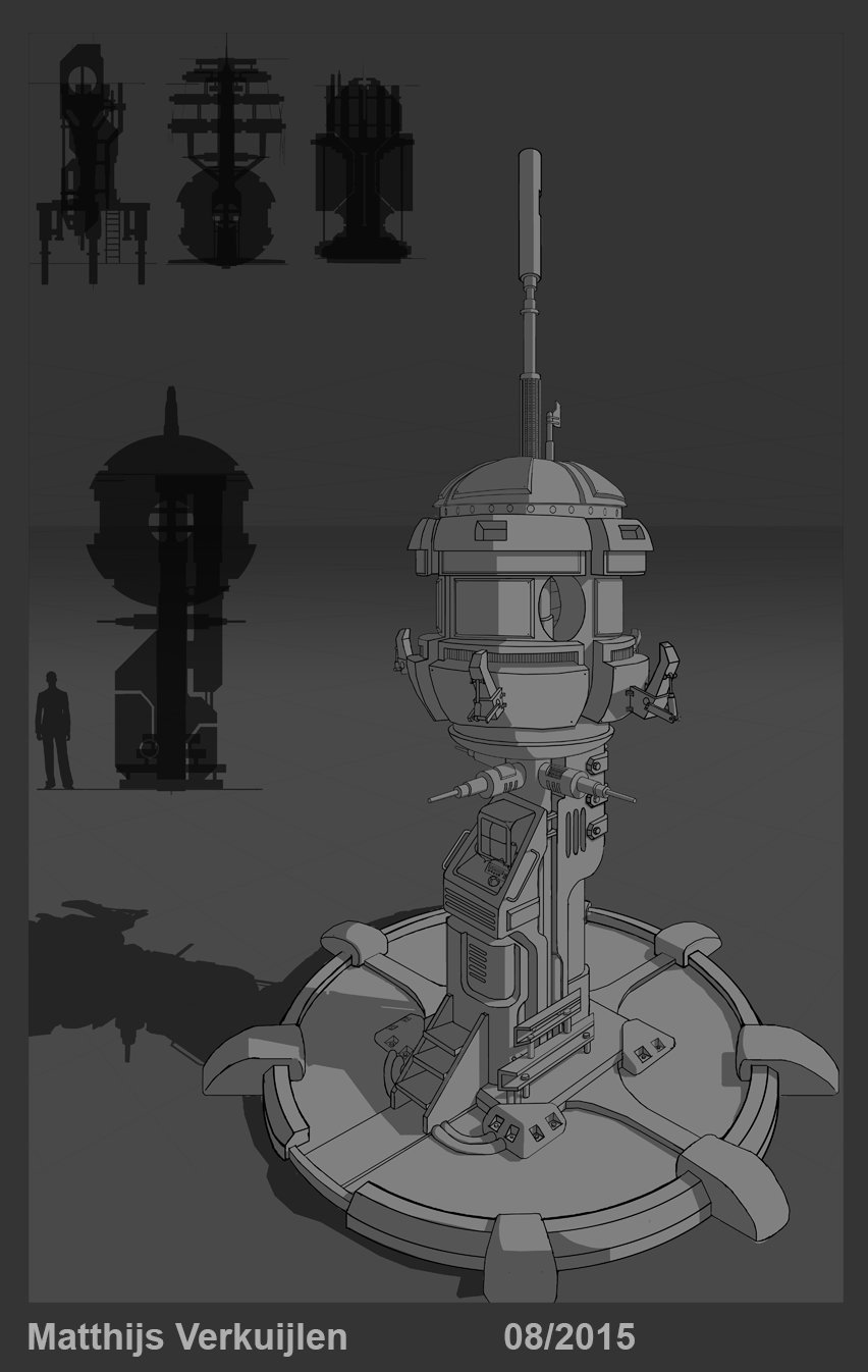
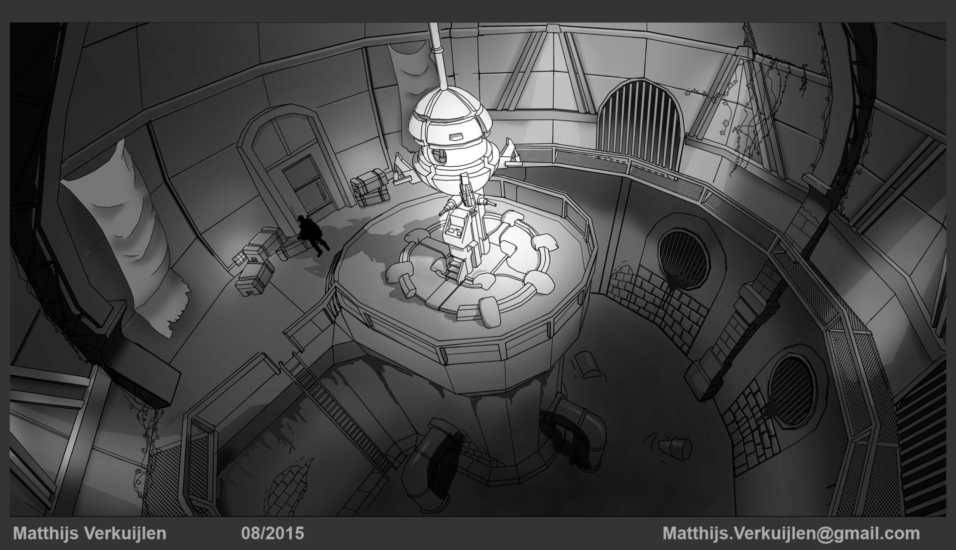
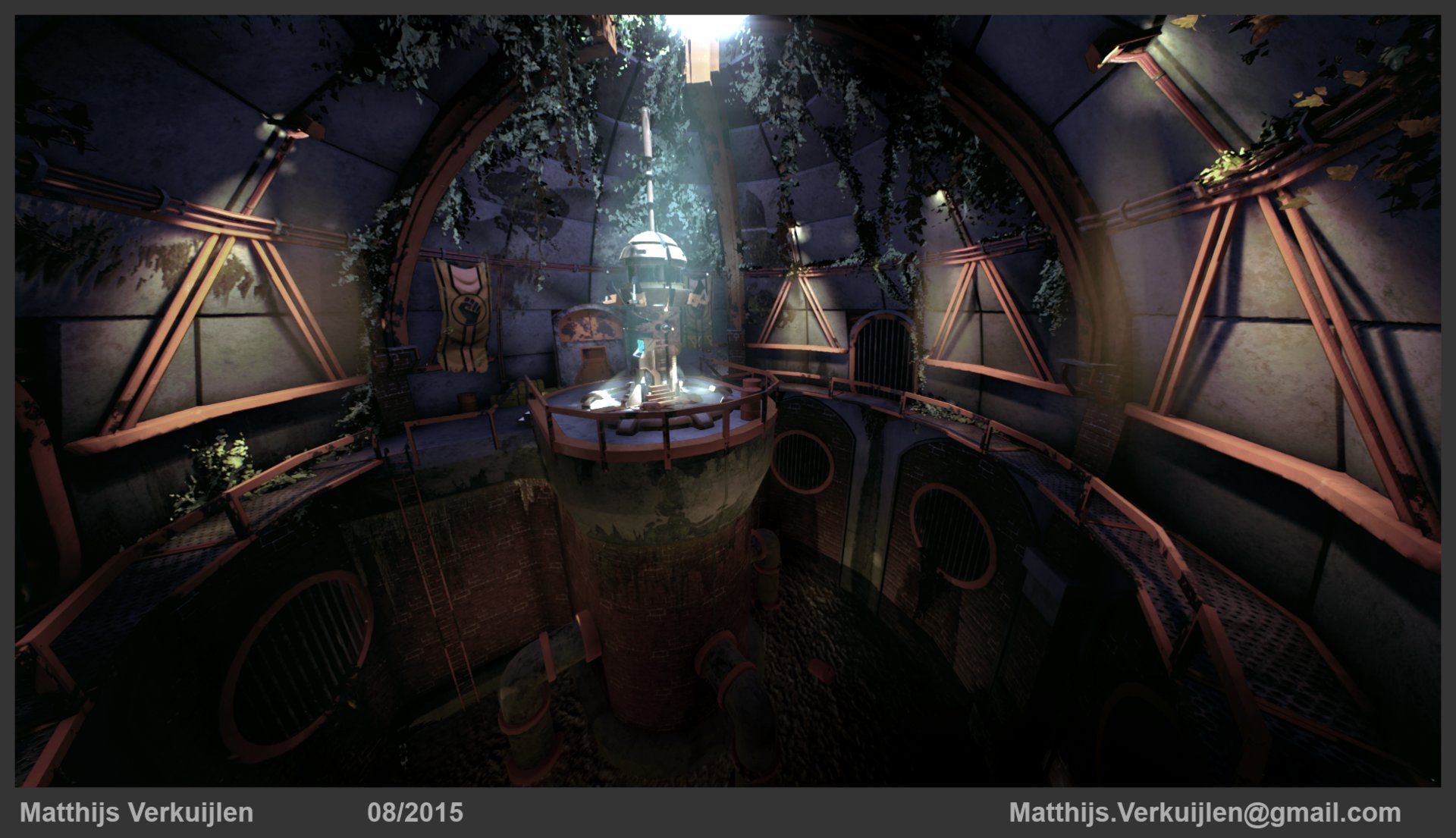
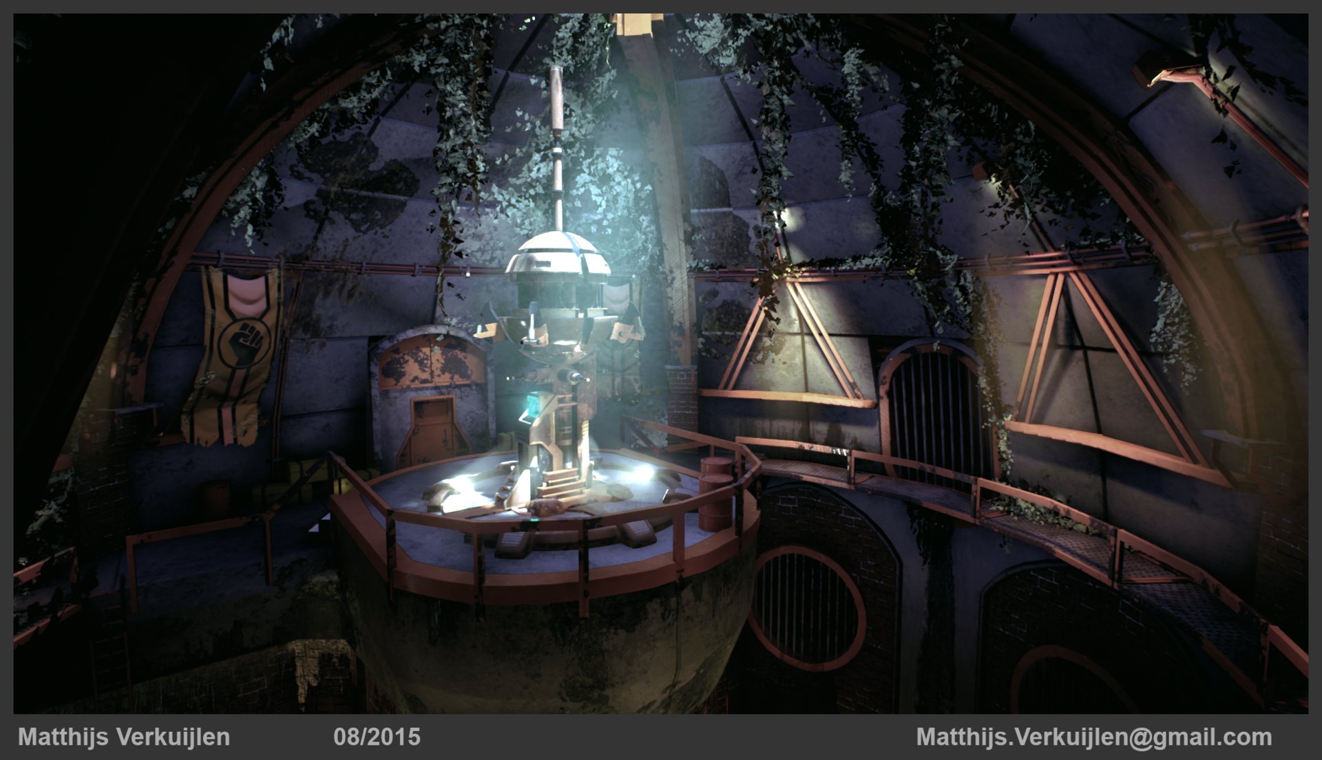
This is the environment I worked on for Dan McGowan's Environment Mentorship at robotpencil.net.
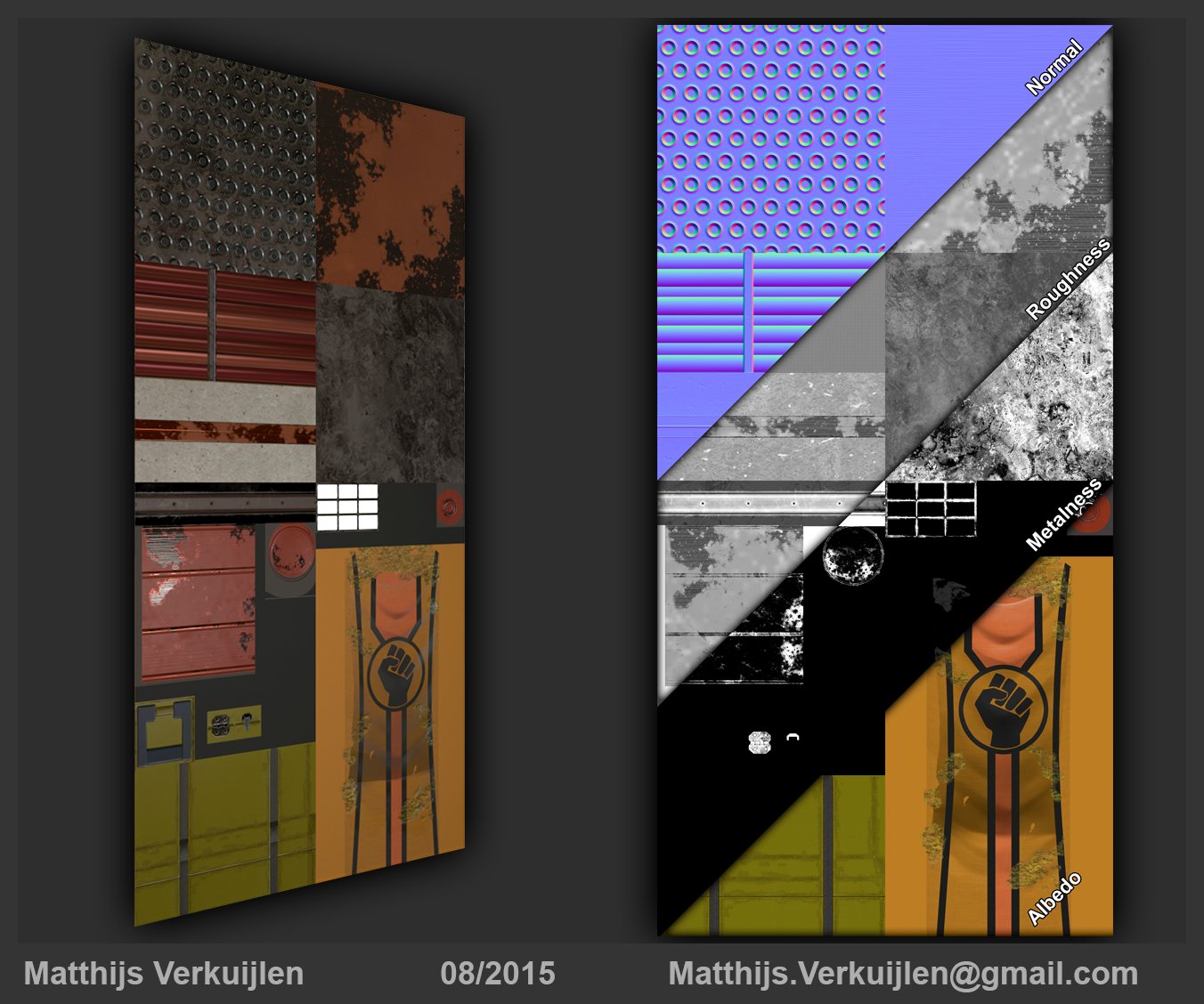
the environment is based on my own concept, I used Maya, Photoshop, Unreal Engine, a little bit of zBrush, a little bit of Substance Painter, and a little bit of Marmoset.
All feedback is welcome, and I hope you enjoy.

Have a nice day!
the environment is based on my own concept, I used Maya, Photoshop, Unreal Engine, a little bit of zBrush, a little bit of Substance Painter, and a little bit of Marmoset.
All feedback is welcome, and I hope you enjoy.


Have a nice day!
Replies
I think the lower part of your image looks a bit too dark and dull. I know you want to focus on the sci fi computer terminal but it would be nice if there are more interesting things to see in the bottom part. Maybe add some subtle lights like fire torches or small wall lamps.
Also the materials look quite flat with little specular/normal map effect going on, everything looks quite diffuse. I think better materials will improve your scene the most.
The environment shots are in Unreal Engine, the loose tower and texture plane are in Marmoset.
I agree about the bottom of those images being too dark. On my monitor at home the colors seem fine, but at my monitor at work it's almost completely black. I'll see what I can do about that!
Do you think the materials look flat in every shot? Or just in the texture plane render? I've got quite some things going on in my normal map, so it shouldn't read that flat. I'll check it out though. Thanks a lot!
Do you guys have any advice for me how to make the textures feel less flat? Do you think this is more of a lighting issue, or really an issue with my textures?
I made a small update to my hero render here
and I think the materials are already feeling a lot less flat. Is this better? Do you have any other feedback or advice?
I'll try to fix this single asset first, and take that advice to fix the rest of my scene as well.
Thanks for your time guys!
I don't know how to embed a Marmoset 3D viewer so here's a link to my artStation page instead
On the tower, I can see why some parts read like plastic, especially the base. I'll try to get that fixed.
Thanks again!
I'll look into the lighting in my scene, see if I can fix that.
Thanks a lot!