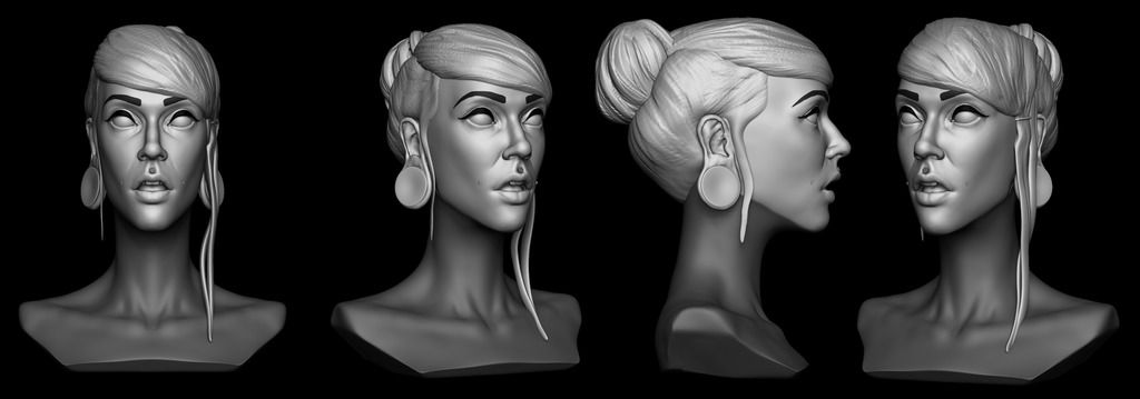
Current WIP_Hardcore_Girl_Bust
Hey guys here's my current WIP of a hardcore female bust. This is just a primary shape pass but detail and TLC are coming next. Just a proxy base mesh for a hair style, but will replace with cards soon. The grayed off section of her neck to chin will be comprised of tattoos to get an idea of what to expect from texturing.
Feel free to CC and as usual thanks to those that stop by.

Feel free to CC and as usual thanks to those that stop by.


Replies
@BradMyers82 Yeah man good eye. Honestly want to lean towards more realistic but I tend to pick out obvious landmarks but stress them too much.Kind of like a characiture. The result is making a lean person looking narrow lol
Yeah so this is a small update but I took everyone's CC and tweak her face and overall made her face more fuller more soft. I also blocked out the torso for the bust as well as a blocked out shirt.
I'm going to finalize the anatomy portion of the sculpt next. Making detail and subtle tweaks as I go.
As usual thanks all for stopping by. More to come soon.
Appreciate all the kind words everyone. Thank you. ∠( ᐛ 」∠)_
I overhauled the face completely and I feel tonight results are much better. I also places hair cards for her but its not 100% set in stone. I need to move around some cards to cover holes and add variation to the flow of the hair.
So to clear things up if anyone has wondered, I plan to have the shirt be a T-shirt cut about half way. Much larger size. Though I haven't sculpted and tweaked the base mesh yet.
Eyes are placeholder to clean/fix placement of anatomy and I'm still giving the face TLC before I go ham on details.
Thanks to anyone who stopped by thus far and see you soon! o/
I'm talking about the two symmetrical shapes you can see in blue on this drawing, called the alar cartilage:
Of course, hers is round, but you should feel this structure underneath it.
I also think that the plane transition on the sides of the nose, between the eyes and the nostrils, is too sharp. Try to smooth that area a bit.
Keep up !
So I've been tweaking the anatomy but mostly working on the hair cards. Playing with placement and layers. Basic, basic texture work on the cards. This is just pre vis if you will in Marmoset. Vertex paint is just to get a visualization.
Honestly though may move on to a new project as this is a time sink.
Thanks all for the CC.
The nose looks much better now.