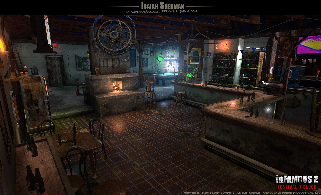
[UE4] Old Pub
So, the final result. Hope you liked it.
https://www.artstation.com/artwork/d98x1


Hello, Polycount!
I'm working on a small environment for my portfolio, so I would like to show my work and get some feedback. My goals is learn more about work in SD, SP and UE4, improve my skills and get a good piece for my portfolio.
A scene is based on a awesome concept by Isaiah Sherman.


Here is my progress so far:

Some textures (SD 5):


And here is a pool table, which I had made today.

Thanks for watching!
Replies
Keep it coming!
Cheers!
Here is a small update. Added a door and pillars, improved wooden and ceramic textures.
Cheers!
Door seems a bit off in a few ways:
Proportions seem askew. Door appears to be too wide.
The level of grunge is consistent across the entire door, which is a bit uncanny.
Presentation of the door (the lighting) is not complimenting the form.
Metally bit doesnt read as well as other materials in the scene.
Looks too wide to me. Good progress otherwise
More progress after the little pause.
For me bottles are actually not good and require some more work. I'm having some troubles with the transparency in UE4.
Cheers!
Here I reworked the lighting and added more props. Also I decided to make bottles not transparent, I think it's looks better.
What is done now:
The new material of bottles, and now they are transparent and made of glass!
New wood texture and chairs, also a little playing with presentation
And different subtle but important changes here and there
I love the chair/stool remakes - a bit more detailed than the concept, but it adds some visual interest.
Three things that really stand out to me: the first being the lighting. Your lighting set-up appears significantly brighter than the concept. The concept is kind of dark and moody, yours still looks bright and happy by comparison.
By extension of that, your concept overall seems much "cleaner" thus far. The concept looks like a bar after a long night of business; food, trash, crumbs, scraps, money on the counter, etc. For example, the bar itself: concept is scratched, dirty, peeling. Yours looks like it was just built. The beer bottles are a good start to messing it up, though!
Lastly, the floor. Your tiles are a bit bigger than the concept, and in the concept, the small square corner tiles are all a darker color. Minor details. The big thing is that I feel your floor isn't shiny enough. The tiles look like they could be made from rough brick for all I know, versus having that worn-down shiny appearance of a well-used stone/tile floor.
New tables
Adjusted floor texture, now it is a little less noisy, and some experiments with lighting and ReflectionCapture. I think that now it looks more atmospheric and cozy.
I made a small edit, I would say lower the bloom a bit more than my edit.
New update so far: a little bit more details and a new LUT:
Do you have reflection captures in the scene, and are they up to date?
Other than that, it's looking great! The little details you've added really help - even the chair etc all of the way in the very back. The last thing that stands out to me in comparison to the reference is the ambient lighting, or lack there of. Making the lighting darker was a definite improvement, but your shadow areas go straight to black - in the concept, it looks like there is a window on the left side of the image, and possibly another behind the bar, and something else off to the front right. That extra ambient light plays up the smokey/dusty atmosphere and softens out the lighting a bit.
So a quick update:
So, the final result. Hope you liked it.
https://www.artstation.com/artwork/d98x1
The wall texture looks too even and looks like the photoshop generated clouds filter. Try to make it cleaner except where it would actually be dirty.