The BRAWL² Tournament Challenge has been announced!
It starts May 12, and ends Oct 17. Let's see what you got!
https://polycount.com/discussion/237047/the-brawl²-tournament
It starts May 12, and ends Oct 17. Let's see what you got!
https://polycount.com/discussion/237047/the-brawl²-tournament
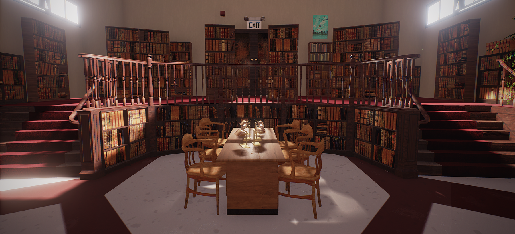
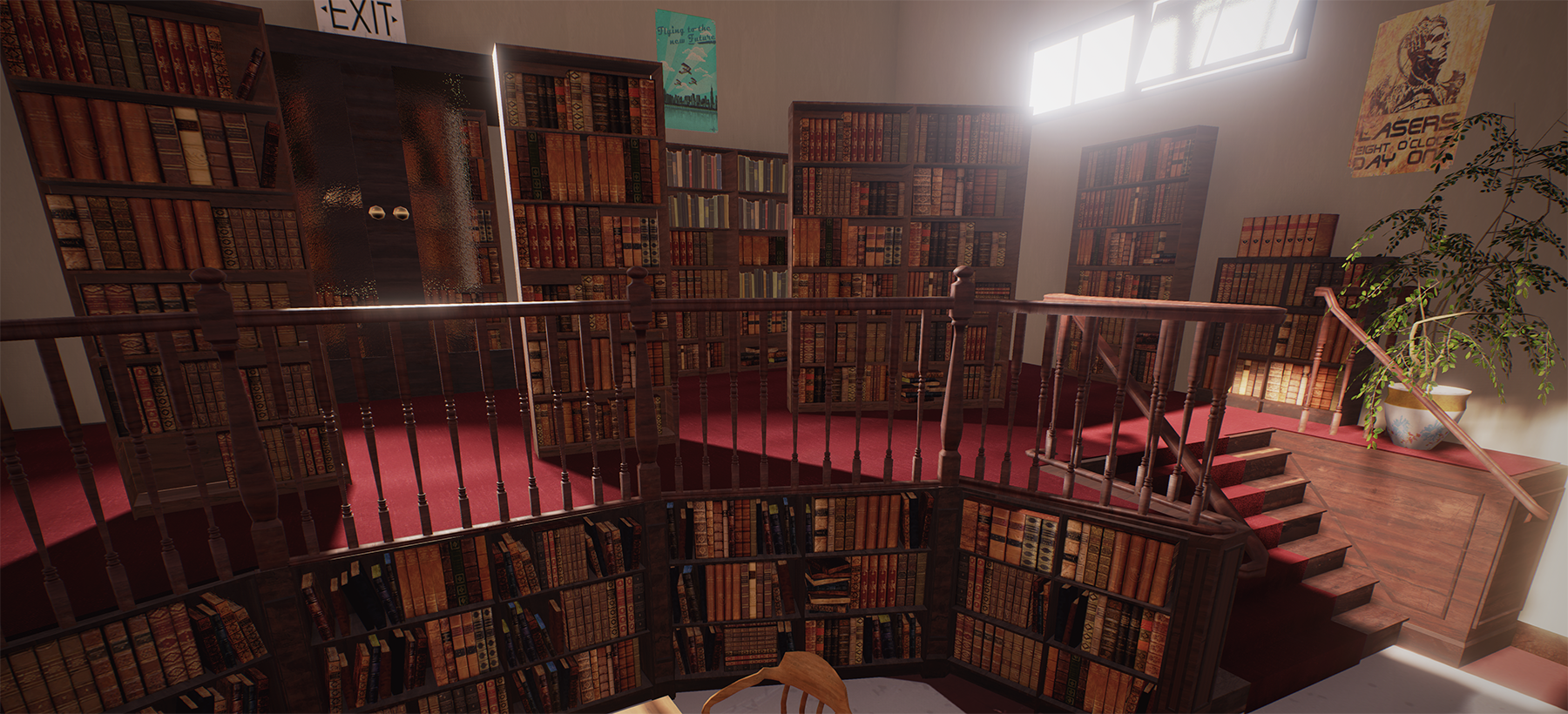
Buffy The Vampire Slayer Library Scene UE4
Hey so most of my environments are outside environments so thought i would do something inside and I was watching some buffy so thought why not.
My real aim was to just give it a try and also to follow a tight time constraint, I gave myself three days to complete this.
I didnt manage to get everything done but i think i did enough so that you can tell what it is and the time is up so im posting the images.
Not portfolio worthy but let me know what yous think?


Replies
or is it supposed to be dynamic lighting
see how the chairs are kind of floating?
I did have the lower shelves like that but the perspective.made it seem a bit off and with the reference I was using it was too maybe ill go back and move stuff about and see, it's all modular so shouldn't take to long from the blueprints it looks like the stairs should be pointing in more to so I'll try that
It is baked with professional lighting. Maybe because I have two directional lights and a small skylight? When I turn up the AO in the post process you can see parts get darker in the corners and the bookshelves and what not
I still think it's missing something. Maybe you can put a big banner there saying something like "welcome to sunnydale high! come in, the library is open until 9 pm". I think adding simple things like that really helps to sell the idea you are trying to convey and completes the image you are trying to create. You don't have to go overboard and add flashy stuff like glowing relics and portals that take away the focus from the beautifully modeled environment you have here!
yea i guess but something like that never really appears on the show. I could maybe put a couple of stakes or crosses on the table?