The BRAWL² Tournament Challenge has been announced!
It starts May 12, and ends Oct 17. Let's see what you got!
https://polycount.com/discussion/237047/the-brawl²-tournament
It starts May 12, and ends Oct 17. Let's see what you got!
https://polycount.com/discussion/237047/the-brawl²-tournament
Flipflop's Progress Thread
Hey guys, I'm just starting this thread to get C&C on my work as I progress through it.
Just going to be posting my progress as I go on this.
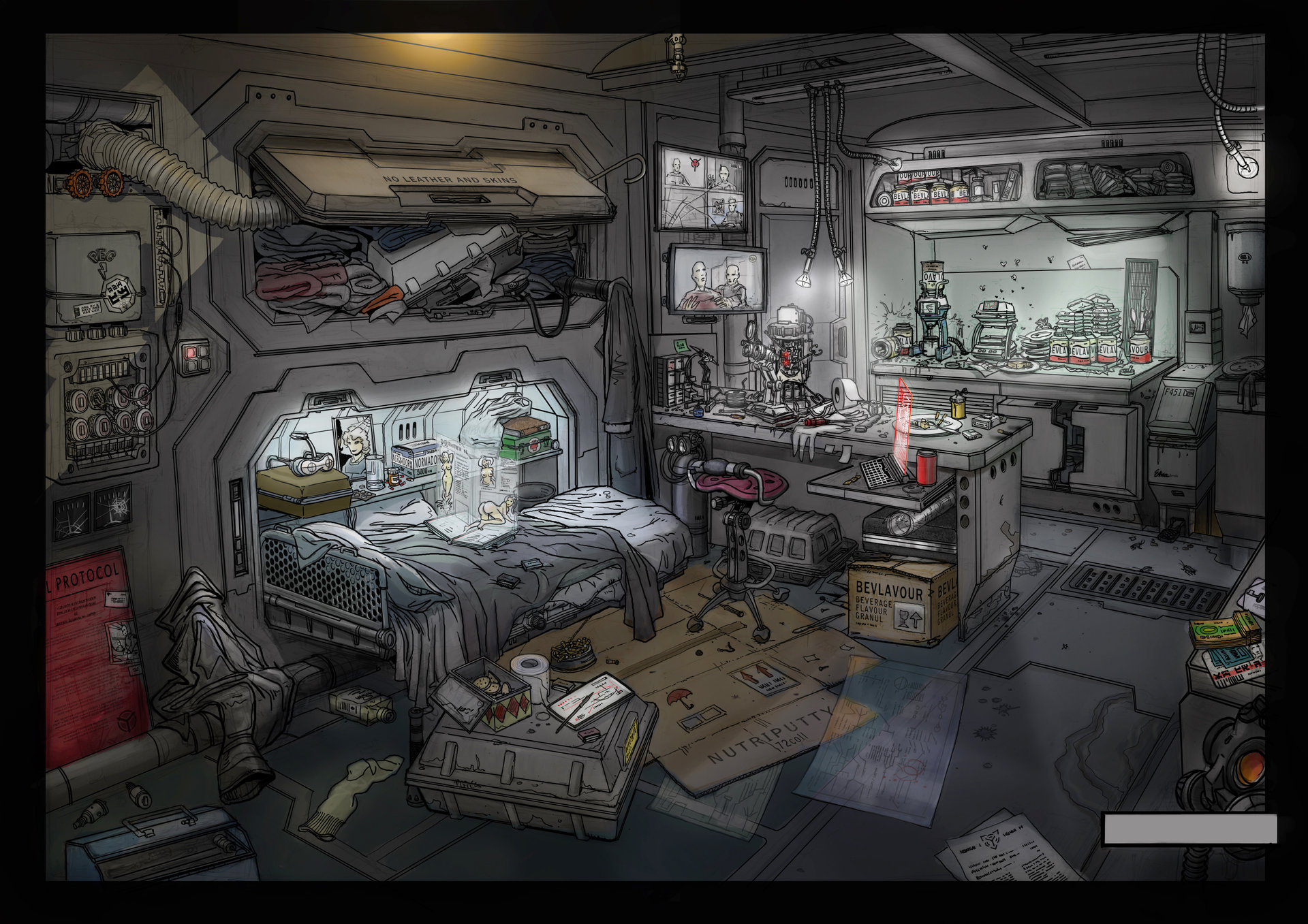
Right now I'm working on a sci-fi room based on a concept called Hacker's Hideout by Michael Voogt located here.

And my progress on modelling so far:

Thanks, hope to see you around.
Just going to be posting my progress as I go on this.
Right now I'm working on a sci-fi room based on a concept called Hacker's Hideout by Michael Voogt located here.

And my progress on modelling so far:

Thanks, hope to see you around.
Replies
I think you should put some mannequin or human mock-up in there to give you better sense of scale.
I think you're absolutely right. At second glance, it looks like the bed might be too short AND the desk too high. I'll definitely be fixing this. Thanks!
Thanks!
I also think the bed looks small
Looking forward to this
Just more progress. Knocked out the cloth meshes, sculpted the norms and baked them out (not shown here, probably won't be until I compile final materials for them).
I brought in a human model, scaled it to about 5'9" and fixed the bed and desk to fit him appropriately.
Now onto UV's.
Thanks!
So, I've UV'ed everything, made some basic substances (styrofoam, plastic, metal/grate material which I'll post later). But here's a lighting mockup in UE4. I'd appreciate any critiques or suggestions on this, as lighting is definitely not my forte.
Thanks!
Edit: Also, some normals/smoothing groups I need to go fix eventually.
Hint: Don't make the lighting too bright in the final.
Thanks!
Haha, right!? :poly136:
On my to do list is whipping up some grime decals, but other than that, I'm all ears.
Edit: So I went back and added some color grading and a bit of post processing and came up with this. It helps a little, but it all still looks amateur to me.
here is a like that should help.
http://www.marmoset.co/toolbag/learn/pbr-practice
I also like taking the unreal template and working from them
you can see a lot of faceted edges and in the silhouettes you can get a little more detail in your models by beveling the edges and exaggerating the detail in the normal maps
https://www.pinterest.com/pin/335870084685935964/
http://www.creativebloq.com/how-make-low-poly-buildings-games-10123111
To be honest, I would invest more time onto polish all the models with better texture solution. For example, make the texture in PBR standard and give them nicely, nicely done textures.
Though, the lighting is looking really really great. Maybe need some subtle ambient light?
@rexus: There's actually no concrete in here. Both materials you're looking at are most likely metal. But that just points towards issues with my actual materials.
I'll definitely go back and give them a looking at and reduce the noise amount. I made all my materials in substance designer, so I can just tweak the values a bit and make them look more realistic. I'll come back and post some of my materials here to get some critique on them as well.
Thanks for the critiques again! I'm going to go look at the texture issues you guys mentioned and be back with an update!
And I'm actually not using this one, it was just a test for a possible replacement metal, but I think it may be too much.
Is it still too dark?
Edit:
Got some feedback, kicked up the roughness on the metals a bit more, adjusted more lights.
Can you teach me how to upload the images that big?
I am trying but i wont upload my image!
Thanks!
You want to copy the direct link url it gives you after you click the image in your library.
Afterwards, come back here, hit this button, paste the url, hit ok, and voila! All done.