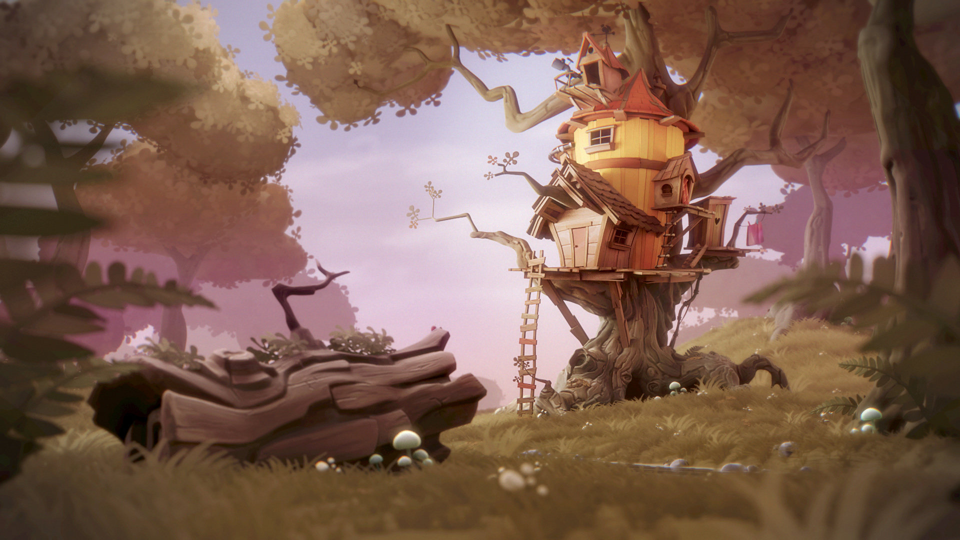
The BRAWL² Tournament Challenge has been announced!
It starts May 12, and ends Oct 17. Let's see what you got!
https://polycount.com/discussion/237047/the-brawl²-tournament
It starts May 12, and ends Oct 17. Let's see what you got!
https://polycount.com/discussion/237047/the-brawl²-tournament
3D Technical Solicited
I'm a developer working on a game. I've got a good 3D artist creating an environment for me. He's working on getting the "look" down by just working on the first asset right now. He's pretty close to what I'm asking for but the look still isn't quite there. As I'm a developer by trade I'm having a hard time guiding him in the right direction as he gets really close to having it right. I have a few questions that I'm hoping some folks on here can help out with, but first here are the images in question.
I have two images that I gave to my artist to help him recreate what I'm looking for. One is the concept art for the scene and the other I'm calling the "reference" piece. The concept art shows the colors and shapes the scene should have in it and the "reference" shows the texture / lighting / shading style they should match.
concept
http://www.polycount.com/forum/attachment.php?attachmentid=30479&stc=1&d=1438754608
reference:

And here is what he's gotten to currently
http://www.polycount.com/forum/attachment.php?attachmentid=30480&d=1438754533
I would appreciate any information that helps me to better understand what things need to change in this piece to be able to match the texture / lighting / shading in the reference.
Also, anything you think may not need to be done in the asset, but that should be done in the in-game lighting or effects would be appreciated. I don't really know much about scene lighting and so I won't know when the asset is ready for lighting or not. If I know when the asset is to where it needs to be for something like lighting or image effects in the game engine to take over I'm confident I can rely on tutorials, documentation and the online community to help me get that correct. Of course the less dynamic lighting or effects that I have to depend on the game engine for the better for performance sake.
Thanks all, really appreciate any help.
I have two images that I gave to my artist to help him recreate what I'm looking for. One is the concept art for the scene and the other I'm calling the "reference" piece. The concept art shows the colors and shapes the scene should have in it and the "reference" shows the texture / lighting / shading style they should match.
concept
http://www.polycount.com/forum/attachment.php?attachmentid=30479&stc=1&d=1438754608
reference:

And here is what he's gotten to currently
http://www.polycount.com/forum/attachment.php?attachmentid=30480&d=1438754533
I would appreciate any information that helps me to better understand what things need to change in this piece to be able to match the texture / lighting / shading in the reference.
Also, anything you think may not need to be done in the asset, but that should be done in the in-game lighting or effects would be appreciated. I don't really know much about scene lighting and so I won't know when the asset is ready for lighting or not. If I know when the asset is to where it needs to be for something like lighting or image effects in the game engine to take over I'm confident I can rely on tutorials, documentation and the online community to help me get that correct. Of course the less dynamic lighting or effects that I have to depend on the game engine for the better for performance sake.
Thanks all, really appreciate any help.

Replies
How is the artist presenting this, is it in the engine you intend to use? (it should be) Which engine do you plan to use?
The trunk is looking pretty good so far, but the color is very monochrome. The bark texture should have variations in hue and texture (moss, lichen, scars, etc.) to add visual interest.
The pink foliage is not well done, IMHO. It would be better to use the foliage style from Airborn, see http://wiki.polycount.com/wiki/Foliage
Also, it's a really good idea to combine the images together into one, so you can easily compare them side-by-side.
We're doing this in Unity and yes he's putting it into Unity as he is sending it back but I don't think he's really put much work into lighting yet. I agree that the shape of the trunk is really good. I would not have even thought about the color variation but I think you're spot on about that. I will have him work on that. I've also sent something back to him about the foliage, to have it look more like that in the top-right corner of the image you spliced together.
I looked at the page for airborn, is that an art style? Or is that the name of a tool or game?
Thanks