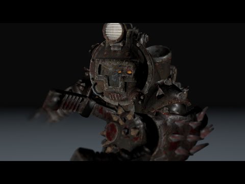
Mech Run Animation
1st post so be gentle  Heres an animation i've been working on with a couple of different angles.. any tips/suggestions would be great.. ps: just noticed a small jerk in right leg in 3rd camera angle.. reckon its a render glitch as does'nt seem to occur in other two.
[ame] https://www.youtube.com/watch?v=LMD8eCavf8o[/ame]
[ame]
 https://www.youtube.com/watch?v=LMD8eCavf8o[/ame]
Replies
hmmm i never thought about that.. run matching the model that is.. makes sense tho. i wonder would making him dip lower on contact also help with weight issue?
Notice how the head and hips almost don't bounce at all here, even on a hulky guy with a lot of weight to carry :
[ame]
And counter-intuitively enough ... the faster on runs, the *more* stable these points become.
[ame]
For the color correction and motion blur, I think it looks way better before.
Talking about the animation itself it looks good below the hips (I would check the hips when he steps with his left foot, it seems to be a little different when he steps with the right) but I think that your arms and head makes a lot of movement and have some pops.
When the head goes up and down, the movement is too much in my opinion, which cause to feel it like a pop. I suggest you tone down your head/neck and I think that the problem is coming from the chest too, I would check that too
For the arms, you have some pretty nice arcs there! Good job. I know it’s a robotical character but I think when he swings his arm/hands there is a pop way too noticeable. It almost seems that you have 2 frames with similar pose in them.
Just my opinion, hope it helps
good work!