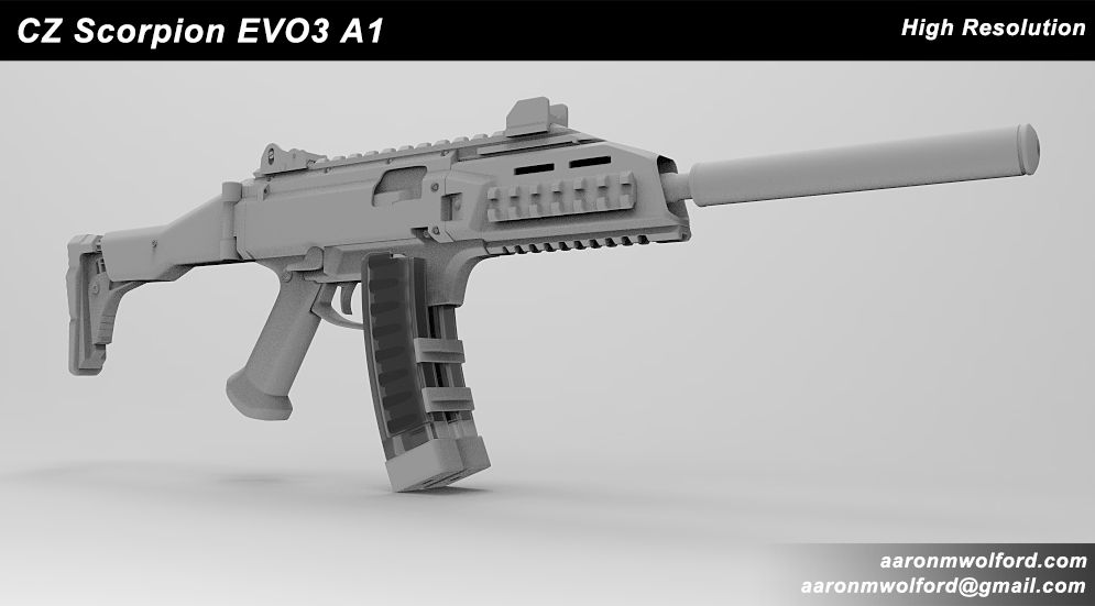
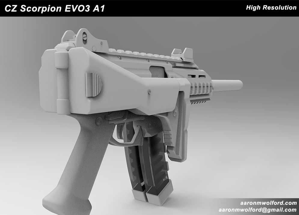
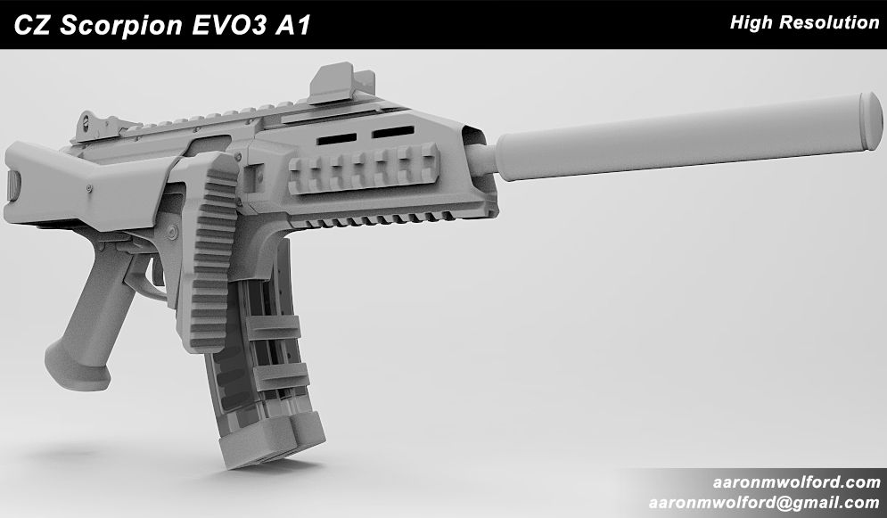
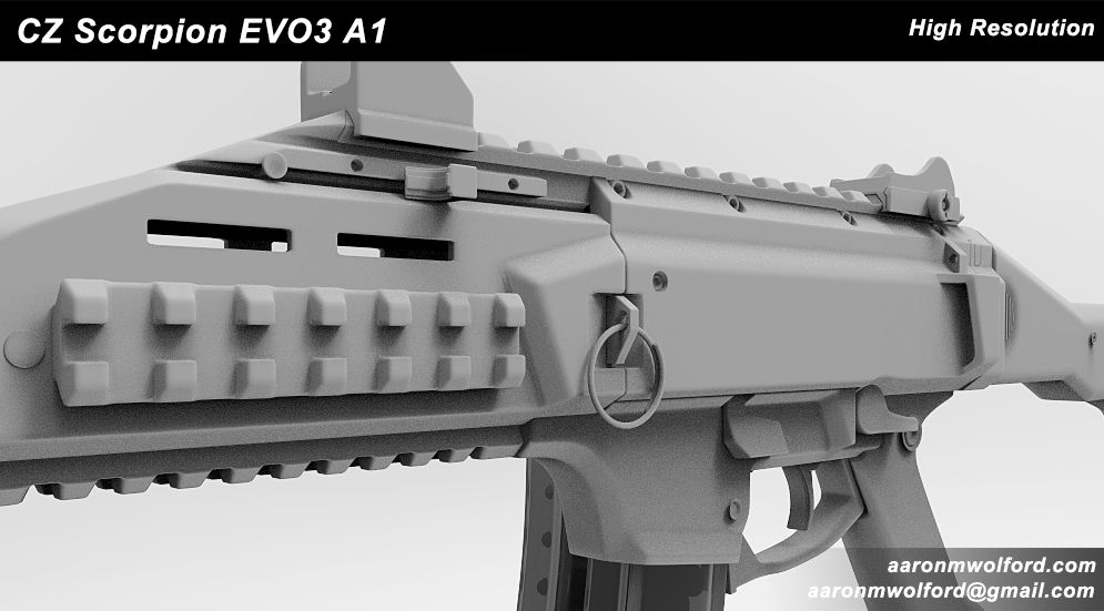
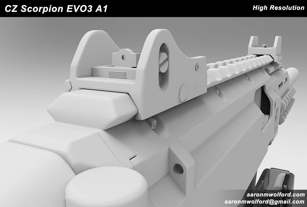
Model presentation needs some more work, white background with grey simple material is not really a good idea unless material is really interesting. Look for "make your presentation model shine" or something like this, here on polycount. http://www.polycount.com/forum/showthread.php?t=69829 . What do you use for rendering? That noise needs a fix
Micaki. Yea I agree. I was trying out Keyshot, but since it was a trying I could only take screencaps without the watermark. I have re-rendered the shots with Marmoset. They can be found here if interested.
Some quick thing you can do inside Keyshot to get some nice materials is use one of the car paint materials, they do seem pretty good as a base to tweak or to get some quick renders.
Nice progress so far!
Heres Some feedback:
First of all i would use a glossier material to present normal maps so we can see the shading better and a different background, you normally want to add some contrast with the background so the weapon pops out a bit more, at the moment they are both(background and weapon) very similar
There is quite some baking problems you have in the mesh as well, i have marked some with red:
Also theres other parts that show that you havent exploded your mesh before baking, i suggest doing so in order to avoid parts intersecting details while baking.
Keep it up, looking forward for more progress!
Hey thanks for the feedback maxivz. Yea I'm noticing some baking errors too. Odd thing is I did explode the mesh before baking... I'll go back and play with the setting a bit. Great points on rendering! I'll make some normal edits and then re-render with your recommendations in mind. Thanks again!
Triangulate before exporting to bake; those X shape errors are telltale signs you've baked with different triangulation (which affects lowpoly smoothing and therefore tangent space normals) to the mesh you've put the normal map on. (If you're not clear why that would make a difference, consider the different ways a polygon can be triangulated; not all software does it the same. For an even better idea, view your lowpoly model and manually triangulate a (non-planar) polygon to see how the different ways affect the surface shading.
Also, are you using a cage? When I look at the rail it looks like you're suffering from the missed rays problem.
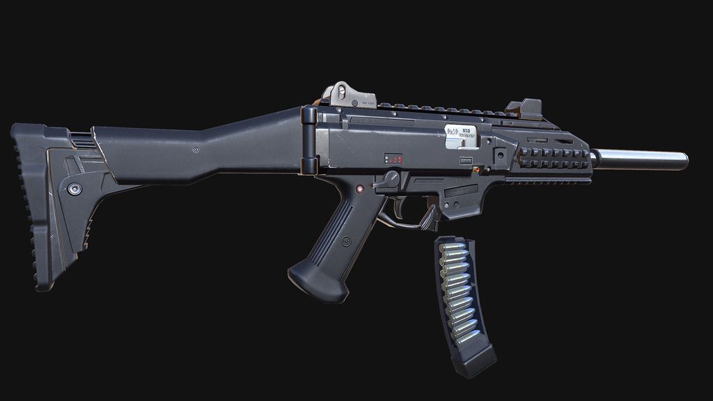
Making some more progress. Fixed the normal issues that were apparent earlier. Laying down some textures. Thoughts so far on general direction? I plan to do a standard black model texture and then some military camo of some sort later.
The bake looks way better now.
The material looks like its some kind of plastic in the reference.
I would go and make it look more like plastic as its looking a lot like metal for the most part at the moment. Id also get rid of the bright scratches on the plastic as they scream metal, try to give it some softer scratches as its usually the way plastic gets scratched.
Try to increase the separation between the metal parts and the plastic parts like that.
Now that is looking way better. I really like the subtle variation you gave to the materials, specially the plastic. Try to add some natural noise to the normal of the plastic, don't make it too strong on the normal or it will look bad. you can use something like this (http://www.textures.com/download/various0671/44968) to generate a normal map from and overlay it in your plastic areas. Some of the scratches, specially on the metal look really procedural, i would try to hand paint or use images to break them up a bit, adding some photosource plastic scratches to the plastic would also be a good idea as it can help in separating the materials. Try to make the light hit the gun at the side and make it more drastic, its pretty flat at the moment, better lighting with more variation on the gloss map will really make the materials reactive to light. Keep it up! this is getting better every time i come back
Replies
http://aaronmwolford.dunked.com/czscorpion
Heres Some feedback:
First of all i would use a glossier material to present normal maps so we can see the shading better and a different background, you normally want to add some contrast with the background so the weapon pops out a bit more, at the moment they are both(background and weapon) very similar
There is quite some baking problems you have in the mesh as well, i have marked some with red:
Also theres other parts that show that you havent exploded your mesh before baking, i suggest doing so in order to avoid parts intersecting details while baking.
Keep it up, looking forward for more progress!
Also, are you using a cage? When I look at the rail it looks like you're suffering from the missed rays problem.
The material looks like its some kind of plastic in the reference.
I would go and make it look more like plastic as its looking a lot like metal for the most part at the moment. Id also get rid of the bright scratches on the plastic as they scream metal, try to give it some softer scratches as its usually the way plastic gets scratched.
Try to increase the separation between the metal parts and the plastic parts like that.
Hope it helps
Try to add some natural noise to the normal of the plastic, don't make it too strong on the normal or it will look bad. you can use something like this (http://www.textures.com/download/various0671/44968) to generate a normal map from and overlay it in your plastic areas.
Some of the scratches, specially on the metal look really procedural, i would try to hand paint or use images to break them up a bit, adding some photosource plastic scratches to the plastic would also be a good idea as it can help in separating the materials.
Try to make the light hit the gun at the side and make it more drastic, its pretty flat at the moment, better lighting with more variation on the gloss map will really make the materials reactive to light.
Keep it up! this is getting better every time i come back