The BRAWL² Tournament Challenge has been announced!
It starts May 12, and ends Oct 17. Let's see what you got!
https://polycount.com/discussion/237047/the-brawl²-tournament
It starts May 12, and ends Oct 17. Let's see what you got!
https://polycount.com/discussion/237047/the-brawl²-tournament
Roman Pillar - WIP - Need Critique
Hey guys, looking for some feedback on a pillar I've been working on. It's based on the design of ancient Roman pillars, which are typically covered in a lot of Corinthian leaf decorations and all that.
Here's some of the reference I've been using:
[IMG][/img]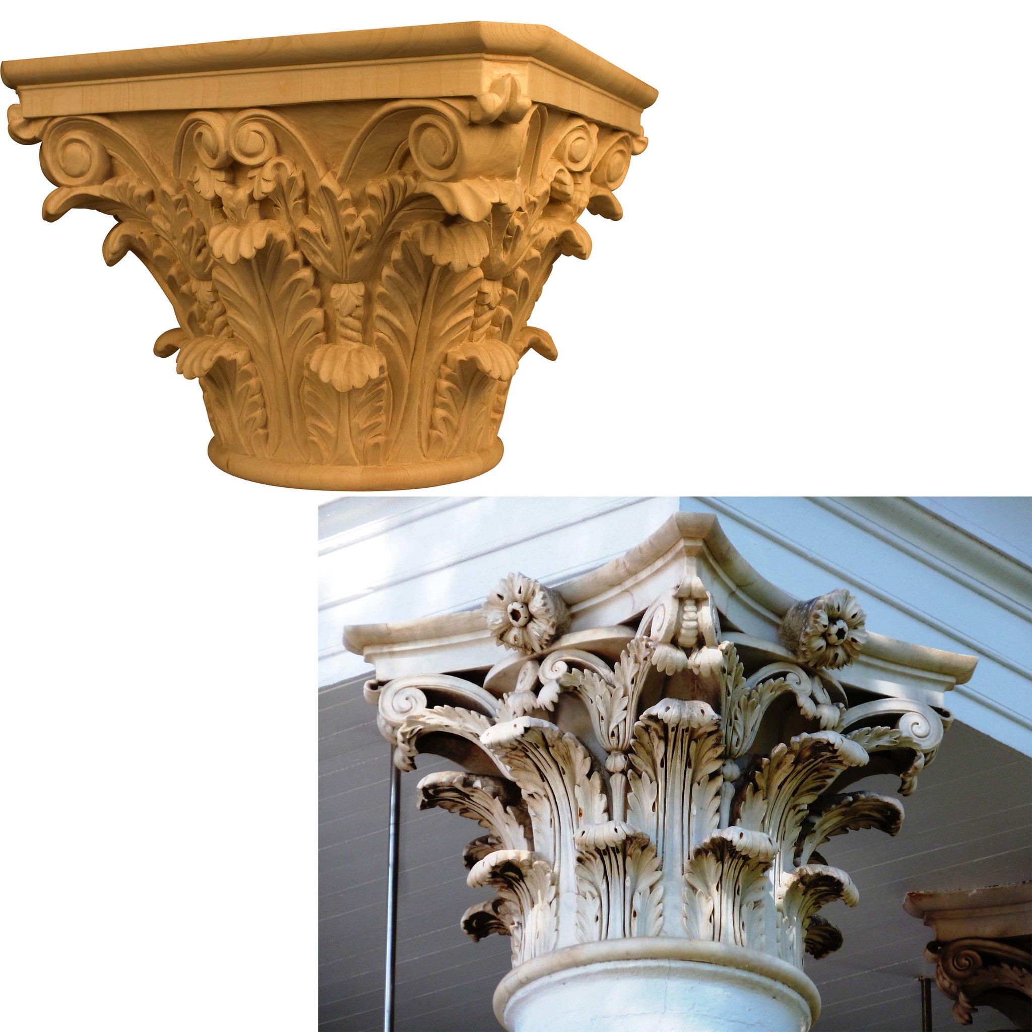 Ardelean_Jason_Concept by Jason Ardelean, on Flickr
Here's the pillar so far:
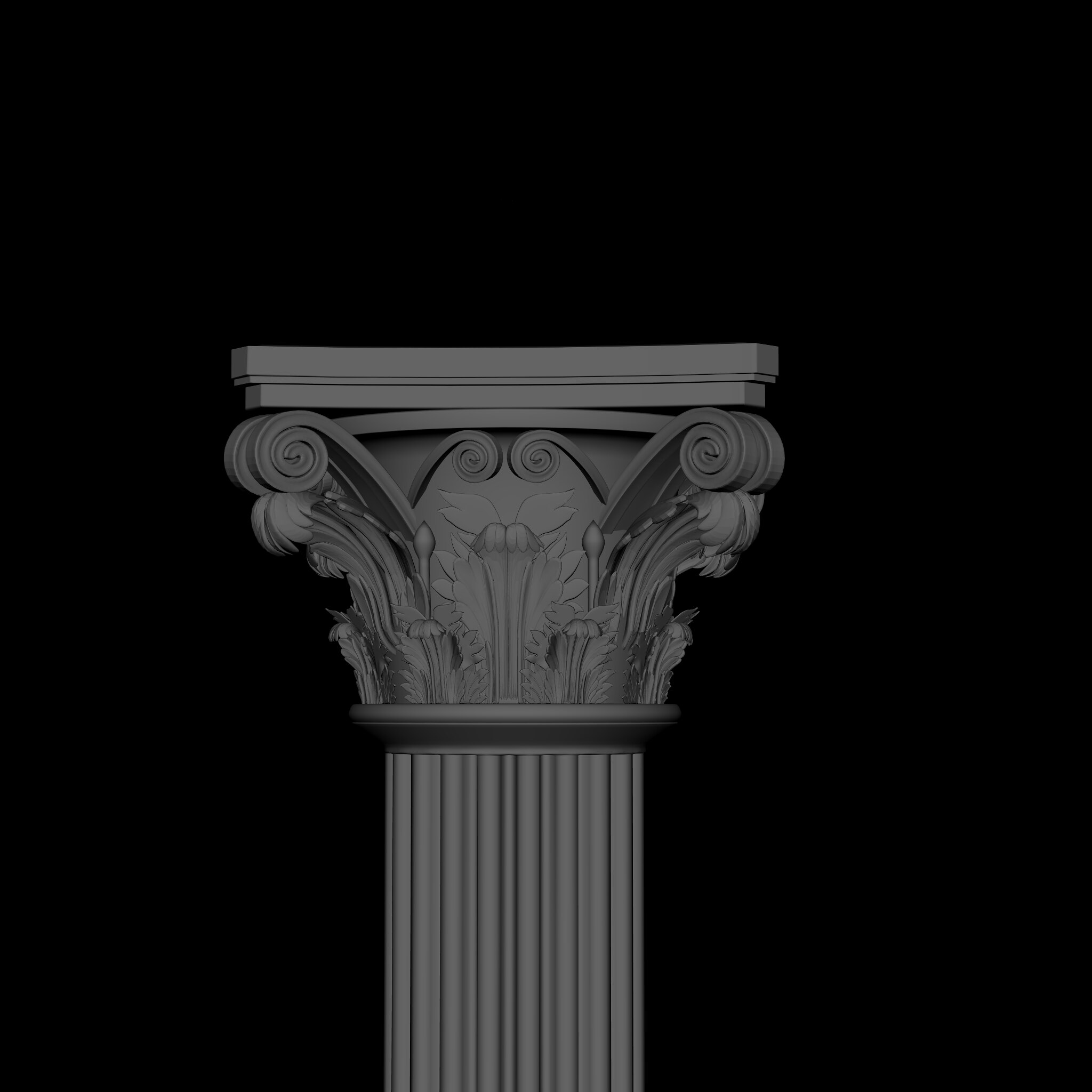 Image_3 by Jason Ardelean, on Flickr
[IMG][/img]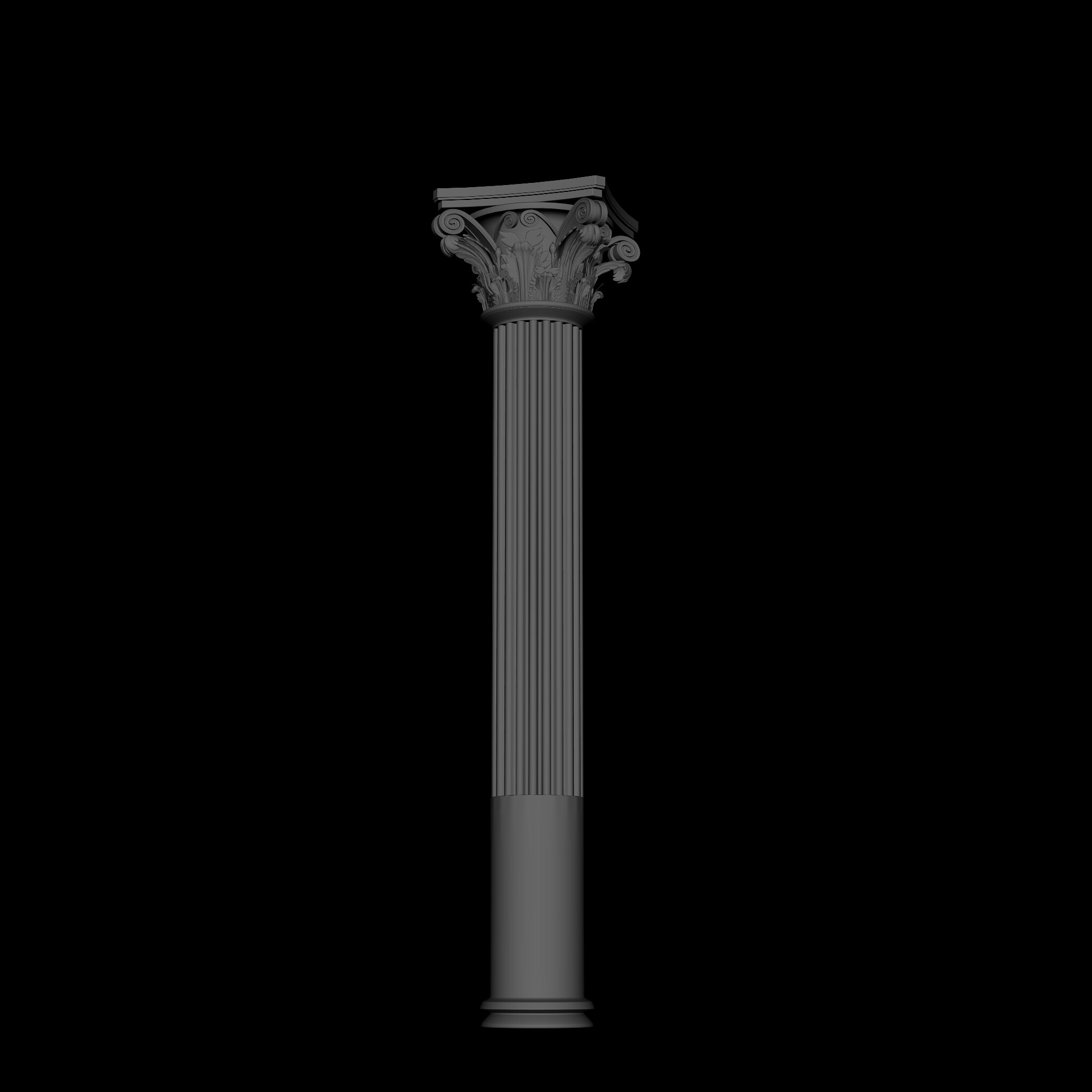 Image_2 by Jason Ardelean, on Flickr
Lemme know if y'all would like some alternative angles or what have you.
Here's some of the reference I've been using:
[IMG][/img]
 Ardelean_Jason_Concept by Jason Ardelean, on Flickr
Here's the pillar so far:
 Image_3 by Jason Ardelean, on Flickr
[IMG][/img]
 Image_2 by Jason Ardelean, on Flickr
Lemme know if y'all would like some alternative angles or what have you.
Replies
Some things:
- These capitals are made out of stone, so they need to be solid. I would recommend adding thickness to the backfaces of the leaves and other hanging elements as not to seem they're just dangling from the main body and are actually part of it.
- The grooved columns are not usually perfectly straight down. They have a bit of curvature and their base is has a bit larger circumference. not hard to do with a simple FFD.
Keep up the good work. o/
[IMG][/img]
[IMG][/img]
It does seem a little too high poly for real time though. Take a look at Epic's Sun Temple demo in which you can download the assets. It shows really well how they did the final modelling and materials for this exact same case.
Ideally the final and normal map baked capital model should be made in a single continuous mesh. Each separate mesh element adds extra draw calls from what I remember. It might not be a big deal depending on your project scope and poly budget though.
Keep up the good work. o/
[IMG][/img]
Cheers!