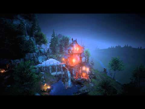
WaterMill Environment [UE4]
Hello
I present a mobile environment created on Unreal Engine 4
You can see this in online preview (W and S camera movement): day and night version
video
[ame=" https://www.youtube.com/watch?v=3l1pCwv0_hI"]https://www.youtube.com/watch?v=3l1pCwv0_hI[/ame]
and some images


I present a mobile environment created on Unreal Engine 4
You can see this in online preview (W and S camera movement): day and night version
video
[ame="
 https://www.youtube.com/watch?v=3l1pCwv0_hI"]https://www.youtube.com/watch?v=3l1pCwv0_hI[/ame]
and some images


Replies
This looks amazing, i really like the colors. And the textures look very real
My only critc is the background, it seems very empty and random. It doesnt do the mill and its surrounding justice, because that looks great.
Keep it up
Still great work!
Perhaps for the night version, put some fog here and here
I don't really care the distant background since the point of interest is the watermill, the distant background is simple but correct...no need to spent time on this imo.
Well done :thumbup:
A bit too much bloom in the night shots. Maybe lowering the emissive and making the lights a bit stronger on the lanterns?
The dam doesn't really look like a believable dam. It should probably be made all in stone; It might benefit from some curvature; It should probably lean backwards towards the water a bit.
Its weird that the stone tower rests on a wooden base. The stone should be a bit heavy for that, and I would expect it to be the other way around.
Cool stuff though
Also the toilet on the edge, NO way I would ever take a leak or dump in there hah.
St4lis Thank you for your criticism.
Dam completely stone, planks put on top. Regarding the house agree, I had not thought about it.
AuntieJamima about 3 months
Chimi Jimi, macoll, toco, Bolovorix, rusty_hawk, Tobbo, josfield, IxenonI, Ged, Peris, Papigiulio, Poinball, amirabd2130 Thank you for your comments, I'm glad you liked my work
I agree with this dude and APiotrW. Really great texture work but a bit of a shame that there isn't more going on in the background. I think a couple of lower poly buildings in the background would really make this great