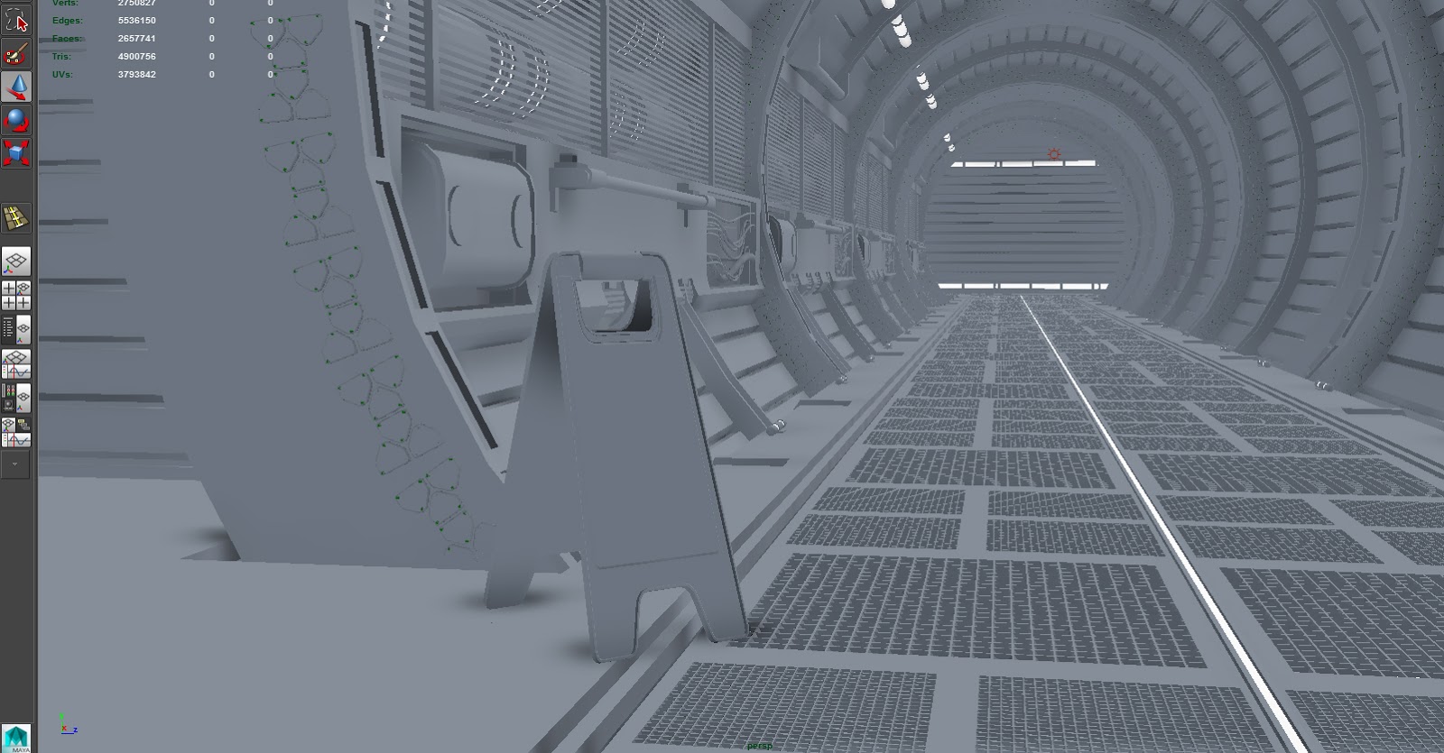
Hey guys! I am currently working on my demo reel and thought I would share my progress. Huge props to Conar Cross for the badass concept art! I will be bringing this into unreal this week after I have finished modeling everything out. C&C is very welcome (everything helps!)
Can't wait to hear what you guys think
Your scene looks great, nice modeling and texturing. The only thing id say you could do better is the floor. The gray grids on the floor dont leave enough space for the dark floor to reflect. Since this is a scene where someone will slid and fall^^, the floor should look really wet. Now the dark floor is too small to really see the wet cleaning water. I hope you get what i mean. Keep it ip
Looks pretty good so far! The only things I would change are the cables in the hole on the left. They look a bit thin. Also dont forget the little orange lights at the top. :P
@Phong added in those orange lights for ya! (more like, for me! haha) I decided to keep the wires the same width since the area was getting pretty crammed.
I brought this into unreal and did some test lighting. Starting to bake out normals. Time for the fun stuff! If anyone notices some funky stuff let me know so I can fix it
Loving it so far! One thing I noticed where you strayed from the concept (and maybe that is intentional), but in the decorative design on the arches in the concept art, the design shapes are cutout/embedded into the metal, rather then sticking it out as you currently have it.
@Marshkin Thank you for the kind words! I chose to make them stick out simply for the purpose of the normal map I plan on baking out. The concept seems sort of flat and I noticed there were some bolts as well... so I figured I might as well have them come out instead of in. Once I bake out the normal I may or may not change it depending on how it looks Thanks for pointing that out, I'll keep an eye on that area to make sure it doesn't feel off
it looks good , the only distracting thing is that pattern looping round the arches, it just doesnt seem very functional and doesnt quite flow with the shape of the arch perfectly even in the concept.
Hey guys! Wanted to drop in and show a quick progress shot. I have a ton to do still... the metal material is just a placeholder right now, need to fix that. Also I'd like to add more material definition to just about... everything haha. More lighting is needed too, need to fix how much red is pouring into the walls. Gah, so much to do! Back to it
Replies
Your scene looks great, nice modeling and texturing. The only thing id say you could do better is the floor. The gray grids on the floor dont leave enough space for the dark floor to reflect. Since this is a scene where someone will slid and fall^^, the floor should look really wet. Now the dark floor is too small to really see the wet cleaning water. I hope you get what i mean. Keep it ip
right on, man! I'll fix that right away, great eye
I would suggest to make some areas darker.
I don't know, but probably switch off those blueish florescent lights on top to see how it will look like.
keep on rocking
@Phong added in those orange lights for ya! (more like, for me! haha) I decided to keep the wires the same width since the area was getting pretty crammed.
I brought this into unreal and did some test lighting. Starting to bake out normals. Time for the fun stuff! If anyone notices some funky stuff let me know so I can fix it
Looking forward to seeing this textured up!
I initially built the scene in 3D and painted over it, nice to see someone doing something useful with the concept haha!
Awesome work