The BRAWL² Tournament Challenge has been announced!
It starts May 12, and ends Oct 17. Let's see what you got!
https://polycount.com/discussion/237047/the-brawl²-tournament
It starts May 12, and ends Oct 17. Let's see what you got!
https://polycount.com/discussion/237047/the-brawl²-tournament
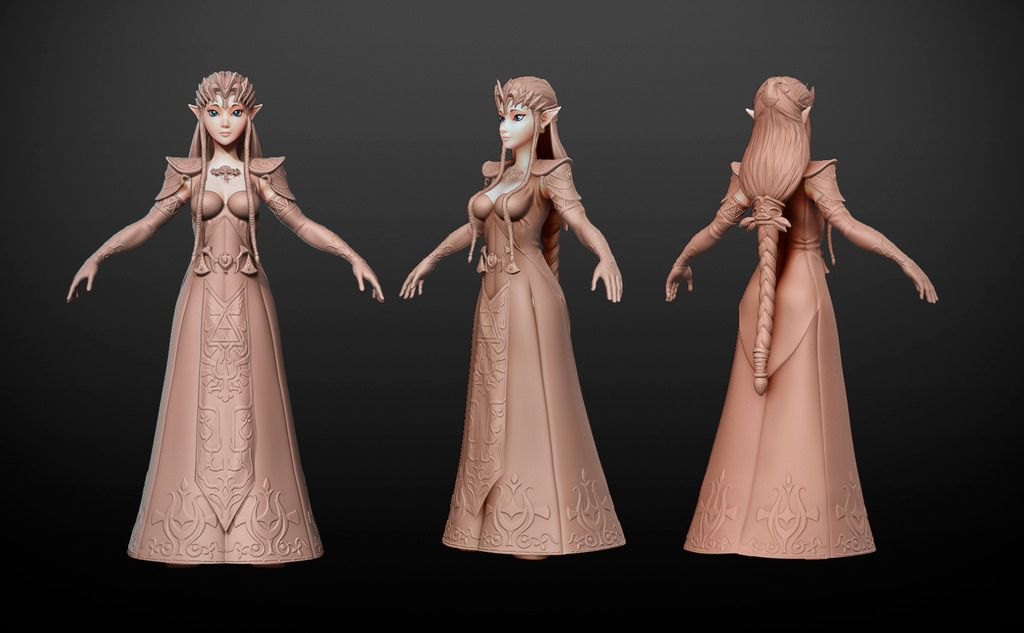
Princess Zelda Fan Art WIP
Study hi-poly modeling for game.
Model made for the workshop characters for games Gilberto Magno http://gilbertomagno.com/
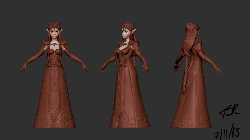
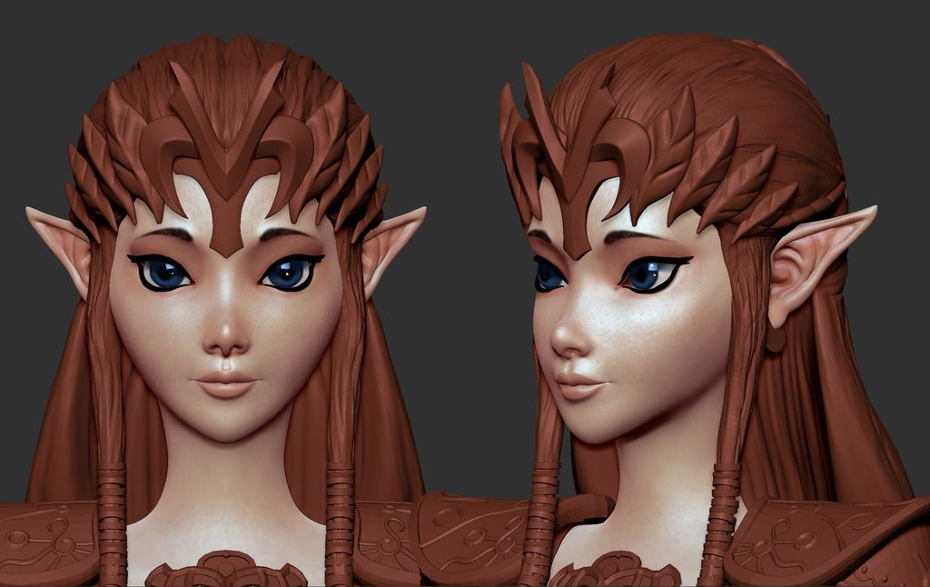
Render
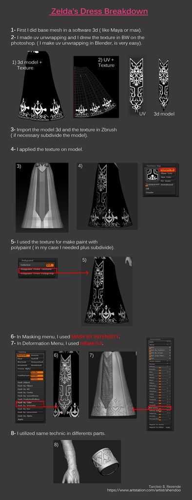
Breakdown
HiRes: My artistation
Model made for the workshop characters for games Gilberto Magno http://gilbertomagno.com/


Render

Breakdown

HiRes: My artistation

Replies
And thank you for the little tutorial!
@Fenyce I'll try improve the face!
@supremedalek925 I want to do this character more sexy.
I would recommend two things for you to take another look at, the first of which being her apparently vacuum sealed top/bust line. The skin-tight look is a pretty common trope in comics as it allows comic artists to show the most heroic human form with muscle contouring and fully revealed anatomy. The origin and reason for the look is pretty interesting, but suffice it to say the look in pop culture comes from trying to replicate the classical Greco-Roman athletic ideal while obviously not having the character run around in the buff. So although you state you're trying to go with more of a "sexy" version, you still want it to look correct, so I'd give some more volume to that top so it actually reads as a fabric top and not vacuum suction spandex.
The second suggestion would be to just add a bit more mass to her front braids and sword. Right now they're a little too thin and don't read particularly well. Even if it strays a bit from a concept, I generally err on the side of making things a bit bulkier so they have more weight when zoomed out and viewing the entire figure. You can see the thicker braids in the reference below - it also has a nice, subtle taper from thin, to thick, to thin again to give it some nice volume.
Also, thanks for the tutorial! I'm definitely going to use it in my projects.
Turntable
Pose
For marmoset viewer
https://www.artstation.com/artist/shendoo
nice work!
Going to have to agree with lotet i see that now also.
apply the skin shader to everything, set the subdermis color to black (so nothing has scattering) and then set the shadow blur slider to zero, or close to zero. this will give the whole model a really harsh shadow line, almost toon shading.
could be really cool to play with that kind of stuff on a character like this.