The BRAWL² Tournament Challenge has been announced!
It starts May 12, and ends Oct 17. Let's see what you got!
https://polycount.com/discussion/237047/the-brawl²-tournament
It starts May 12, and ends Oct 17. Let's see what you got!
https://polycount.com/discussion/237047/the-brawl²-tournament
Arena Gods - A Vicious Local Multiplayer Arena Game
Hi guys,
Happy to announce Arena Gods, a indie game that I'm developing (art) with my friend Mark Parrish (code and design) in Beijing.
At this stage graphics might look not that exciting, specially for polycount community . The idea was to nail down game play, animations and mechanics before jumping into graphics. We believe we are almost there and my intention with this tread is to show the game art evolution, and of course gather as much feedback as possible from you guys.
The guidelines for art are Non Photo Realistic Render flat without shading, and use fixed width outlines for shaders. This will maintain good readability for such a fast paced gameplay and of course will give us a unique look.
I know the AD still on early stages, but feel comfortable for suggestions and criticism. Please be brutal!
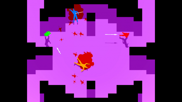
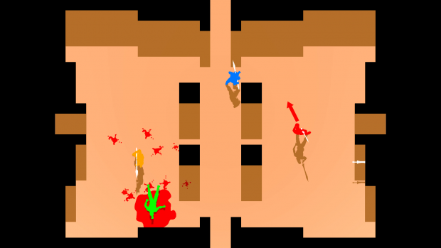
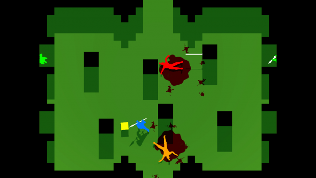
Check out our pre-alpha gameplay footage (watch in hd60fps)
[ame=" https://www.youtube.com/watch?v=XjK9rK8qLg8"]https://www.youtube.com/watch?v=XjK9rK8qLg8[/ame]
For more info please visit us at http://www.indiedb.com/games/arenagods
Hope you guys like it and get ready for more updates!
Happy to announce Arena Gods, a indie game that I'm developing (art) with my friend Mark Parrish (code and design) in Beijing.
At this stage graphics might look not that exciting, specially for polycount community
The guidelines for art are Non Photo Realistic Render flat without shading, and use fixed width outlines for shaders. This will maintain good readability for such a fast paced gameplay and of course will give us a unique look.
I know the AD still on early stages, but feel comfortable for suggestions and criticism. Please be brutal!
Arena Gods is a vicious local multiplayer gladiatorial arena game
where weapons are scarce,
anything can be thrown,
and one hit kills.
where weapons are scarce,
anything can be thrown,
and one hit kills.


Check out our pre-alpha gameplay footage (watch in hd60fps)
[ame="
 https://www.youtube.com/watch?v=XjK9rK8qLg8"]https://www.youtube.com/watch?v=XjK9rK8qLg8[/ame]
For more info please visit us at http://www.indiedb.com/games/arenagods
Hope you guys like it and get ready for more updates!
Replies
The game looks fun!
For the art, I'll wait to see how you will manage to create the cohesion between the detailed shape of the charaters and the atari-like environnement
@Holi: Good point man, we are approaching development by layers since we are just 2 guys.The environment still on very early stage, just grid units are established and environments are pretty much binary on the grid. Each "world" will have its own shape language.
@lotet: Oh yes! if we take the screenshots and turn to black and white is possible to note that ground and characters have the same value, gonna be fixed on next iteration!
@Nerf Bat Ninja: here it goes;
So guys, as I told before we're looking for fixed width outlines, got really inspired after watching GDC talk from Junya Christopher Motomura on Guilty Gear X-Factor, specially the part when he talks about the outline technique they used; [ame]
It might be too overkill for us, and hopefully a geometry outline by shader would be good enough.
I've made some tweaks on unity native toon shading, is almost there.But still too many points with variable width, there is the smoothing group factor that have an influence on it. Still ongoing, also gonna need a material outline priority list, so, for example, the character "main color" would be always dominant over the skin, metal etc. Check it out;
Still debating with my partner about the characters, he is very reluctant to use more than one color (like Nidhogg)per character and of course I'm trying to convince him that this is boring. I'm sure there is a sweet spot between readability and visual interest.
What is your opinion?
I dont think an outline will be enough for the readability and I partly agree with the "full character color" option. I will agree becose it will be easy to produce and easy to understand in game, but I disagree becose it seems that you want an in betwee with more details. I will recomand you to watch the diablo 3 art direction gdc talk, and find the chapter about character readability.
In short, the environnement colors play a big role in the readability of the gameplay, so maybe you should work on that in the same time on your mockups.
edit:
I just did a quick before/after
I hope it will help!
I think the very simple colors works well but can be tough on the eyes a little bit as they are all bright solid colors.
something that would help the characters stand out a bit is making the environment have a darker tone than the players, and having the the characters armor being the primary color instead of there skin.
A quick update on the environment kits, still pretty experimental but it already breaks the atari look.
Check it with and without outlines;
Also to let you guys know we will be at The MIX, media indie exchange on SIGGRAPH2015!
All good for this Tuesday, if you're attending to Siggraph please come check it out the game and bring it on!