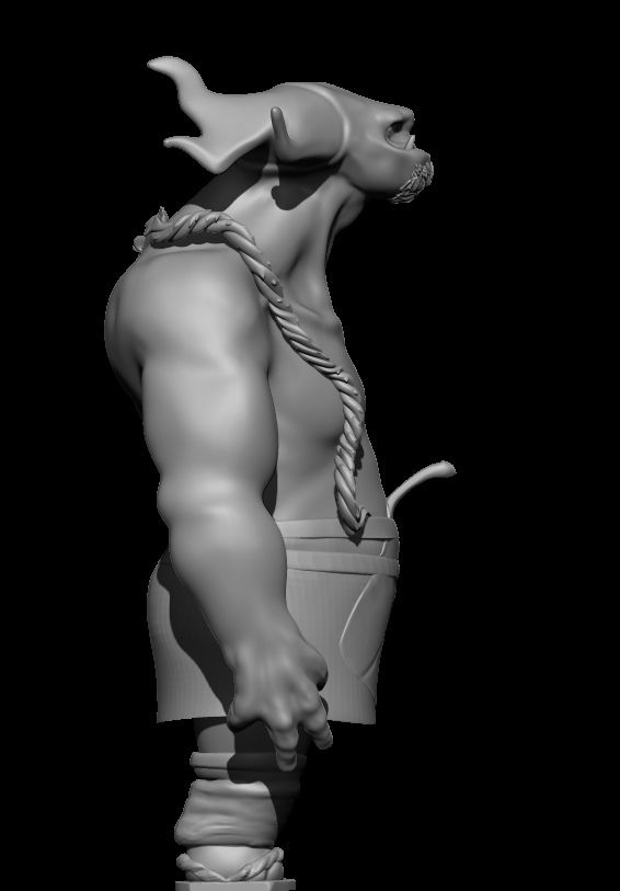
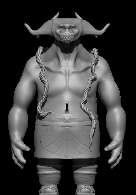
working on two characters for personal work to add to my portfolio wanted some critique to know thought if i should go for more realism or stylized and opinions and ideas to make them interesting anything helps and thanks for looking
Try and post full sized images (around 900 px broad). Check out hosting solutions and use image tags in your post. It will help you get more reactions!
still looking for feed back added a few grass vines and roots to him wanted opinions if its to much or just right, and removed lip detail seeing if less is more planning to head toward colors and finishing soon thanks if your able to take a look
just another post been working on textures and and small detail things just wanted feedback to know if its close to something i can put on a reel or if should keep it as just personal and focus other things that would a studios style . also areas i need to improve to qualify for working in studios any feed back is appreciated
thanks willehrendreich took a while but now i think i just got to pose and tweak a bit
pigart
yeah he not from the dessert originally i had a second character in my first post that was but i focused on the dweller so i guess the titles confusing now ha
I think he looks great, I how think the little grass stalk sticking out if in a silhouette or un-textured can look a bit rude at first just because of where it it. But i think textured he looks incredible really great design!
did a simple pose and a small environment for the character just looking for info on things to improve the textures and renders for a turntable any comments or suggestion would be welcome
Replies
pigart
yeah he not from the dessert originally i had a second character in my first post that was but i focused on the dweller so i guess the titles confusing now ha