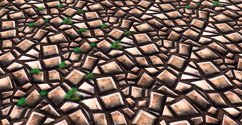
First, your grout. This gives the items scale. Right now it's way too thick and even, implying the stones are very tiny, but then the grass implies they are medium sized. Make your grout lines thinner.
Color. This is a huge one, you are basically shading with linear white to black. Taking a brown item and adding white to highlight, or black to shadow. Objects have a ton of life in the color transitions from lit to shadow and highlight, and variations from object to object. (meaning even if you find a lively tan color to highlight with, don't use it on every single stone).
My biggest concern with this is the harsh under shadow that surrounds each rock piece... it comes off very graphics cartoon like (unless that's the style you're aiming for then ignore this)... if you aren't then I'd tone down the black outline because comparing it to the harsh highlights that you have on the rock tiles it makes your texture far too noisy and unpleasant to the eye. Also the shadow under the rock tiles gives it the sensation that the rock tiles are floating above the dirt base which isn't what you're going for I'm assuming.
Generally with my own rule of thumb is that rocks have a value range that's not too extreme... Also I second what poopin said about using whites and blacks for your highlight values... always consider the environment you're painting in... if it's a grass land... have a tint of green as your rim light and have some yellow/blue for your sky and sun light...
your brightest values (highlights = yellow
your medium values /shadow areas = blue
and your rim light coming from the opposite direction from your key light = green
Thanks for the tips I agree that it looks a bit cartoony. I actually do use blue as a shadow colour rather than black but I guess the hue I use is too dark. Thanks again
It kinda looks like you used the bevel and emboss tool in photoshop, try painting these bevels and surfaces yourself, that way you can change the depth and height of different tiles giving a more natural varied look
Hi I didnt use any bevel or emboss all the bevels are handpainted
Replies
Color. This is a huge one, you are basically shading with linear white to black. Taking a brown item and adding white to highlight, or black to shadow. Objects have a ton of life in the color transitions from lit to shadow and highlight, and variations from object to object. (meaning even if you find a lively tan color to highlight with, don't use it on every single stone).
good advice thank you
Generally with my own rule of thumb is that rocks have a value range that's not too extreme... Also I second what poopin said about using whites and blacks for your highlight values... always consider the environment you're painting in... if it's a grass land... have a tint of green as your rim light and have some yellow/blue for your sky and sun light...
your brightest values (highlights = yellow
your medium values /shadow areas = blue
and your rim light coming from the opposite direction from your key light = green
That's how I approach my hand painted textures.
Hope that helps!
Hi I didnt use any bevel or emboss all the bevels are handpainted