Mat Ryan sculpt
Hi there !
Last week I decided to start a personal project, creating a 3D-sculpt of
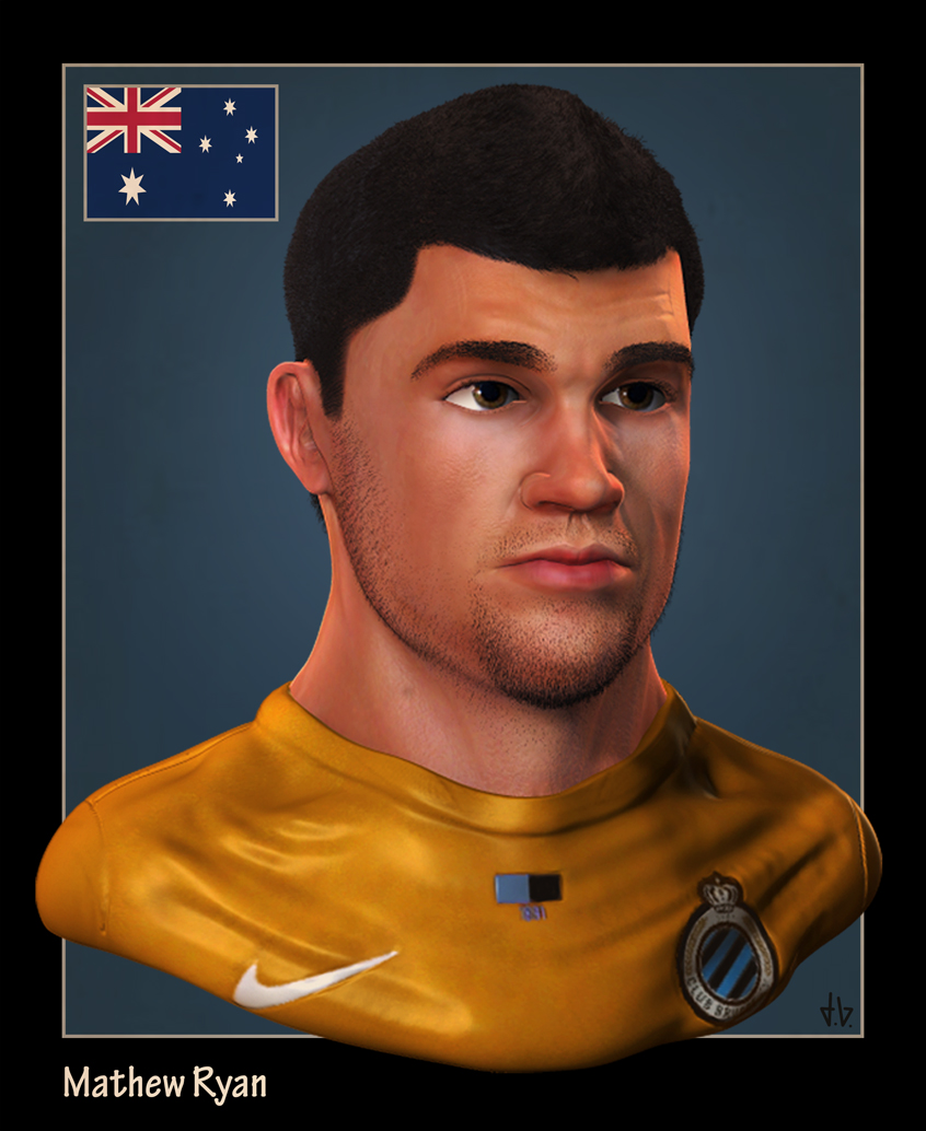
Mathew Ryan, Goalkeeper of Australia & Club Bruges.
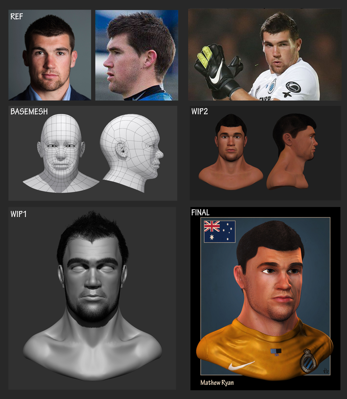
First I started by modeling a basemesh in 3DsMax, which was an exercise in getting the topology done. Next I started sculpting and experimented with fibermesh for the hair. Eventually, I became this as a result.
WIP-Overview

FINAL

I'll probably make some more of these sculpts to get a collection
Feedback, tips & comments are more than welcome
Last week I decided to start a personal project, creating a 3D-sculpt of
Mathew Ryan, Goalkeeper of Australia & Club Bruges.
First I started by modeling a basemesh in 3DsMax, which was an exercise in getting the topology done. Next I started sculpting and experimented with fibermesh for the hair. Eventually, I became this as a result.
WIP-Overview

FINAL

I'll probably make some more of these sculpts to get a collection
Feedback, tips & comments are more than welcome
Replies
The eyes look a little too - clean? his whites really stand out, so consider adding a gradient of some kind there, or narrowing the lids at the sides and bottom to frame and shadow the eyeball more.
As for overall shape, your head looks a bit too bottom-heavy when compared to the shots you provided of the man himself, almost stylised. Compare Ref and Wip 2 and you'll see what I mean. Also his ears are a bit too big.
Hope that helps!
Indeed the white on the eyes was too 'clean',I should have seen that one ^^ So I've added a gradient and color to it to reduce that white standing out, considering the light comes from that direction though...
I also made some subtle changes on roundness of the cheek, probably that's what made it bottom-heavy, but I didn't change too much there, because on some other reference pics it looks heavier than on the side view I posted here
For the ear I uppered the earlobe a tiny bit, as it was indeed too big.
I think I went through most there, if there are other stuff that might need a change feel free to tell me
(The big Image in the start post is the new version, the original stays on the image with the wip-images.)