The BRAWL² Tournament Challenge has been announced!
It starts May 12, and ends Oct 17. Let's see what you got!
https://polycount.com/discussion/237047/the-brawl²-tournament
It starts May 12, and ends Oct 17. Let's see what you got!
https://polycount.com/discussion/237047/the-brawl²-tournament
The Lab
Hello Polycounters.
This is a scene I'm working on that I'm calling "The Lab" and it's still very much a WIP. I wanted to get some feedback on the scene at its current stage. I'm struggling with the lighting at the moment. All comments and critiques on anything are welcome. Thanks in advanced.
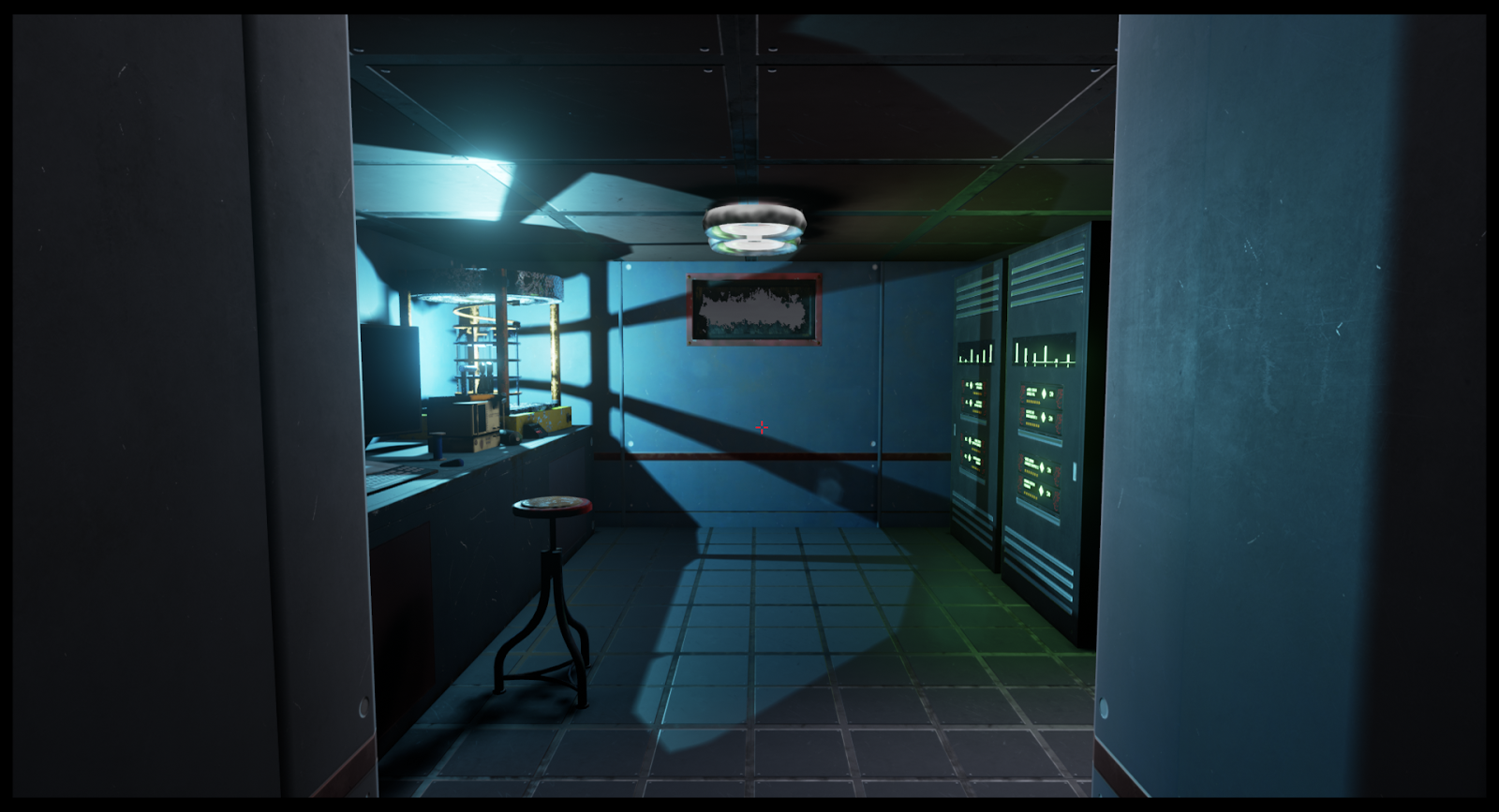
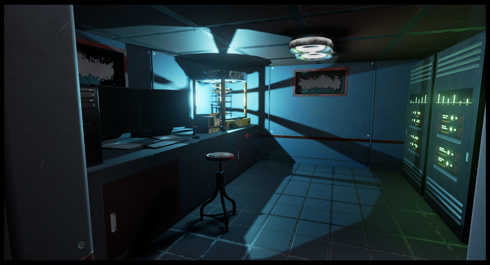
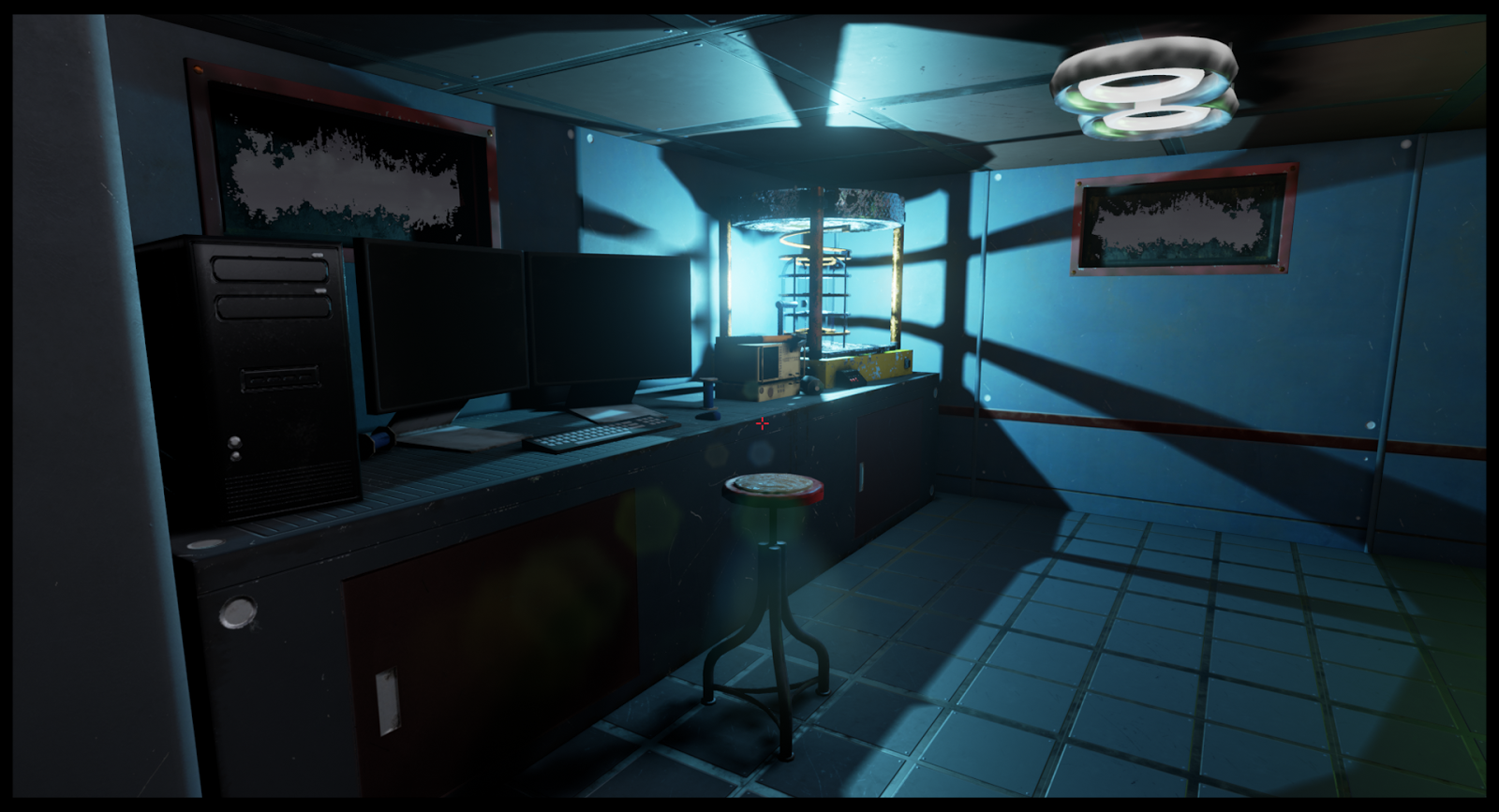
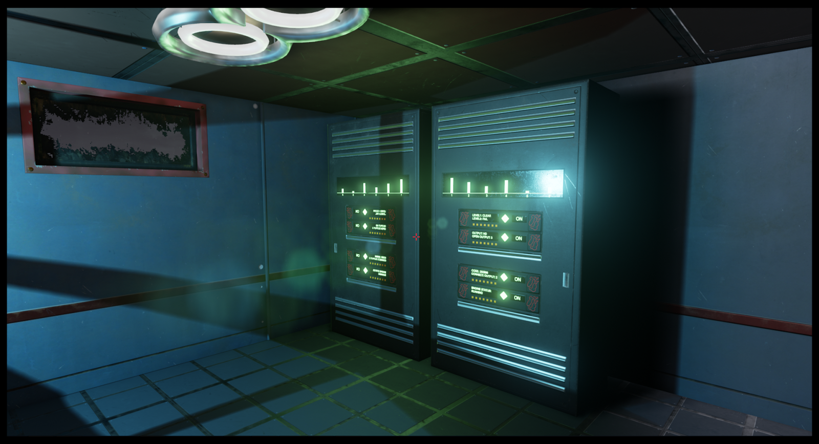
This is a scene I'm working on that I'm calling "The Lab" and it's still very much a WIP. I wanted to get some feedback on the scene at its current stage. I'm struggling with the lighting at the moment. All comments and critiques on anything are welcome. Thanks in advanced.


Replies
Also I think you could use some more color variation, at least in the props, everything looks too blue and uniform.