The BRAWL² Tournament Challenge has been announced!
It starts May 12, and ends Sept 12. Let's see what you got!
https://polycount.com/discussion/237047/the-brawl²-tournament
It starts May 12, and ends Sept 12. Let's see what you got!
https://polycount.com/discussion/237047/the-brawl²-tournament
Atmospheric Brutalism Environment - Showcase & Critique
Hi all, first time posting here!
I'm a third-year game art student at Media Design School (Bachelor's of Creative technologies)
I'm aiming to get into environment art for games.
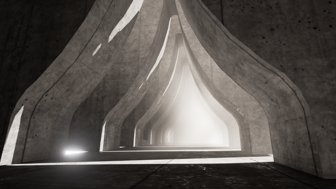
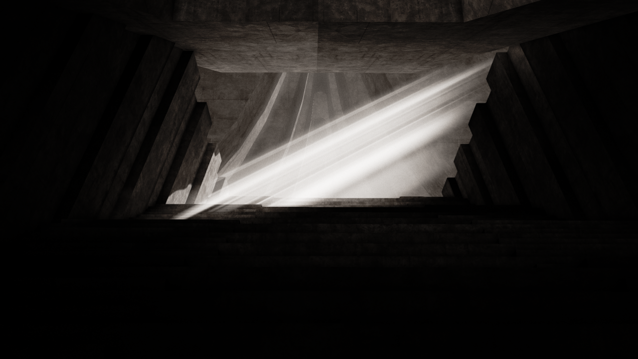
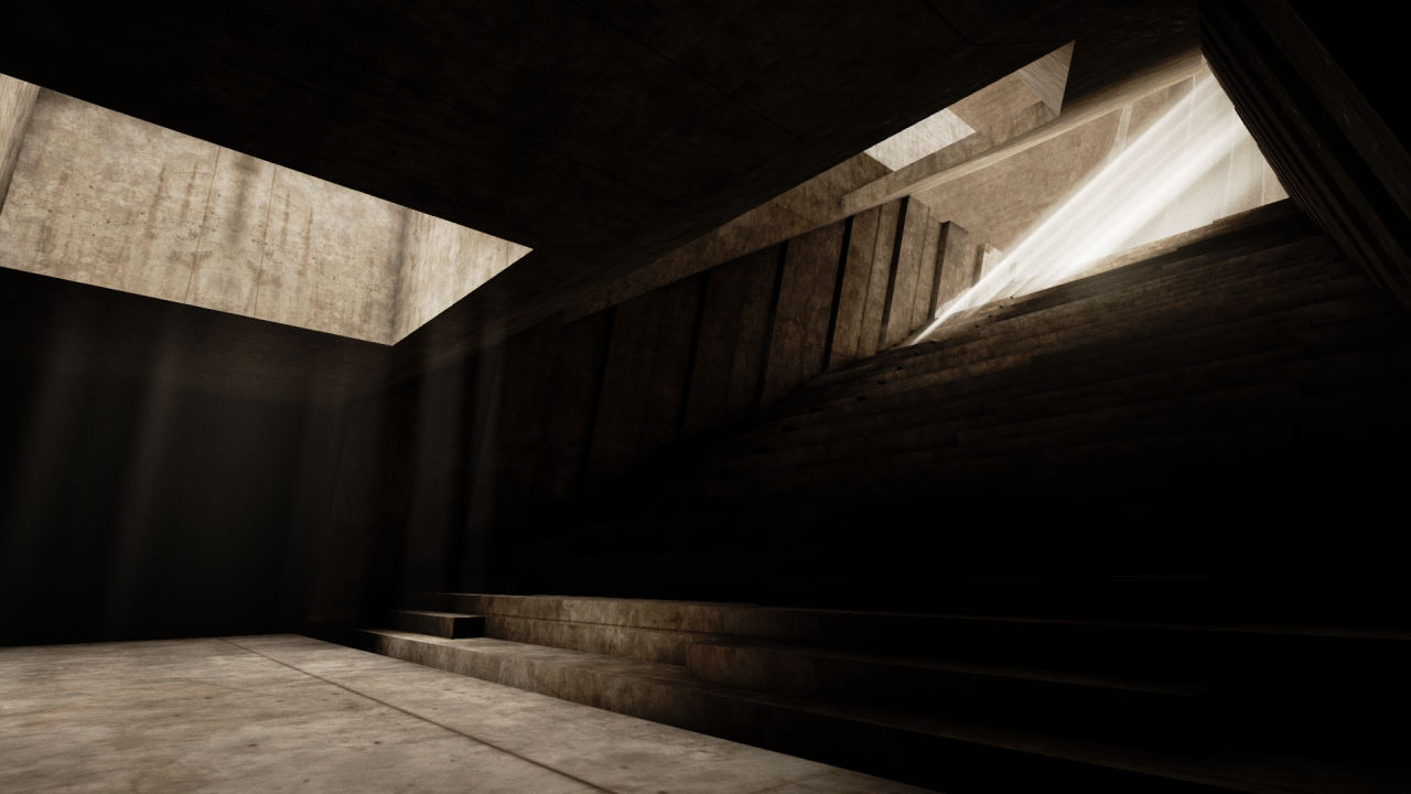
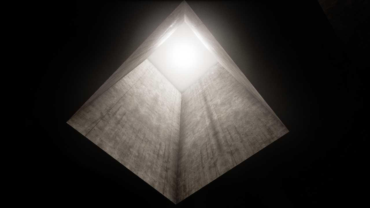
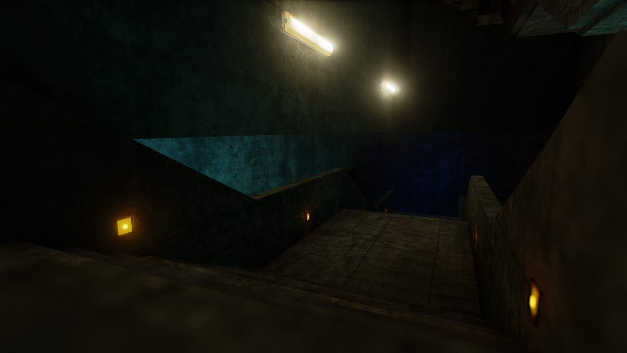
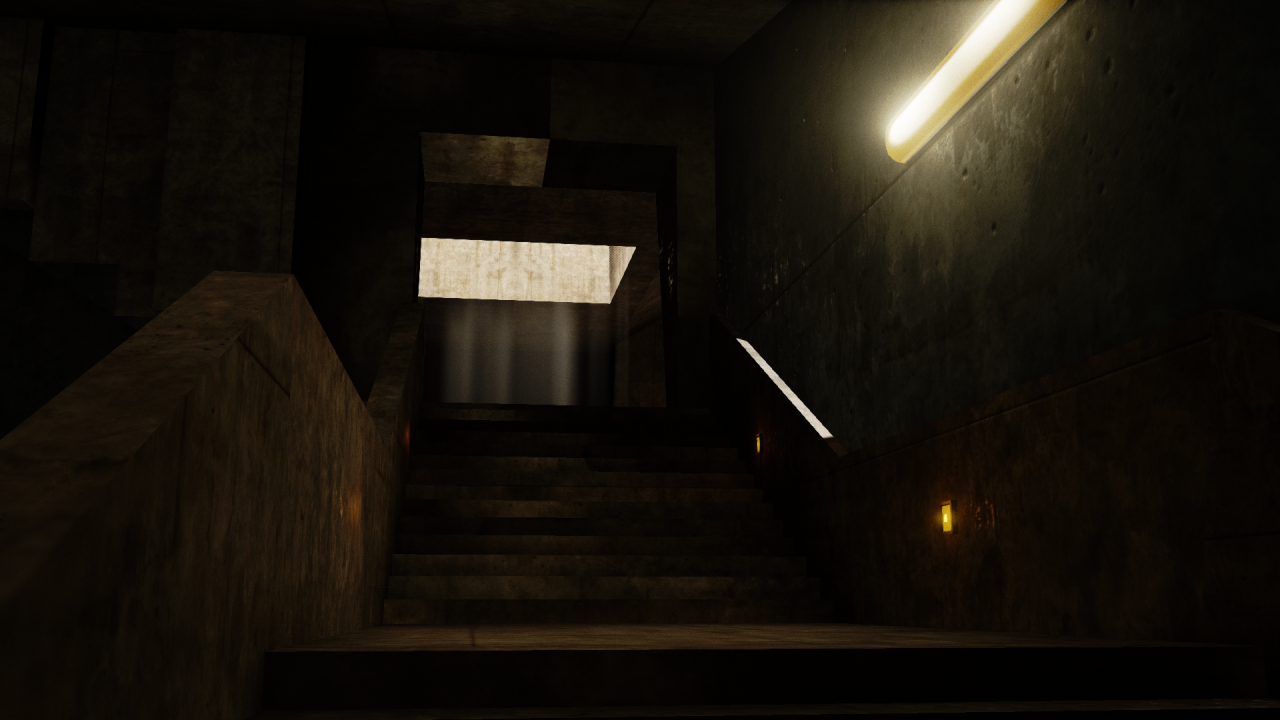
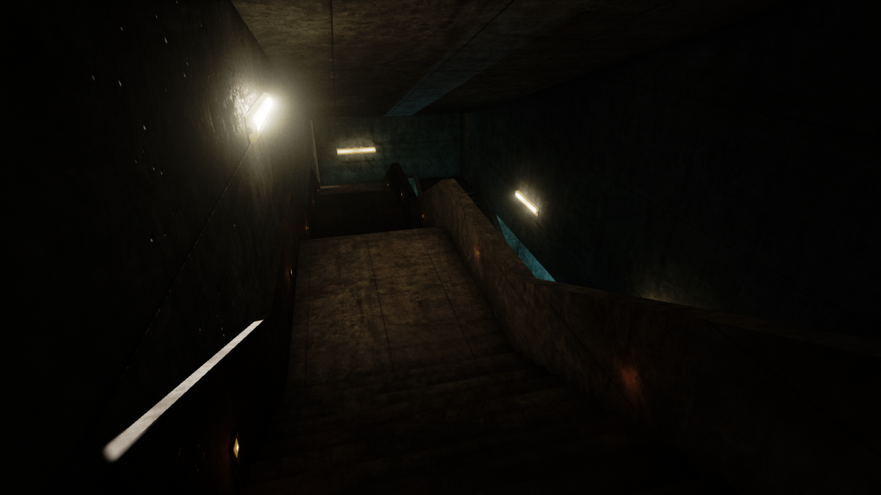
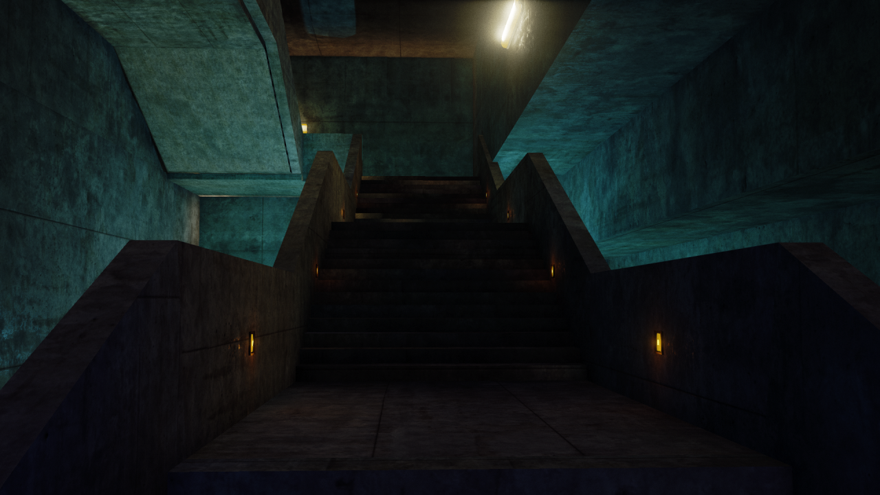
This is an atmospheric brutalism project I'm working on in class for my end-of-course architecture assignment. Really need to spend a bit more time on this over the coming weeks, its been put on a bit of a backburner because of a group project I'm working on.
Any comments, improvements, or other areas you think I could work on would be great, I'm hoping to get into environment art within the games industry at the end of the year, and could do with some constructive criticism
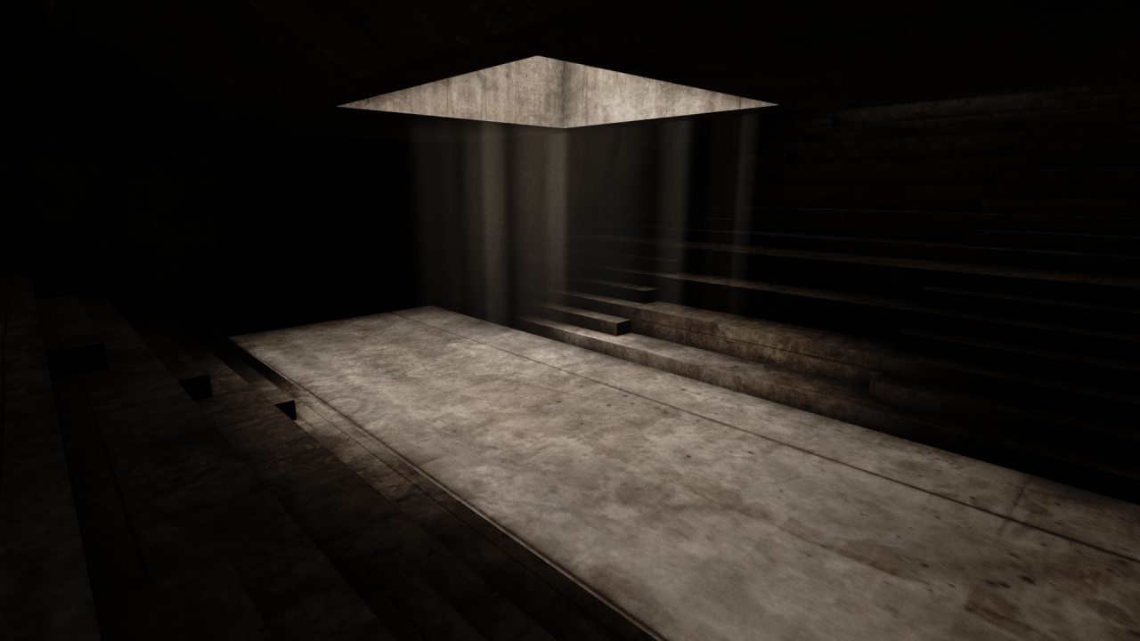
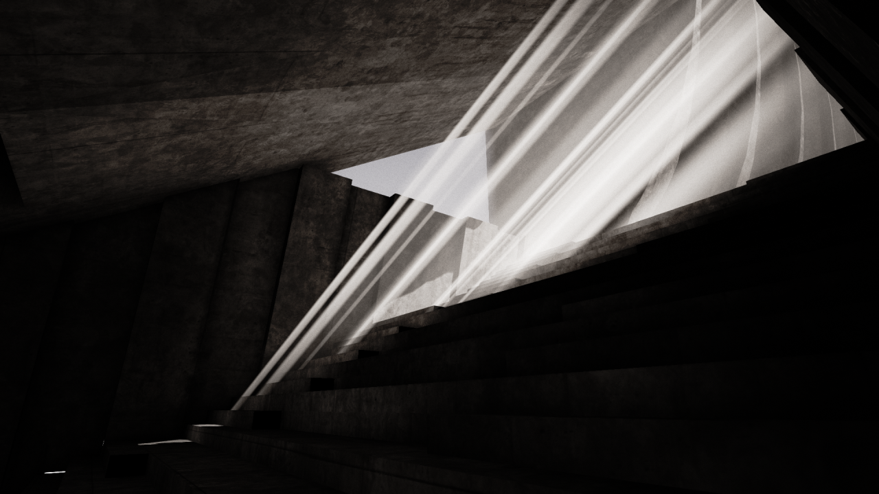
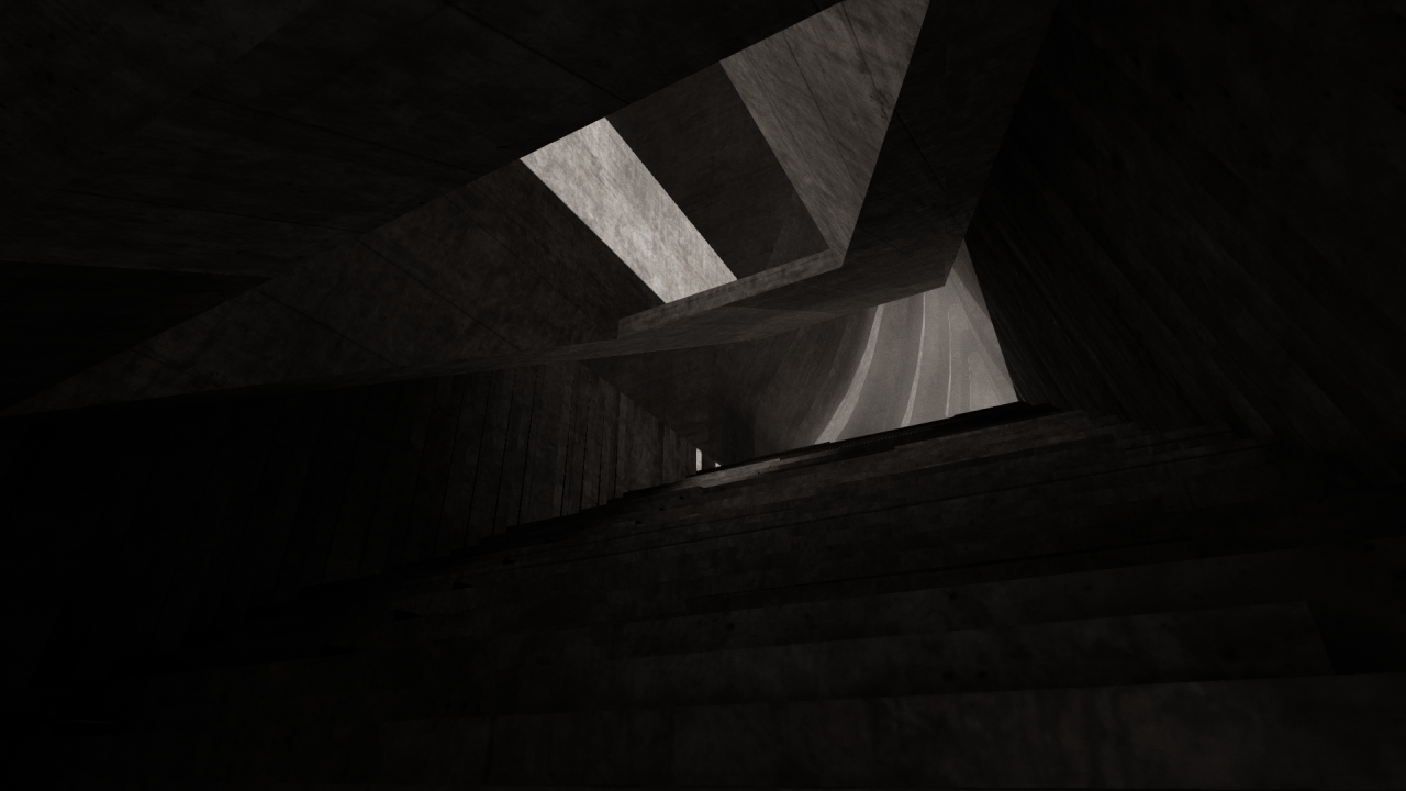
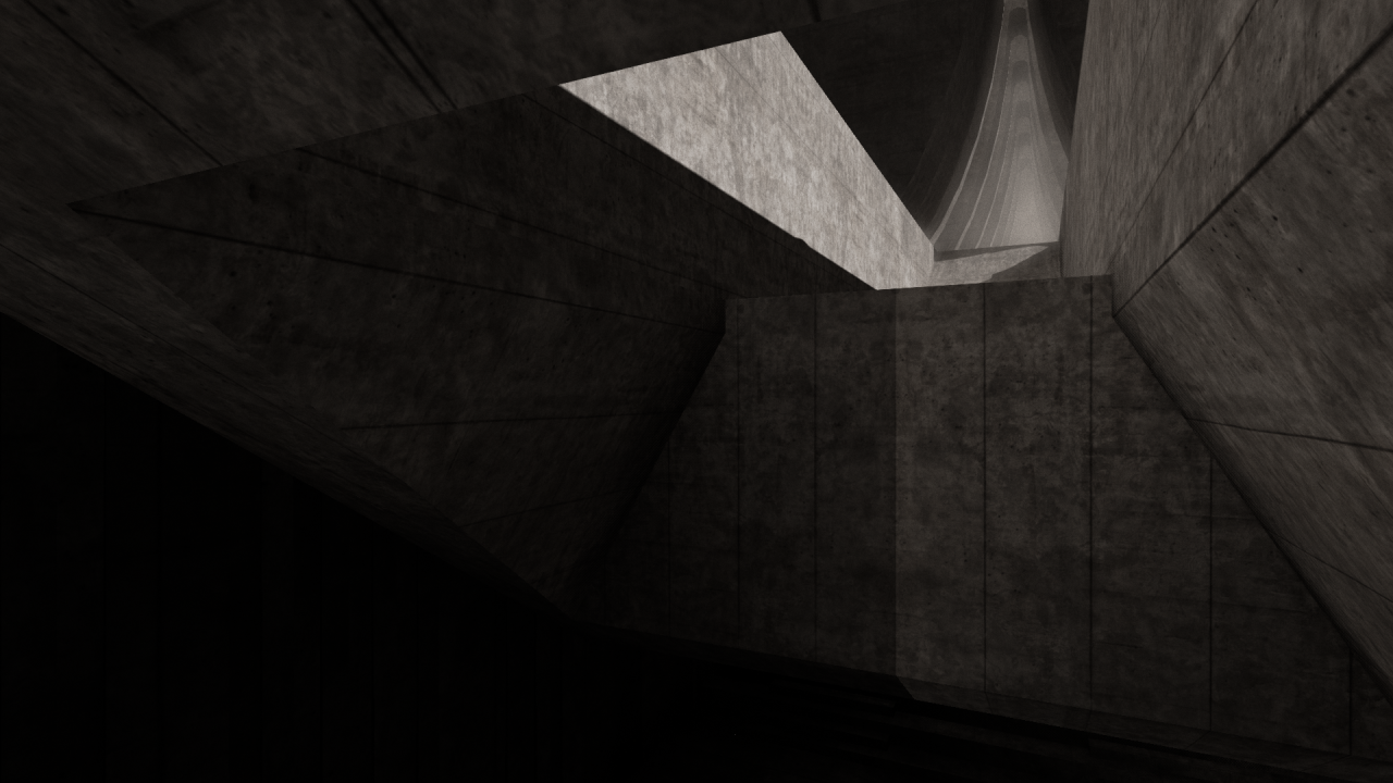


Replies
Seconded. The desaturated ones are stunning. The colored ones look like somebody's first Quake map.
This scene all uses the same texture at the moment, I've been considering just replacing it with a flat colour for the purposes of modelling out the whole scene before I get into texturing properly. The way I've scheduled myself for this project is I'm modelling first and getting all the shapes/contours/lighting/pathing working as a whole scene, then texture/decal work. I don't even think I've UVed properly yet :poly122:
Aw shucks
My tutor told me the same thing though. I'm going to re-work the arches to be higher and more detailed eventually. The godrays coming in from the side are too evident when you walk down, so I'm shifting the whole thing up a section and adding small crevices in the gaps. And yes, more concrete textures! There's a whole bunch of reference material I'm using for texture creation over on one of my blogs (here), but that's scheduled for later on this term
Thanks, yeah. Especially in the larger stairway, it gets really hard to see where you're going, so I've got to figure out how to lighten it up. Doesn't help either that the post-processing volume UE4 uses can't seem to agree on how light it should be for that area. I've walked it a hundred times and get all sorts of interesting brightness settings. Probably going to add a directional light coming in from the gap in the roof with low intensity and high bounce lighting, that should at least fix the dark patch
Yeah I'm not too happy with how the stairs came together either, they were really just a test to see if I could replicate this in UE4. I'm thinking I'll replace it with something like this, this, or this, as there's an area at the bottom of the stairwell that I want to connect to other parts of the map and it just doesn't work with the current stairs.
I have a basic map layout somewhere, I'll highlight the two areas I've worked on so far:
And two in-progress shots of the big square bit on the left. Based of the SFU campus and this.
Still not sure what to do about the background scenery. I'm thinking either large monoliths like artwork by John Harris, or a cityscape scene with big interesting-shaped skyscrapers. Maybe a combination of both?
I don't think I'll be able to work on this this week, I'm on holiday visiting my parents, and they're very active people. I've got a week and a half of free time after that before my course starts back up though, and I'll be working mostly on this to try and get the map geometry fleshed out.
I do have some in-progress shots of the big square bit to the left of the concept piece. I Didnt dare build the lighting, my laptop could barely manage 5fps for these shots (!)
Anyway, You can see the final version of this over on my blog, here: Linksies