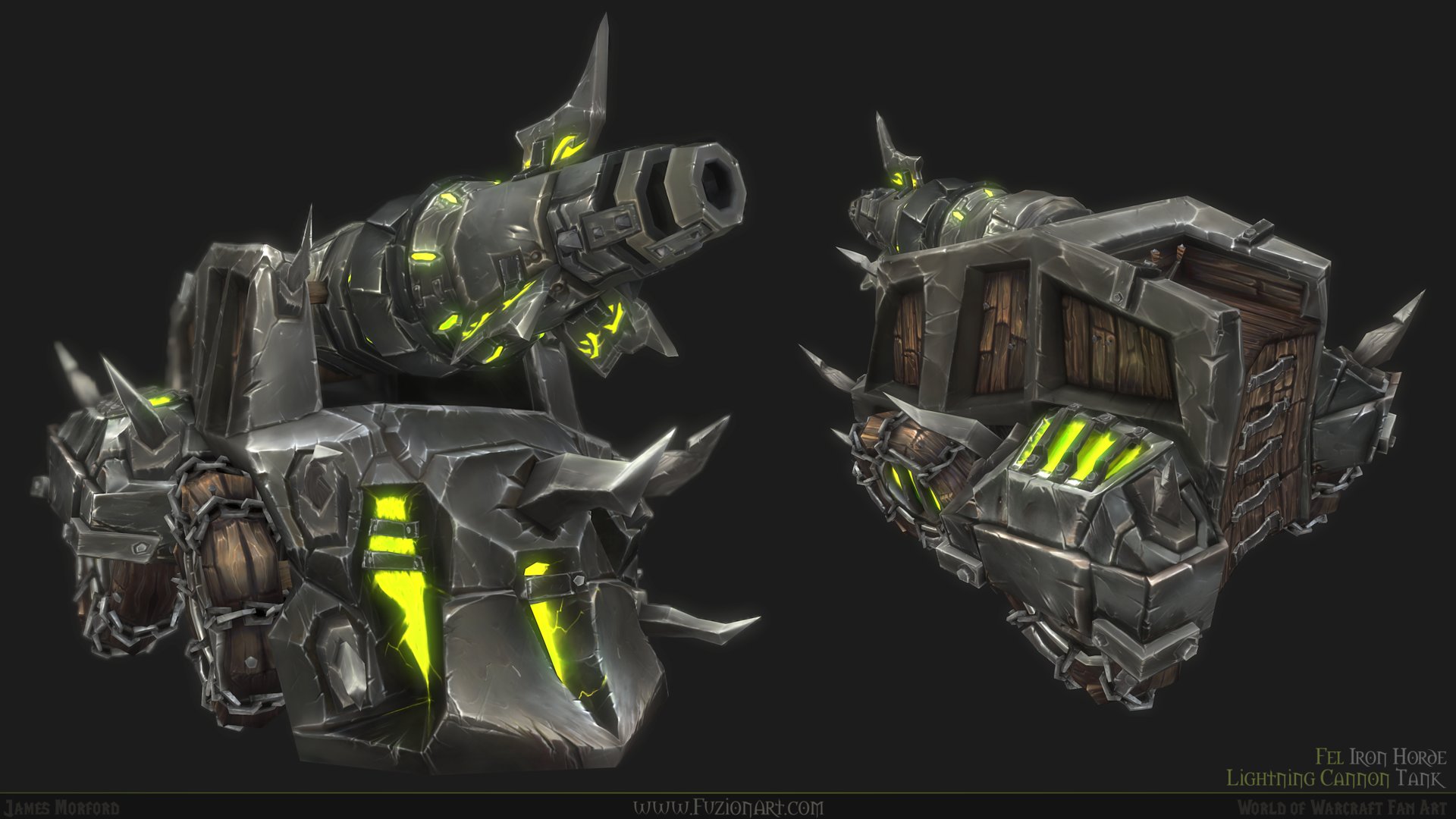
Awesome. My only criticism would be that it looks a bit blurry/murky (the render itself) - I think it would look better sharpened a bit. The textures are completely hand painted?
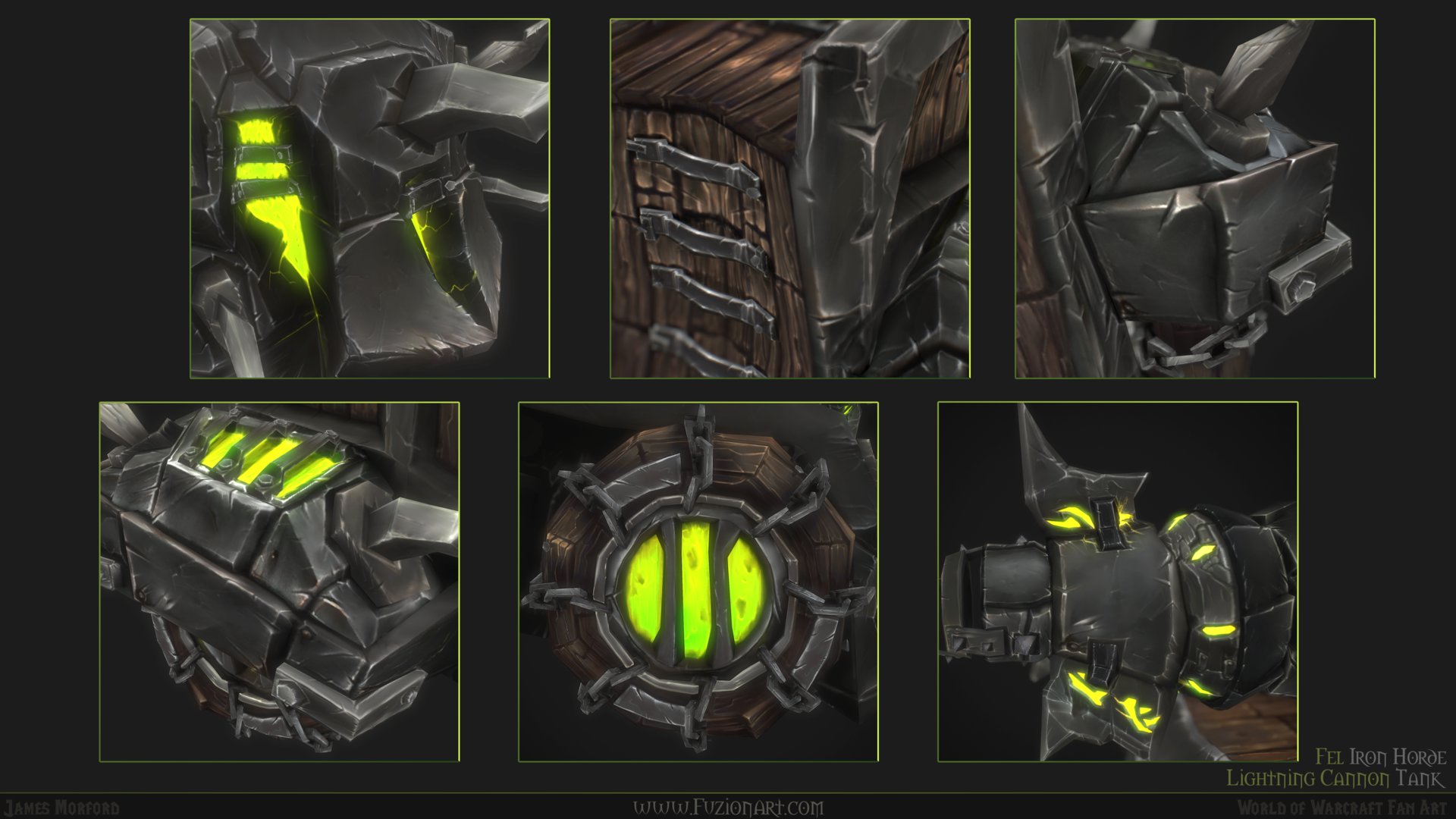
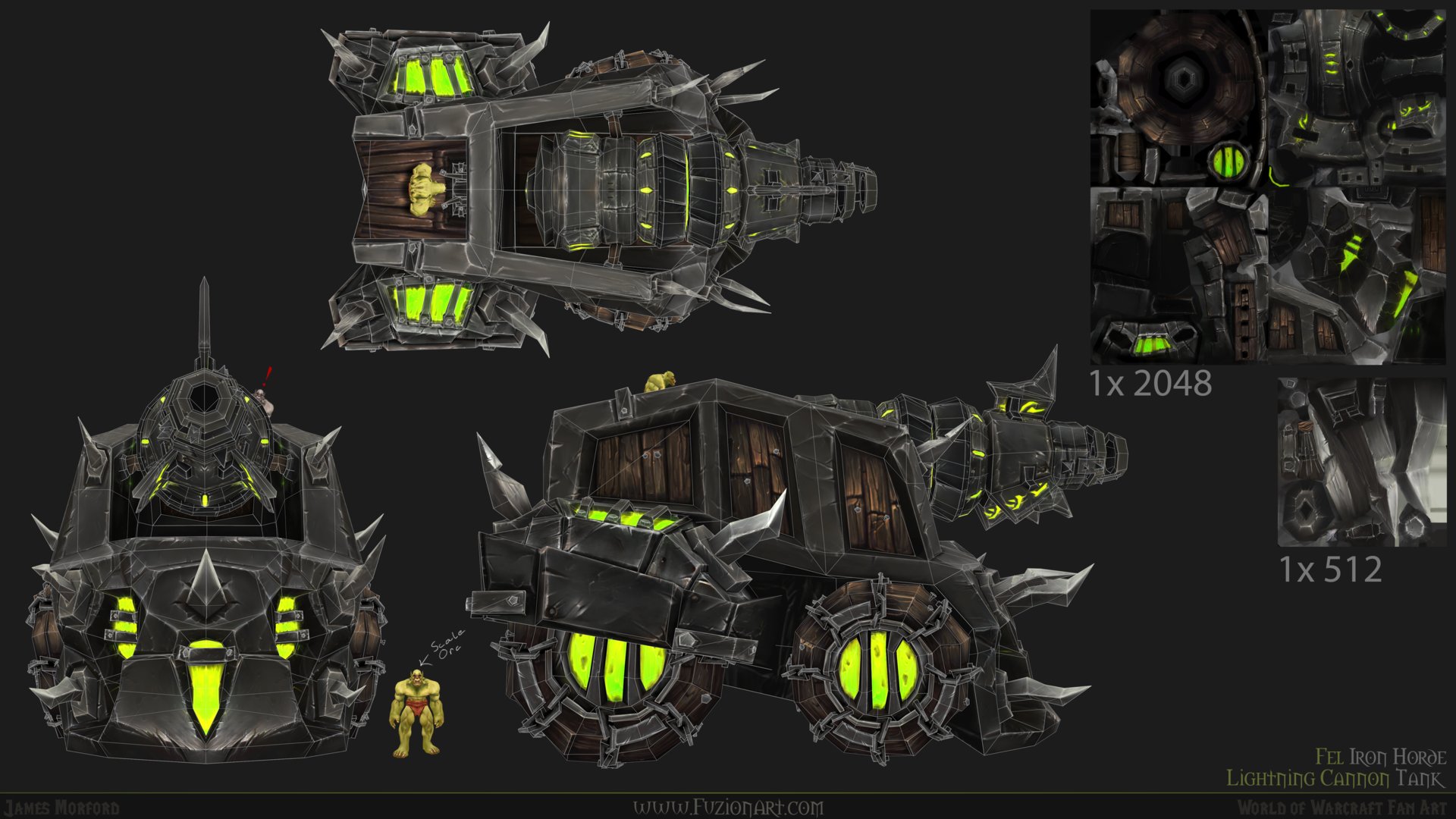
@alex1 - Yeah, I may have gone a little overboard with the bloom and depth of field. It is a bit crisper in the Marmoset Viewer. The textures are 100% handpainted, no highpoly bake or photos for this project. Thanks for the feedback!
As previously mentioned, I agree that the bloom on the renders are overboard. I personally feel without the bloom or depth the renders will still look amazing, and even more so like a WoW asset.
Hey!
Great work!
Just a few thoughts.
From a texturing standpoint, you could break up the symetry a little bit. I know it'll have technical implications but the overall look will benefit from it.
And finally, you can add more colour variations, especially regarding the emissive material. You can play more with the greens and yellows.
Replies
Fine work!
Great work!
Just a few thoughts.
From a texturing standpoint, you could break up the symetry a little bit. I know it'll have technical implications but the overall look will benefit from it.
And finally, you can add more colour variations, especially regarding the emissive material. You can play more with the greens and yellows.