The BRAWL² Tournament Challenge has been announced!
It starts May 12, and ends Oct 17. Let's see what you got!
https://polycount.com/discussion/237047/the-brawl²-tournament
It starts May 12, and ends Oct 17. Let's see what you got!
https://polycount.com/discussion/237047/the-brawl²-tournament
sci fi barrel
been a while since I posted my own work to get helpful crits on
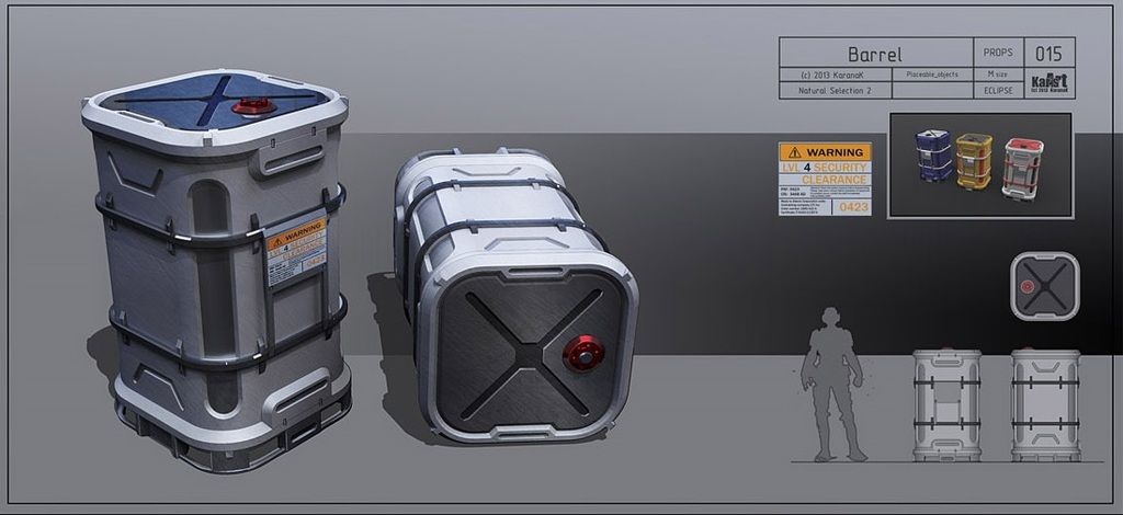
made a sci fi barrel based on this concept:

his portfolio here: http://karanak.deviantart.com/gallery/
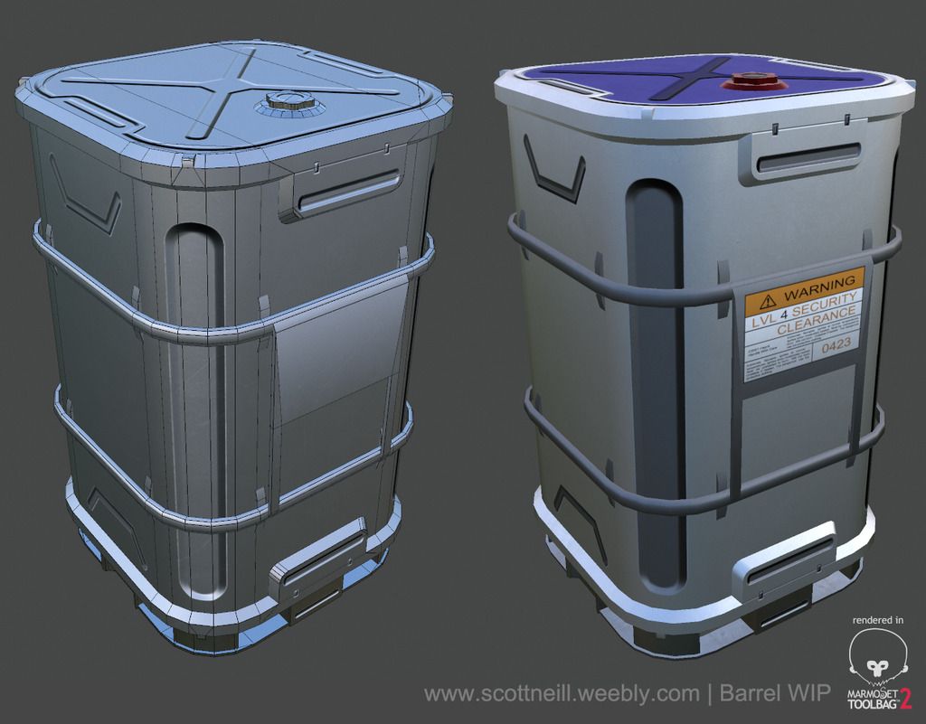
and my 3d version of it

** forgot to mention the tri count: 2058 tris
wanted to get some fresh eyes on it, I have to do some more work on the wear and tear and make the metal rings darker
made a sci fi barrel based on this concept:

his portfolio here: http://karanak.deviantart.com/gallery/
and my 3d version of it

** forgot to mention the tri count: 2058 tris
wanted to get some fresh eyes on it, I have to do some more work on the wear and tear and make the metal rings darker

Replies
Critics:
- The top bevel looks much bigger on the concept, due to this the "noses" aren't that visible in your version
- The "shield" at the front has a top bevel on the concept, this is missing at your version and this lead to a "round/flat" shield
- As the top is most likely the part the player sees, I would model the recess instead of using normal maps for it, same for the "corner recess".
- I would push the "pipe mounts" a little more to make them more visible in the final work
- As far as I can see you used something like ndo for the normal map, but no real high poly bake which leads to unbelivable sharp edges
-yea there is a size difference I'll have to do some adjusting to with that top lip bevel
-the shield at the front does have a bevel in my version, maybe not as dominate as in the concept and also doesn't have the lighting hitting it the same to show it off as in the concept
-i'm not sure how I feel about modelling all that detail, it's just a barrel after all and by no means a hero prop - not trying to sound lazy or make it seem like I'm not capable but not sure it's what a studio would ask for
-100% agree on the pipe mounts
Just getting the tire on the road for this one is ace work in itself.
Way to go.
here is a small update, beveled the top edge of the plate more to get that better reflection, also did that for all the tabs holding the two big rails on
changed up the texture to look more metal and less blah, think I got a good base going now. Just need to add in the small details now
thinking I should add some screws or something into my normal map on each corner of the metal plate to show how it's mounted? any thoughts on that
White materials are always tricky as well, try and get some discolouration and some scuff marks that aren't just in your roughness and maybe put a bit more love into the label... little bit of scuffs / dirt (maybe fingerprints in the roughness) could add a bit.
I would try and set up your presentation shot a bit more as well, you can make a quick lighting setup in marm that will help make this pop a bit more.
If you keep pushing this a bit more you'll have a solid asset for your portfolio
and now that I look at it i'll have to adjust that too, thanks Nick
I guess i'll do another pass on it when I get some free time.... probably not till next week :P