[UE4] Abandoned Asylum Ahs
Hey Guys,
Thought it was finally time to make a thread for this thing as I am probably at a stage where I would appreciate feedback and critique. The project is a about 65% ish complete. So still a fair bit to do. My original concept was based around a few images I found online of some abandoned asylum and developed from there with the attempt to add something a bit more realistic to my portfolio as I tend to stick to my comfort zone of making Sci-fi projects
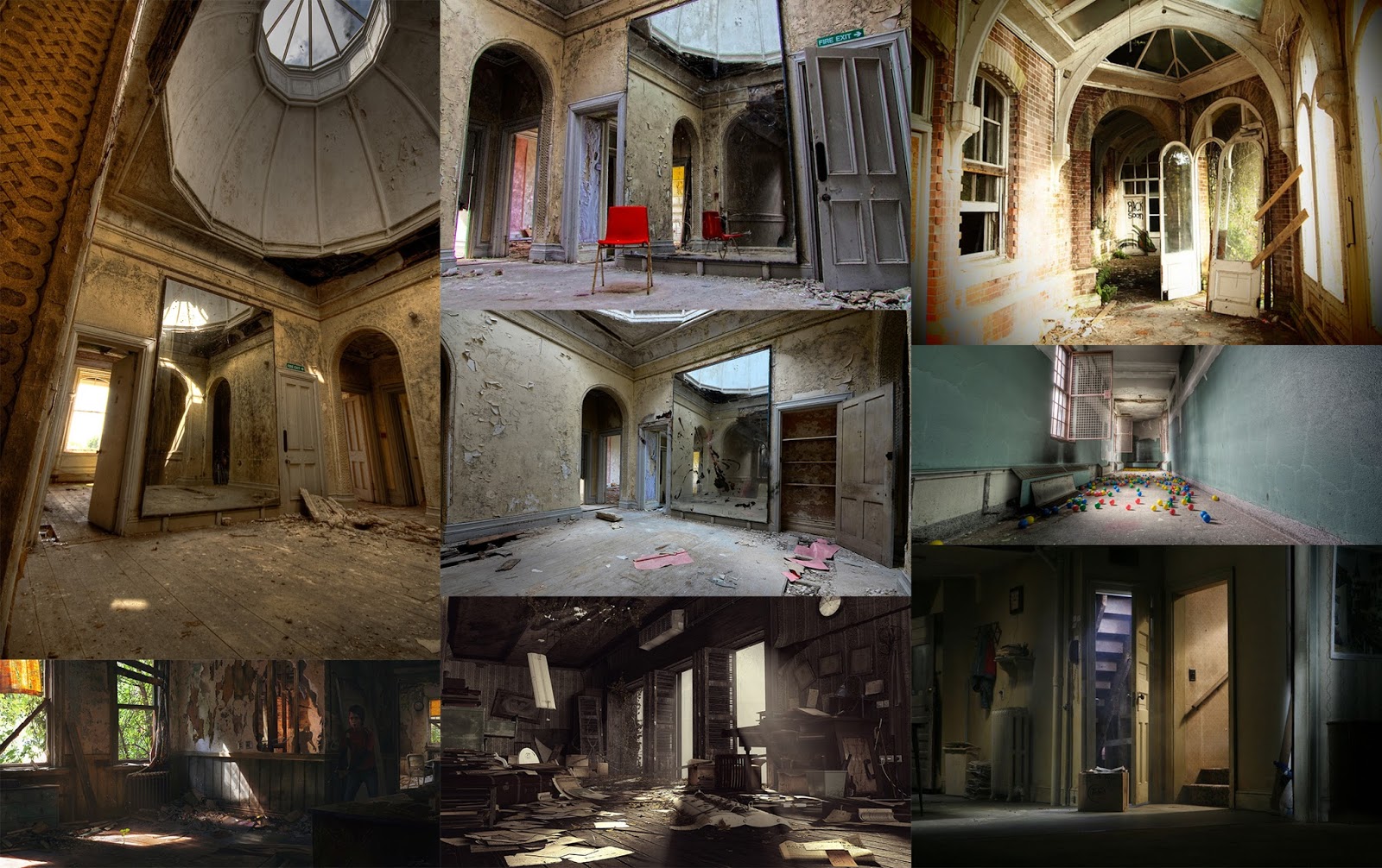
Here is some of the original reference mood board. I have 3 main areas so far, an office, entrance hall and hallway. Was originally planning on doing a bathroom but decided to cut it because it was too much work.
I am also influenced by the tv show american horror stories so I am going to put a few cameos in from the tv show just for fun. As mentioned I wanted to go for something realistic but also really push myself and make the quality of the project as good as possible. I wanted it to be the sort of style of the Last of us with materials similar to the Order.
All of the material work and props are done using Substance Designer and Painter btw
Here are some shots of the scene how it stands at the moment
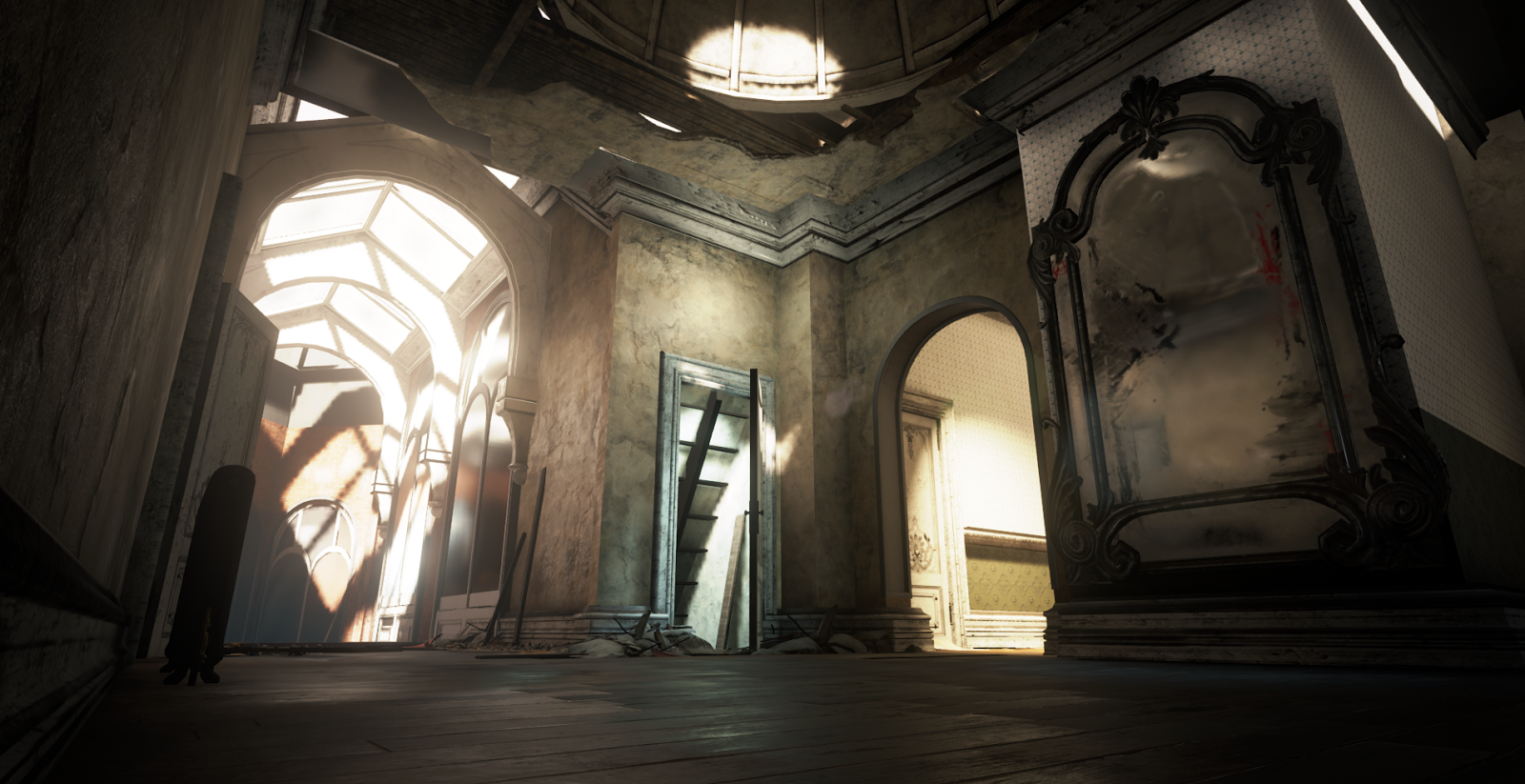
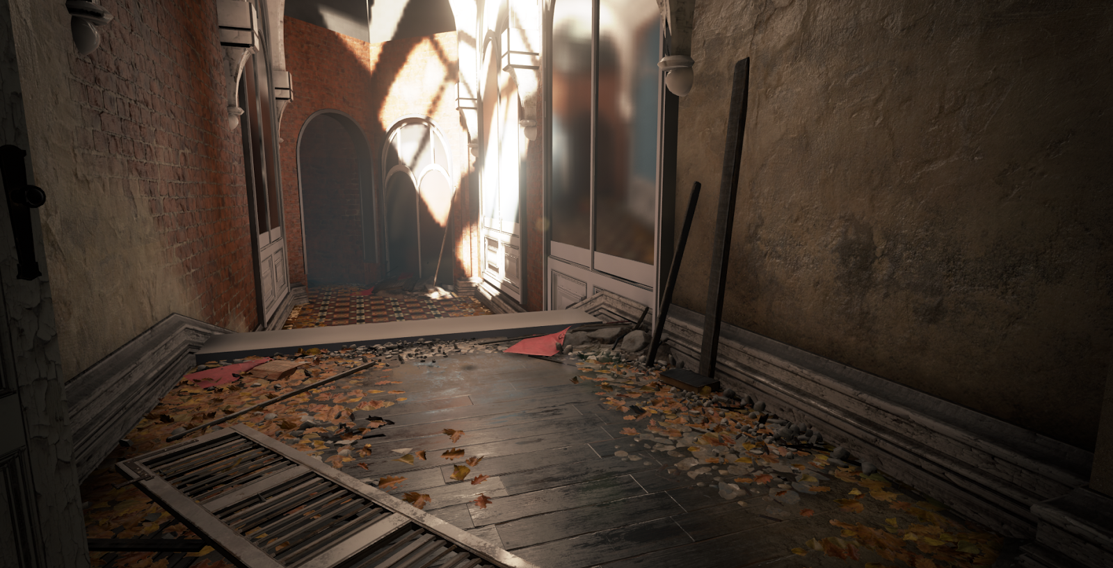
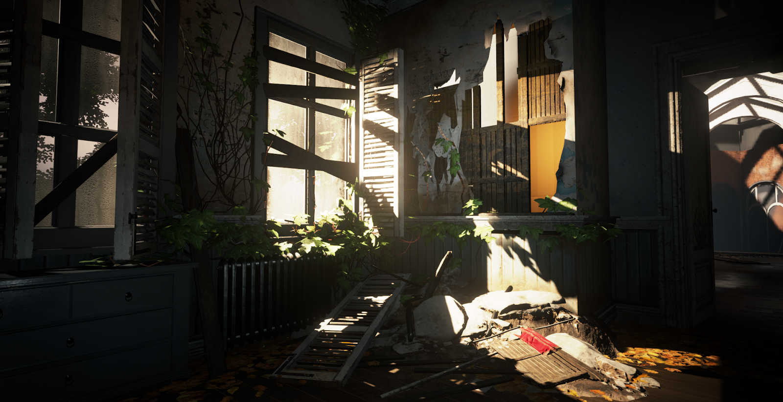
Few Shots of the Materials, still working on these
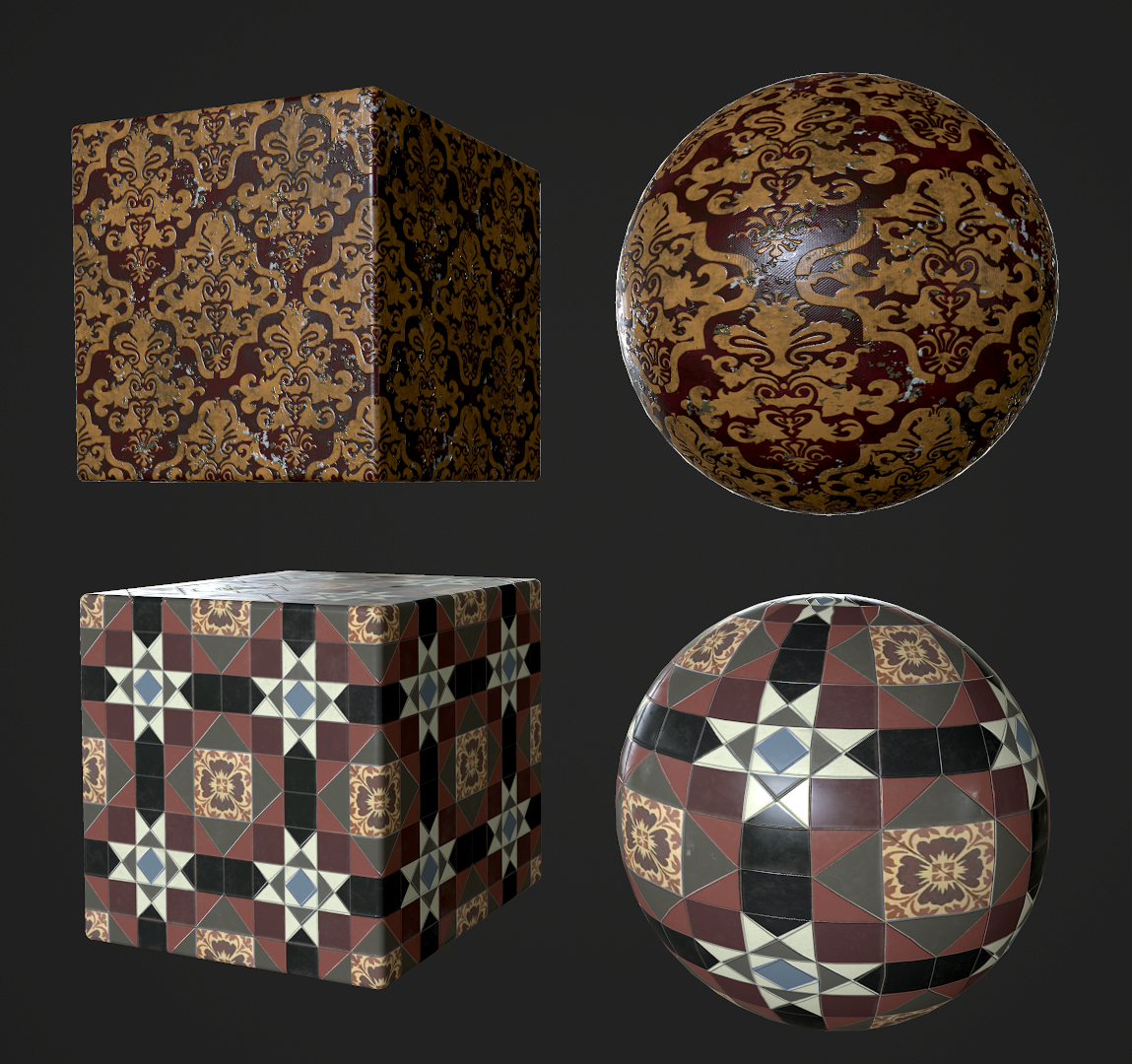
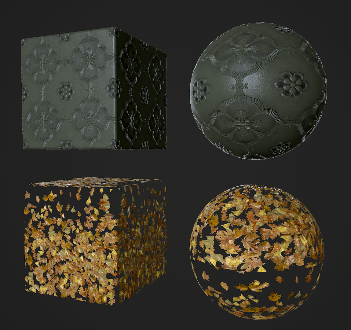
Thought it was finally time to make a thread for this thing as I am probably at a stage where I would appreciate feedback and critique. The project is a about 65% ish complete. So still a fair bit to do. My original concept was based around a few images I found online of some abandoned asylum and developed from there with the attempt to add something a bit more realistic to my portfolio as I tend to stick to my comfort zone of making Sci-fi projects
Here is some of the original reference mood board. I have 3 main areas so far, an office, entrance hall and hallway. Was originally planning on doing a bathroom but decided to cut it because it was too much work.
I am also influenced by the tv show american horror stories so I am going to put a few cameos in from the tv show just for fun. As mentioned I wanted to go for something realistic but also really push myself and make the quality of the project as good as possible. I wanted it to be the sort of style of the Last of us with materials similar to the Order.
All of the material work and props are done using Substance Designer and Painter btw

Here are some shots of the scene how it stands at the moment


Few Shots of the Materials, still working on these


Replies
Subbed!
@hold: Yer I might open up some of the roofing and put some puddles in so that it feels like its rained and then the sun is drying it out a bit.
@Bruno Afonseca: Yer definitely have dust particles planned, same with the walls I have a dusty version of the wood that needs redoing. I also have dirt that I vert painted in but I need to brighten it up so it contrasts against the wood better.
Cheers for all the critique and comments guys
@Row': Cheers dude will be adding some stuff reflecting in those mirrors to add to the creepy element I think.
@MiguelBernardo: Thanks for the kind words, shall keep refining and polishing not to far to go
Here is an update to the scene, been finishing off the assets using Substance Painter so the scene is starting to reach completion now (about 90%)
I have a few more tasks left to do before wrapping this up
-Fix up some materials, textures and normal maps
-Any outstanding placement
-general post process and lighting pass
Just one thing, the mapping on the floor there seems too big for a carpet and miss some trims on the sides.
Also here's a good site for ref of this kind of thing
www.opacity.us
and like vincent said: there could be more "transitions" for certain materials. Suddenly going from carpet to wood with no "transition" can really break the realism and can make things feel "lego-y".
Same for the stucco of the ceiling and how it meets with the walls.
Some trims or even slight wear where two materials meet would really smoothen things out between materials.
@DEElekgolo: Cheers man awesome critique, I have a few volumetric's in there but I shall add some more and dust particles is a good idea. Thanks for the link as well, that will definitely be useful for finishing the scene.
In regards to the comments about Lego-y stuff I totally agree, I had some decal transitional things planned so I see if I can put that in for the next update to make some of those transitions better. I need to add some trims in, in some places as well that I had forgotton to do. So I shall do that as well which should help.
Cheers for the feedback all.
For now here are some Asset renders I did yesterday
All textured in Painter
Also cheers for the comments guys, the ornament texture were created from a high poly kit bash in max and then baked to a low poly. I textured it using substance painter to get the metal values and dirt build up in the ao and scratched on the edges.
In the final shot (last set of shots) what is going on outside those windows? The black foliage is so harsh/hard to tell what is going on out there.
The leaves in the hallway look great but look odd how they just stop almost like they are going underneath the trim boards. Leaves would bunch up in the corners and slightly overlap the boards I'd imagine. It's not a deal breaker, but a few single modeled leaves that float above your bigger mesh of leaves that break that harsh line would go a long way for believability.
Props though, looks great!
I will have a think about a video flythroigh see if I can put one together as I agree it would show it off some more.
Cheers pixel patron all very valid points. I think the one about bunched up leaves is a good idea I may do that if I have time. Someone else suggested if. Think it may be the alpha on Windows may have a look.
What would everyone like to see for breakdowns? I see if I can do some.
Foggobbler it's three meshes in max for the walls broke them up for lightness. But props are all instances. Structural ones are the biggest meshes. They are evenly quad for vert painting too.
Would be great to see breakdowns of some of the wall meshes. Interested in seeing the process with any modelling and sculpting.