The BRAWL² Tournament Challenge has been announced!
It starts May 12, and ends Sept 12. Let's see what you got!
https://polycount.com/discussion/237047/the-brawl²-tournament
It starts May 12, and ends Sept 12. Let's see what you got!
https://polycount.com/discussion/237047/the-brawl²-tournament
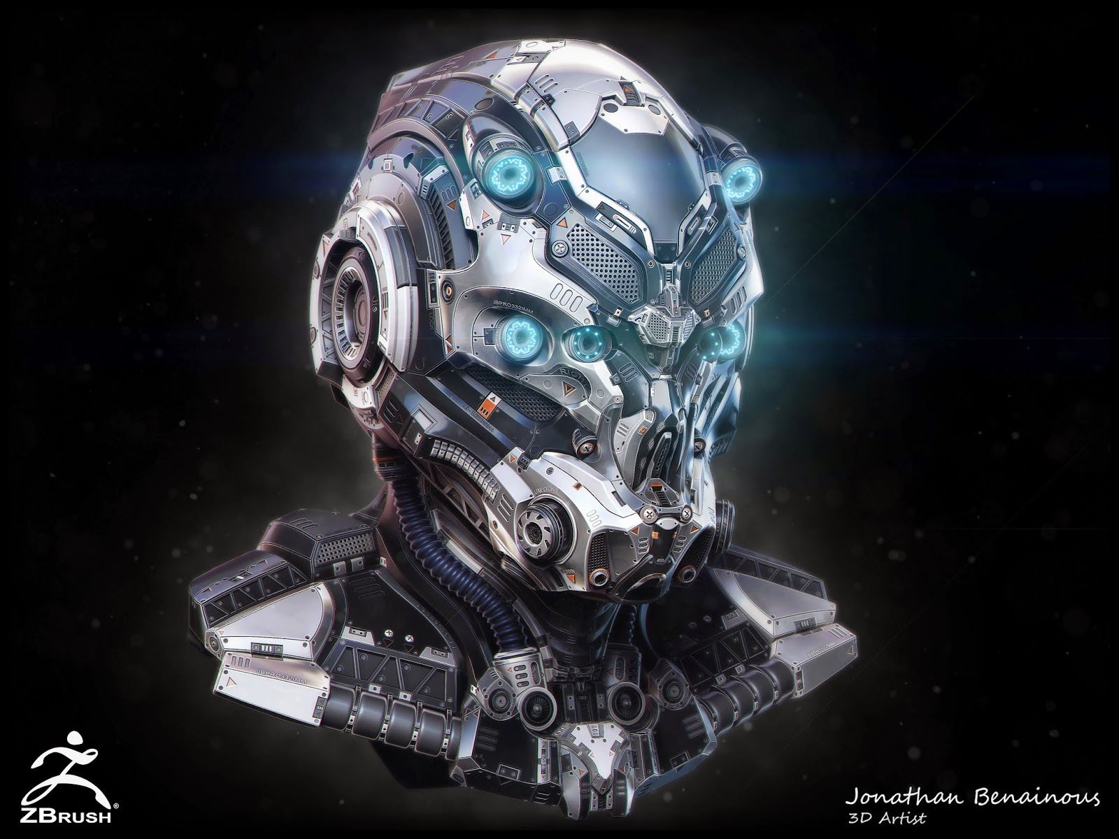
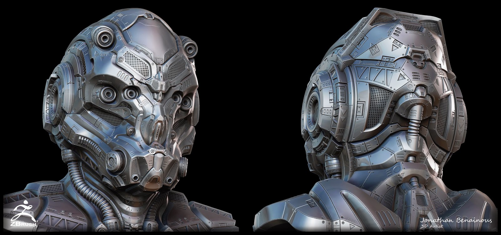
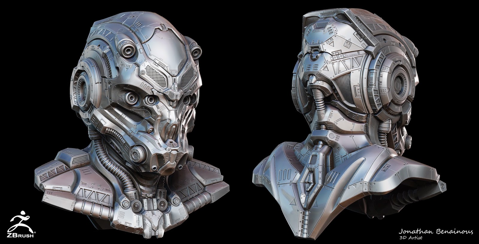
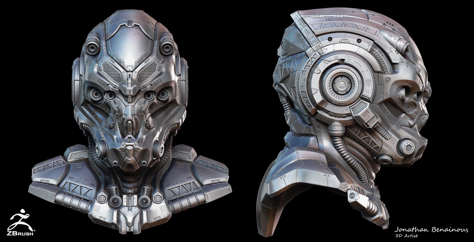
Sci-Fi Helmet by Jonathan BENAINOUS
Hi guys,
Here is my latest personal project done using Zbrush4r6, Maya and Photoshop.
The goal of the project was to create a Sci-Fi Helmet, fully concepted and created by myself with the intention of pushing my knowledge of sculpting hard surfaces in Zbrush.
I'm really excited to finally be able to share this project with you all and I hope you will like It !
For those who are interested, I've also collaborate with the magazine 3D Artist, for a pretty detailed step by step tutorial.
So if you want to have more explanation about my method and learn tips & tricks on how to realize this type of hard surface helmet, the article will published in 3D Artist Issue 84 !
Cheers,
Jonathan
Benainous

My portfolio : http://jonathan-benainous.blogspot.fr/
My LinkedIn : https://www.linkedin.com/in/jbenainous
Here is my latest personal project done using Zbrush4r6, Maya and Photoshop.
The goal of the project was to create a Sci-Fi Helmet, fully concepted and created by myself with the intention of pushing my knowledge of sculpting hard surfaces in Zbrush.
I'm really excited to finally be able to share this project with you all and I hope you will like It !
For those who are interested, I've also collaborate with the magazine 3D Artist, for a pretty detailed step by step tutorial.
So if you want to have more explanation about my method and learn tips & tricks on how to realize this type of hard surface helmet, the article will published in 3D Artist Issue 84 !
Cheers,
Jonathan
Benainous


My portfolio : http://jonathan-benainous.blogspot.fr/
My LinkedIn : https://www.linkedin.com/in/jbenainous
Replies
Too many people are mastering hard surface sculpting in zBrush for me to skip learning it in favor of using Maya for this part. I guess as soon as I get my soft materials skills to an exceptable level, I will have to make a push for those. I should get my hands on that tutorial.
Baking in progress
SCI-FI_HELMET_BAKING_WIP.jpg
My portfolio : http://jonathan-benainous.blogspot.fr/
My LinkedIn : https://www.linkedin.com/in/jbenainous
How do you made the LowPoly?
zRemesher? Retopo, which Tool? ^^
Your bake down is looking so good!
Great work! hats of to you sir! and i must stop using exclamation marks!!!
Here is a little update of my Baking still in progress.
I hope you'll like It
@Gazu : I use the Quad Draw Tool in Maya for the retopo.
BAKING_WIP_SHARPEN.jpg
...you clever bastard you
Nice to see that some people still speak out, nobody is helped by Yes sayers :P
100% agree
It indeed is extremely well executed, although the textures are rather basic and rely on form and shiny materials. The helmet look aesthetic but its not authentic, no human will ever build a similar looking helmet in the future im sure, form follows function is the first commandment in industrial design, and authenticity is the most important aspect (imo) especially in futuristic concepts. There is a lot of beauty in simplicity and adding detail often does not increase quality, doing more with less is often a nice goal. The signature font also bites with the subject but thats a minor thing.
I dont want to talk down your efforts, its very nicely done and hope this helps your future designs
First, thanks a lot guys for all those great feedbacks !
I also would like to thanks Polycount who gave me the chance to be a part of the Polycount Recap, wich is amazing
As you can see, I finally finished the baking of the normal map.
Now my next step is to texture my Helmet with Substance !
I Can't wait to share this with you all !!!
I had the pleasure to write a very detailed tutorial about How to sculpt and construct a Sci-Fi Helmet using program such as Zbrush, Maya and Photoshop.
The issue 84 is already available, so check It out and let me know what you think about It !
https://www.imagineshop.co.uk/magazines/3dartist/3d-artist-issue-84.html
A very big thanks to Imagine Publishing and Carrie Mok for their professionalism. It was a great pleasure to work with you guys and to be featured by such a famous magazine !