The BRAWL² Tournament Challenge has been announced!
It starts May 12, and ends Oct 17. Let's see what you got!
https://polycount.com/discussion/237047/the-brawl²-tournament
It starts May 12, and ends Oct 17. Let's see what you got!
https://polycount.com/discussion/237047/the-brawl²-tournament
Medieval House - Feedback
Hi guys, this is my first thread on this forum. I'm a newbie in 3D, and I wanted to show you my works. Tell me what is right and what is wrong, i've a lot to learn and I really want to improve my skill.
Thank you guys
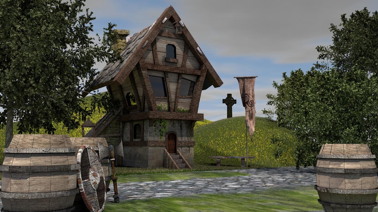
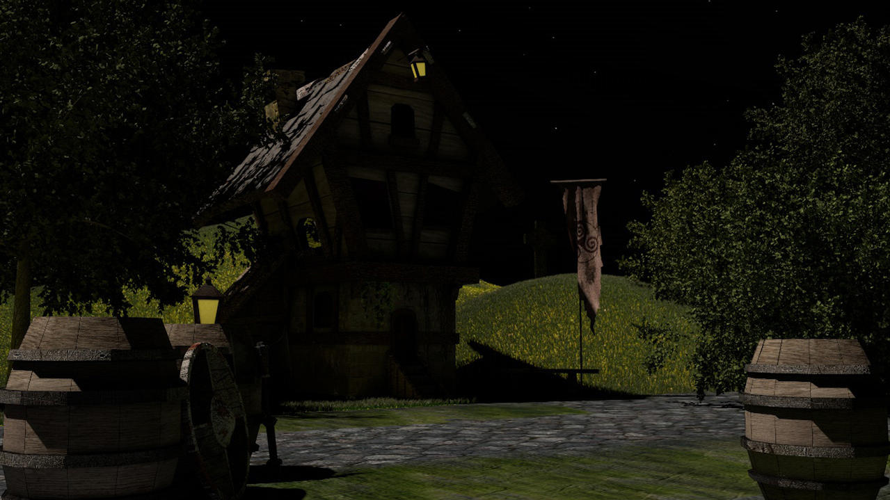
It's a medieval house with some props around


Thank you guys
It's a medieval house with some props around


Replies
1) Think about your texture placement, the orientation of your textures can have a powerful aesthetic effect. For instance on the roof panels your wood grain is going horizontally which is good, try changing their tiling to a lower count. This goes for the main wooden walls as well, they are tiled rather low.
2) Don't be affraid to add some extra geometry to your main models. At the moment they look extremely blocks, adding an extra vert or poly here or there will improve this.
Chamfer the edges of the barrel extrusions so they slant in and out of the main form.
Im no expert but think these will improve it somewhat