The BRAWL² Tournament Challenge has been announced!
It starts May 12, and ends Oct 17. Let's see what you got!
https://polycount.com/discussion/237047/the-brawl²-tournament
It starts May 12, and ends Oct 17. Let's see what you got!
https://polycount.com/discussion/237047/the-brawl²-tournament
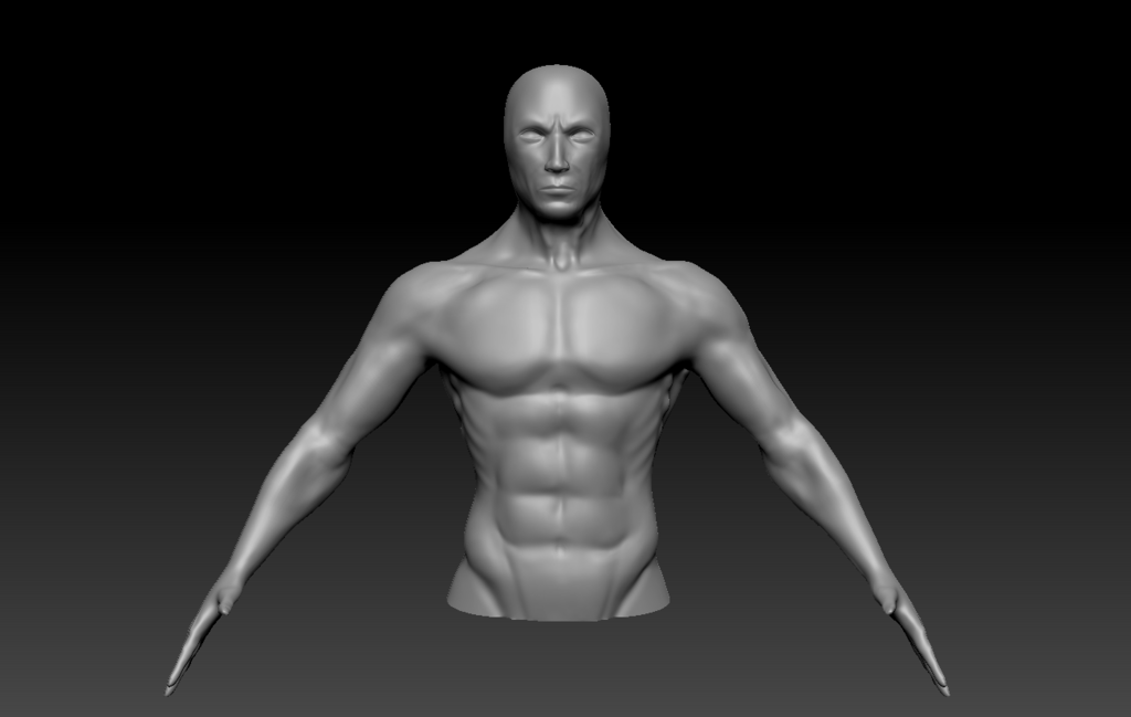
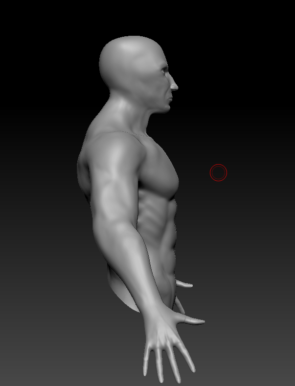
Warrior Character WIP
Hey everyone!
This is my very first attempt at using zBrush and modelling a character so any critiques would be really welcome!
I started by modelling a lowish poly version of the character in Maya, and then I took it into zBrush to just detail some of the definition Ignore the sculpt from the belly button down as that's where his pants start.
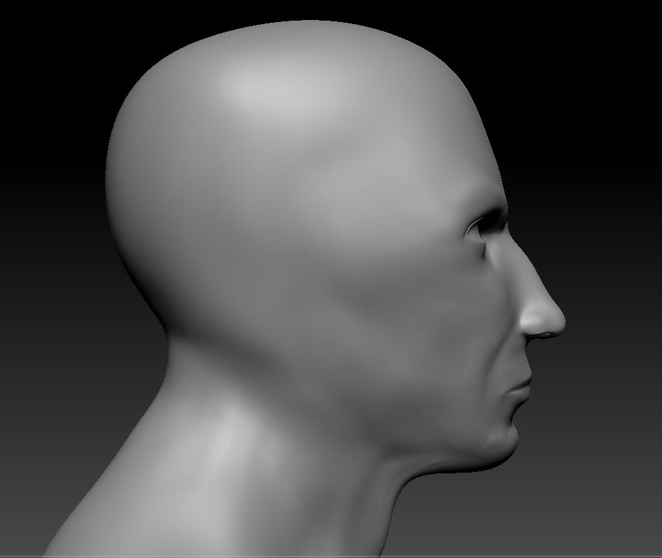
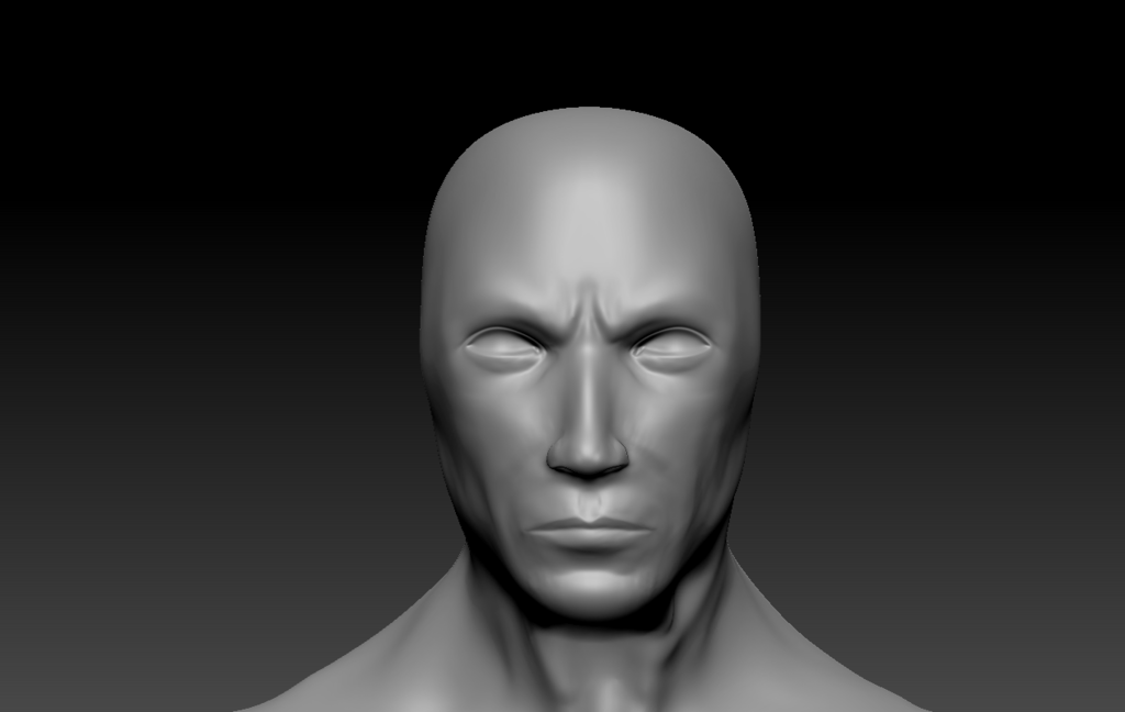
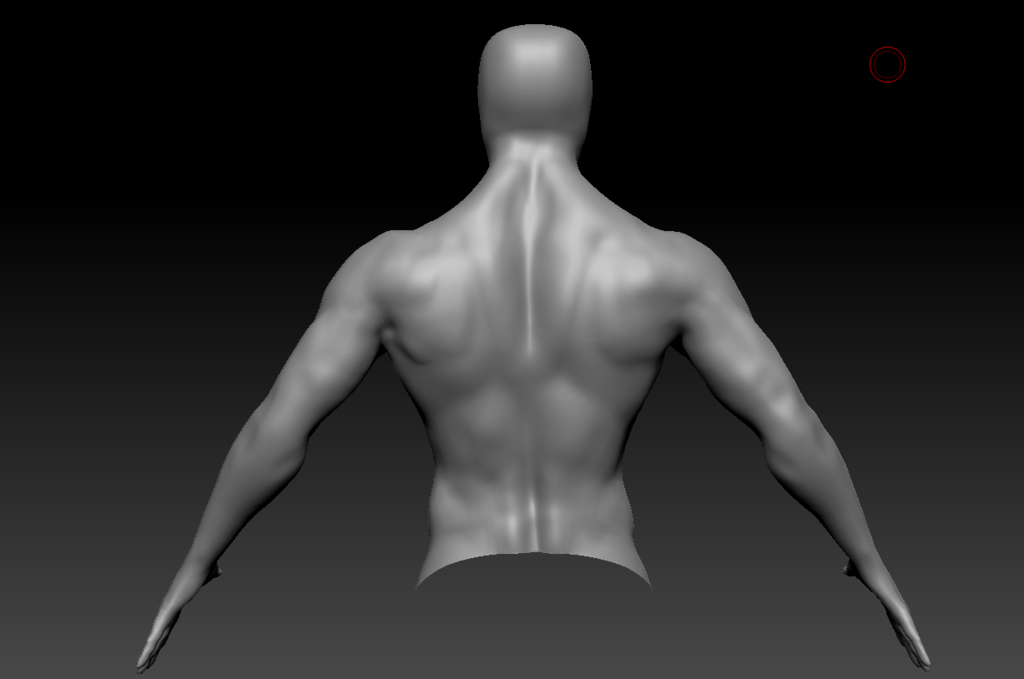
I haven't done ears because he's wearing a helmet and I have to have it finished by next week so ears will be a task I'll tackle on my next attempt. When I get a chance I'll get some pictures with his accessories.
Thanks!
This is my very first attempt at using zBrush and modelling a character so any critiques would be really welcome!
I started by modelling a lowish poly version of the character in Maya, and then I took it into zBrush to just detail some of the definition


I haven't done ears because he's wearing a helmet and I have to have it finished by next week so ears will be a task I'll tackle on my next attempt. When I get a chance I'll get some pictures with his accessories.
Thanks!
Replies
Check some reference for your serratus anterior groups. Right now they look like ribs with their angle and definition, especially from the front.
You definitely have a solid start though. Just keep tons of reference whenever you do any new character or project, as that will help you immensely.
http://www.polycount.com/forum/showthread.php?t=152706
Hope that helps, if not i am sure these two guys got you covered.
@Jarran I'll look up some more reference to compare and try and work it out, I think it's probably him being too broad. Thanks!
@THendersonVFX Yeah I accidently switched off symmetry when working on the teres major and delts area.. oops.. I'll make sure I keep it more symmetrical on my next attempt and just add some differences at the end.
I completely agree that the serratus anterior and ext. obliques look like ribs haha, when I get a chance I'll redo them. Thanks so much for your help!
@DavidCruz Any info helps
Through this week I should have some more progress to post as it's due in a week
Cheers!