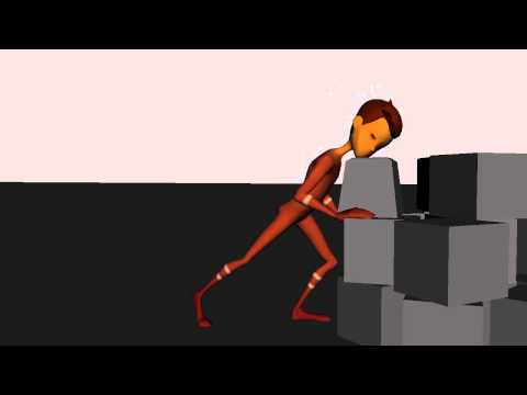
Andrew Flatt Demo Reel
Any suggestions and tips are welcome.
This is my work from my final year of my Game Development Program
[ame] https://www.youtube.com/watch?v=v4lSZbq_Y-A[/ame]
This is my work from my final year of my Game Development Program
[ame]
 https://www.youtube.com/watch?v=v4lSZbq_Y-A[/ame]
Replies
Just some quick notes
shot 1 - shooter - Speed this up over all. The kickback lacks weight.
shot 2 - armoured guy - Characters right knee is distracting. It moves a LOT at the end, compared to the rest of him. Its almost as if the rest of the body stops and the knee still moves. Pretty good shot otherwise. But zoom in. Let the watcher actually see the animation.
shot 3- the run - good stuff. check the hips. when the right leg is forward, the right hip should be forward and down. I think its forward and up? Hard to tell without being able to scrub. And the arms are pretty one directional. forward and back on. get some swing in there to mix it up. elbows going out and in type of stuff.
shot 4 - the walk. same deal with the hips. its forward and up when the leg is forward.
shot 5 - probably your weakest piece. stiff posing. not much overlap or anything. you could get away with cutting this from your reel, i think.
shot 6 and 7 are pretty good. You could do with a bit more fluidity. bigger arcs and such. some feels a bit pose to pose. I think the biggest issue is you are using the same rig for 2 different voices. I would try to avoid that. It can be confusing, especially when the shots are right after another. It almost instantly takes the viewer out of it all. What you could do right now is just change the hair colour and clothing colour on the second shot. give him white hair and what not. Maybe a beard? Super easy fix that will help with some confusion.
but ya, good start man. Keep pushing. you`re definitely on the right track. Some simple, fast changes could really improve how it views.