[UE4] Moirai Industries - Side Project
Hey everyone, it's been a very long time since I've posted anything on polycount, so I thought this is a great to show my new finished project.
This is a side project I've worked on for the past couple months. Everything was created by myself. Programs used: Photoshop, Quixel Suite, Maya, Zbrush, Marvelous Designer and UE4. Enjoy!
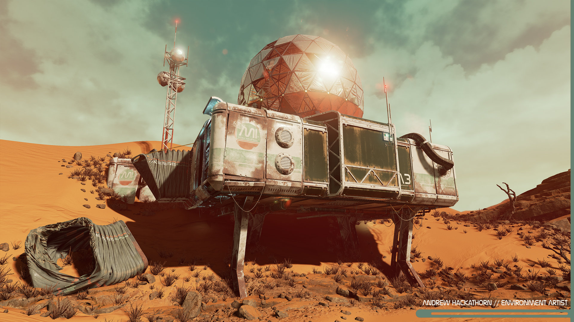
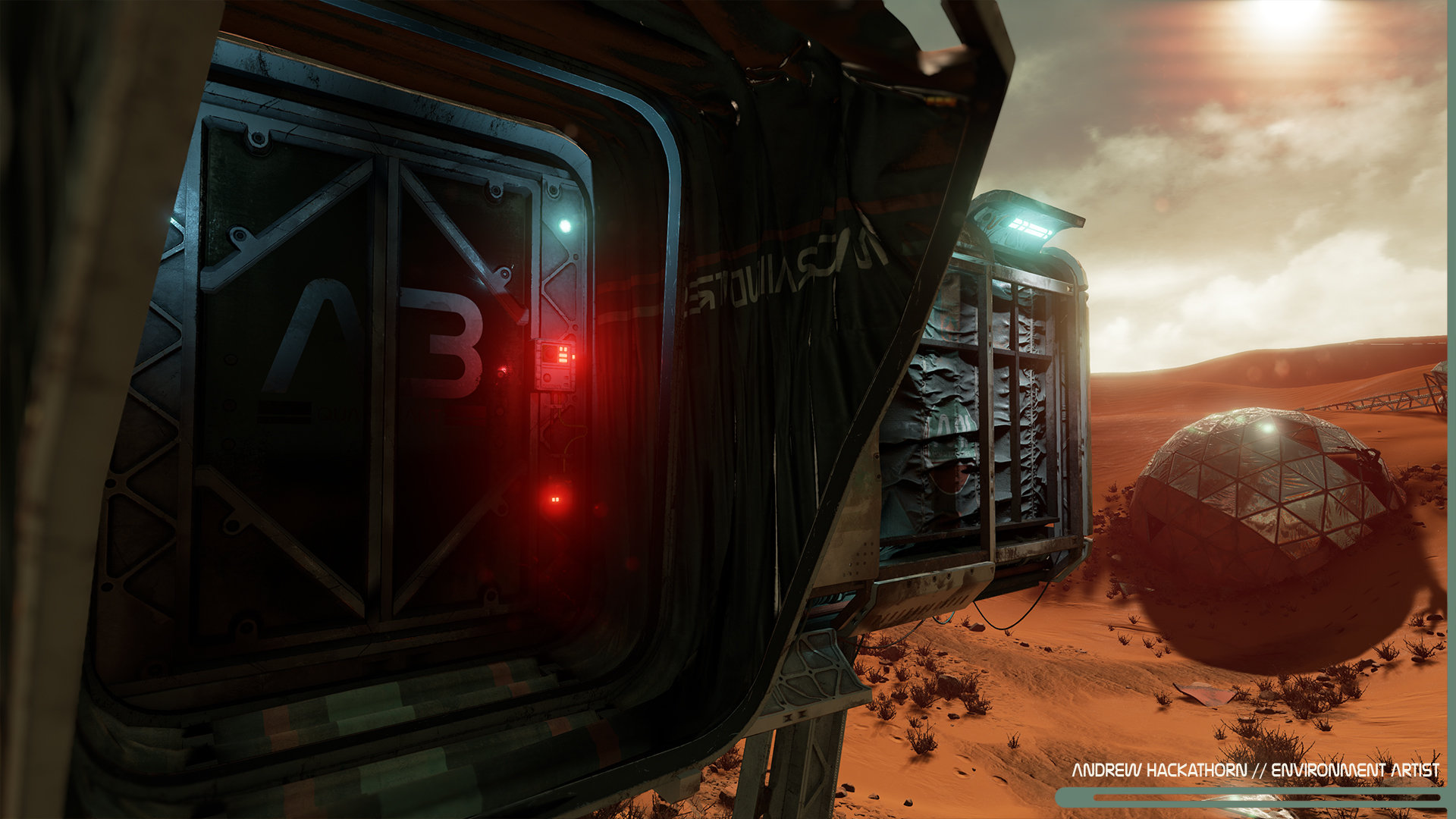
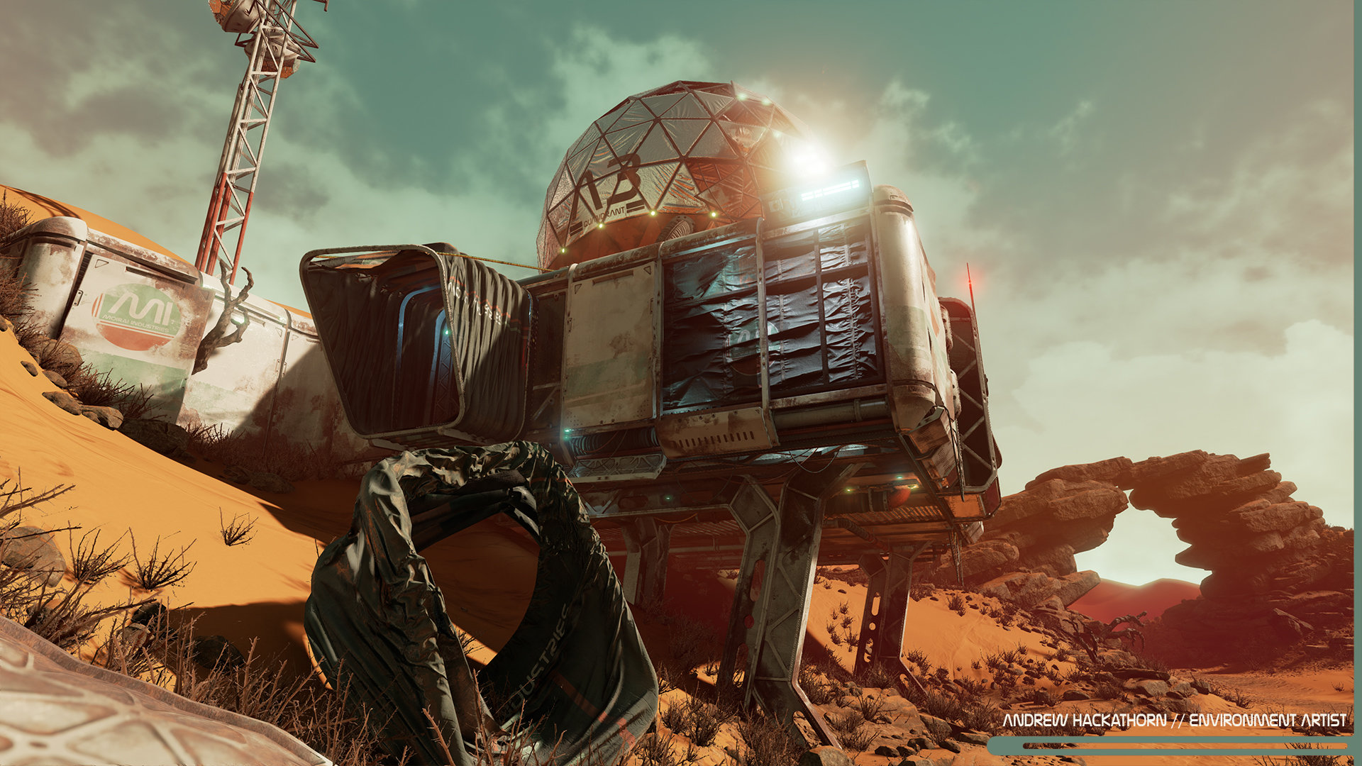
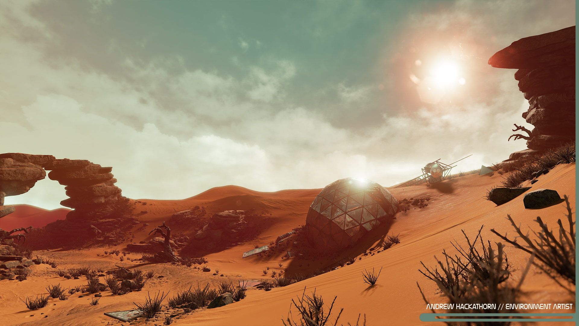
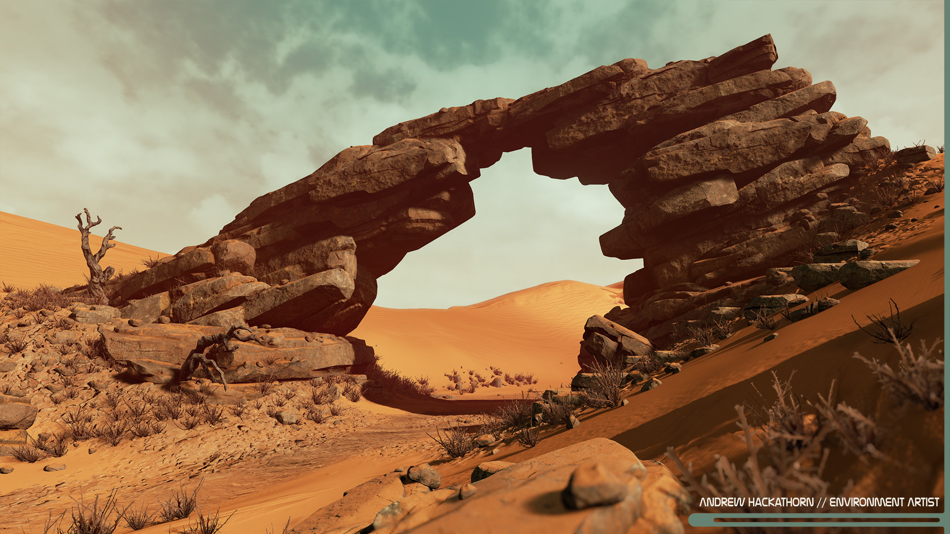
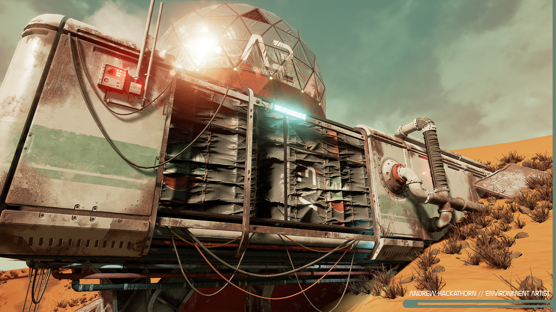
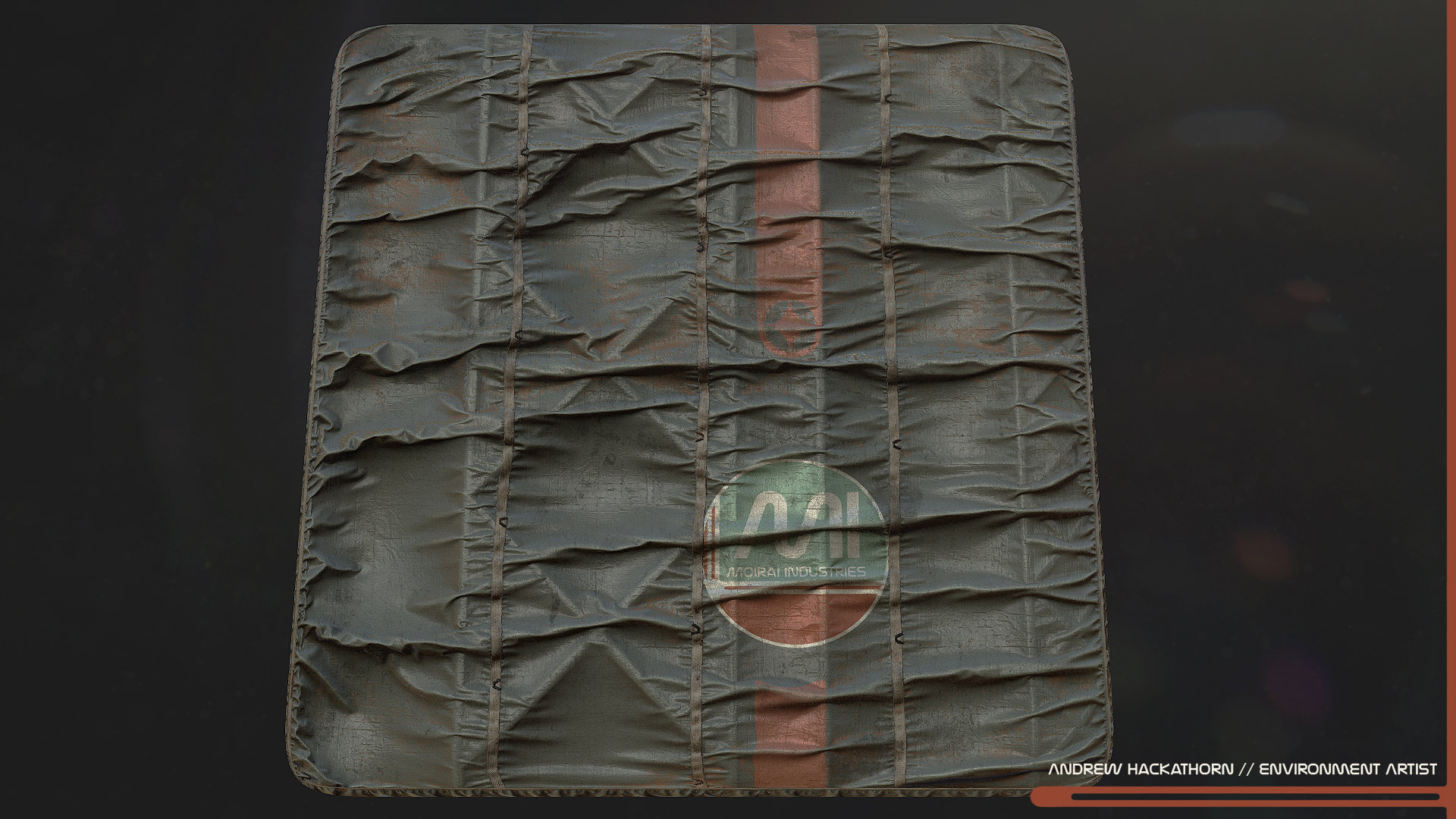
More shots of this project and other work at my Art Station site.
This is a side project I've worked on for the past couple months. Everything was created by myself. Programs used: Photoshop, Quixel Suite, Maya, Zbrush, Marvelous Designer and UE4. Enjoy!


More shots of this project and other work at my Art Station site.
Replies
Great job
Congrats btw!
Thanks Chris, it's been awhile!
@lxenonl - I used Marvelous Designer for those materials. I would take the high-poly from MD and bring it into Zbrush. From there I clean up the mesh and add some extra detail in Zbrush. For the tileable material, I would bake my normals and AO from Zbrush. For the accordion door, I would decimate the Zbrush version to get my low-poly and bake in another program. I hope that helps a bit. Thanks!
I especially love the sandy rocks and the dunes colors. And everything else
Maybe one very small critique: On certain shots, the atmosphere feels a bit too clean.
@Kid.in.the.Dark/FULGORE - I was definitely inspired by Destiny and Tor's work!
+1
Would be nice to see some of your texture flats / high poly work as well.
Have you considered showing it in motion (video capture)? I think your glass falls apart as glass when viewed in images. It looks matte black, not like glass between the viewer and a dark room. Seeing it in motion would also do it well since we could see some environment effects that would lend itself to the feeling of isolation and abandonment.
This rock arch feels a bit too much like an isolated hero piece than a rock formation amongst many rock formations. It feels a bit forced in placement. I think that shot in particular would be best supported by additional slate rock in the background. (It's clear to me that you, as an artist, wanted to build this piece and show it off, which you've done well. I feel the overall use of it could be improved.)
Can you tell us more about how you built this? You mentioned its tools - do you have any breakdowns? How did you build this, for instance?