The BRAWL² Tournament Challenge has been announced!
It starts May 12, and ends Oct 17. Let's see what you got!
https://polycount.com/discussion/237047/the-brawl²-tournament
It starts May 12, and ends Oct 17. Let's see what you got!
https://polycount.com/discussion/237047/the-brawl²-tournament
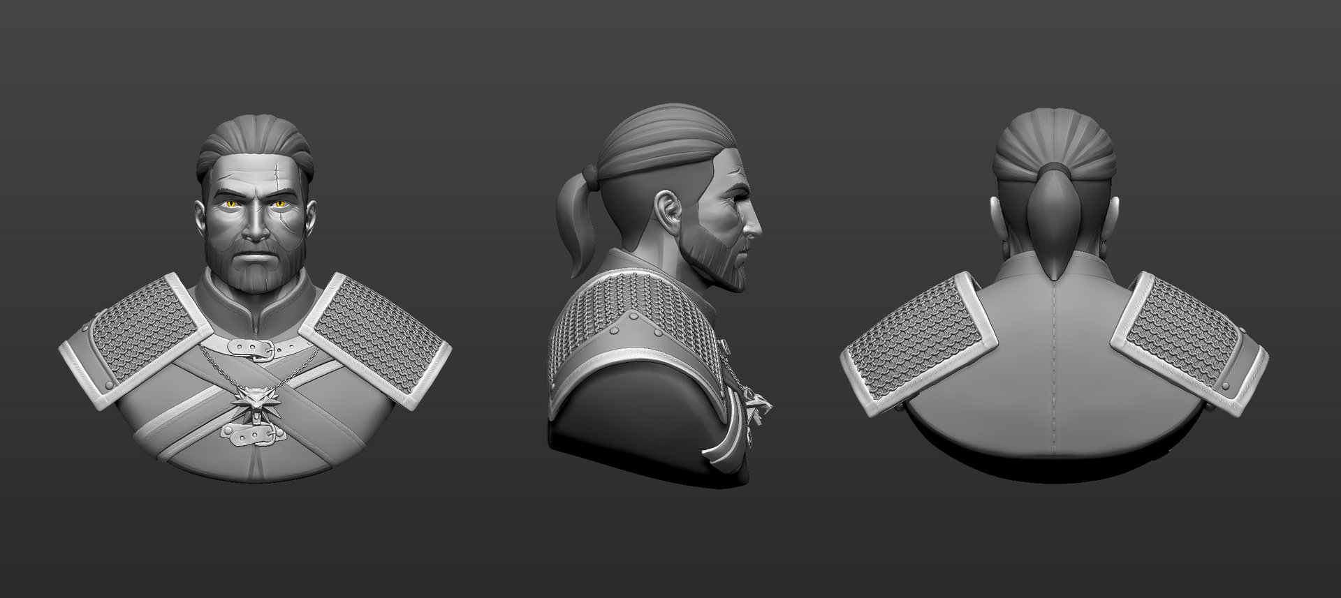
Witcher 3 bust fanart
Hey guys! Looking for some feedback. Thanks.


http://www.artstation.com/artist/tonygreen
www.linkedin.com/in/3dartisttonygreen


http://www.artstation.com/artist/tonygreen
www.linkedin.com/in/3dartisttonygreen
Replies
Hair is too symmetrical. Break it up. Oh yea, make his face asymetrical too. Doesn't need to be much. His nose points towards either side a little or the bridge is a little crocked, his eyebrows are in a different position, mouth/expression, etc. Right now the only thing that breaks the symmetry, are the scars and it feels too..placid.
His head shape (which includes beard) is too straight I feel. So I think having his jaw bones come in a little on the sides would be nice. You still want to keep him looking tough and not scrawny. Right now he looks like he's chubby, which he isn't.
Pauldrons/shoulder pads are too boring (shape wise) It's a boring silhouette.
The bottom of the bust I feel is pretty boring too. Doesn't give Geralt's stature enough "oomph" so I think having it come in closer would make him look tougher, etc/bigger.
But yea that's just what I gathered from playing all the Witcher games so far :P Up to you what you wanna do with the feedback
But looking sweet. Can't wait to see it textured. You hand painting it stylized? Or is it stylized PBR?