The BRAWL² Tournament Challenge has been announced!
It starts May 12, and ends Oct 17. Let's see what you got!
https://polycount.com/discussion/237047/the-brawl²-tournament
It starts May 12, and ends Oct 17. Let's see what you got!
https://polycount.com/discussion/237047/the-brawl²-tournament
Making A LCVP Higgins Boat for a Project - Need some support.
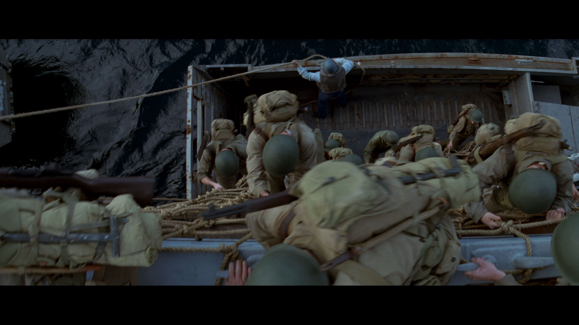
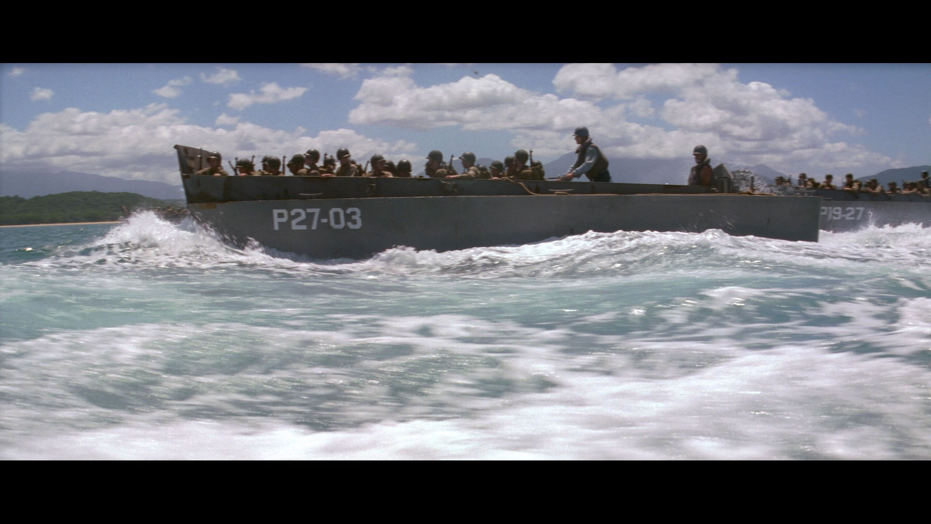
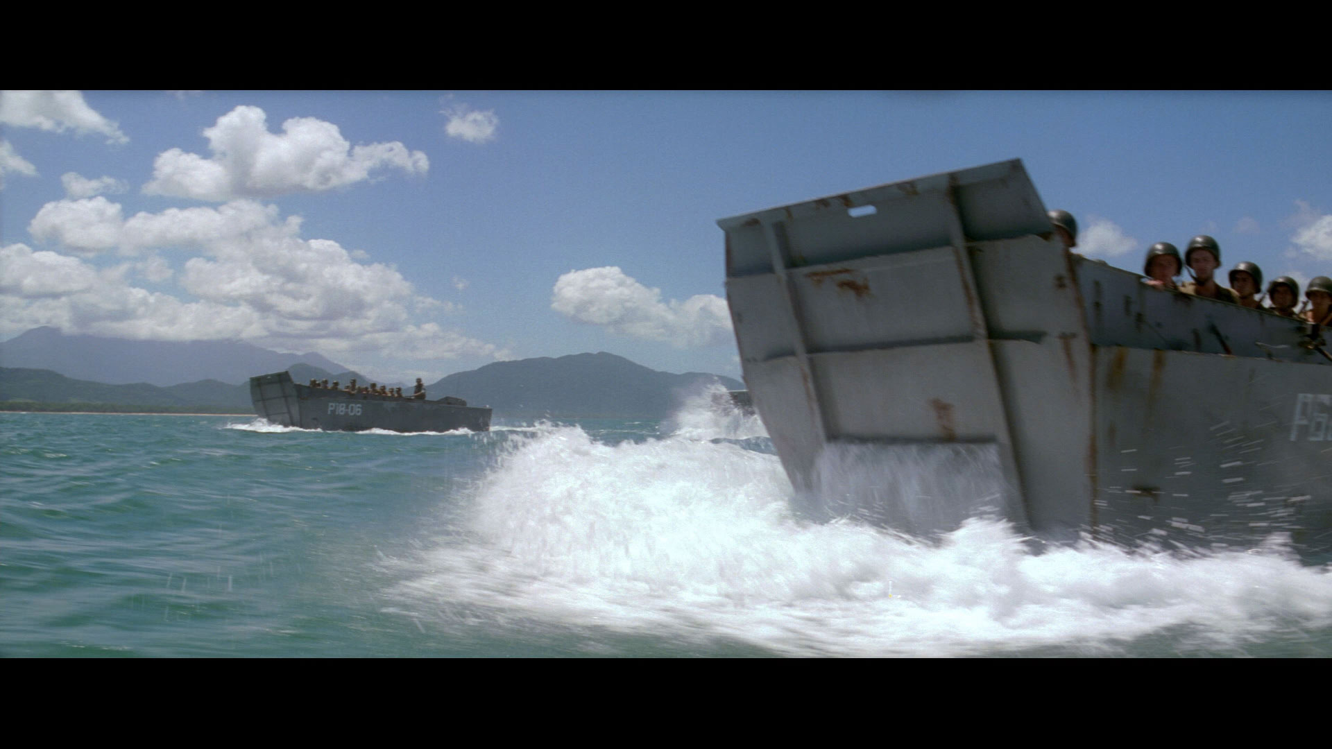
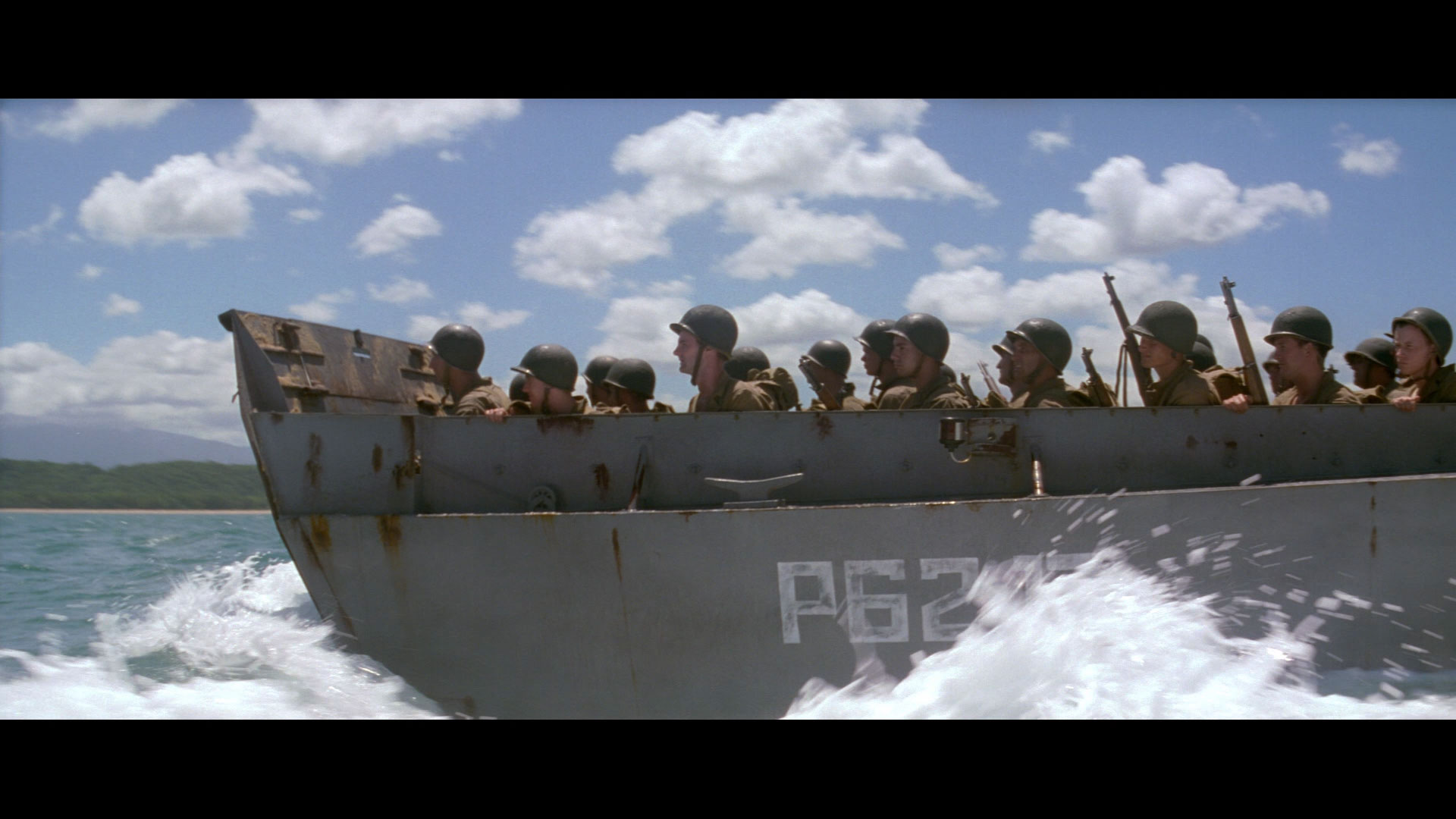
Film References for the LCVP Higgins Boat.
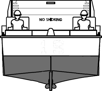
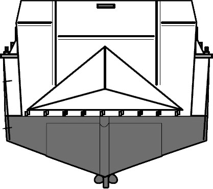
Blueprints references for the Higgins Boat.

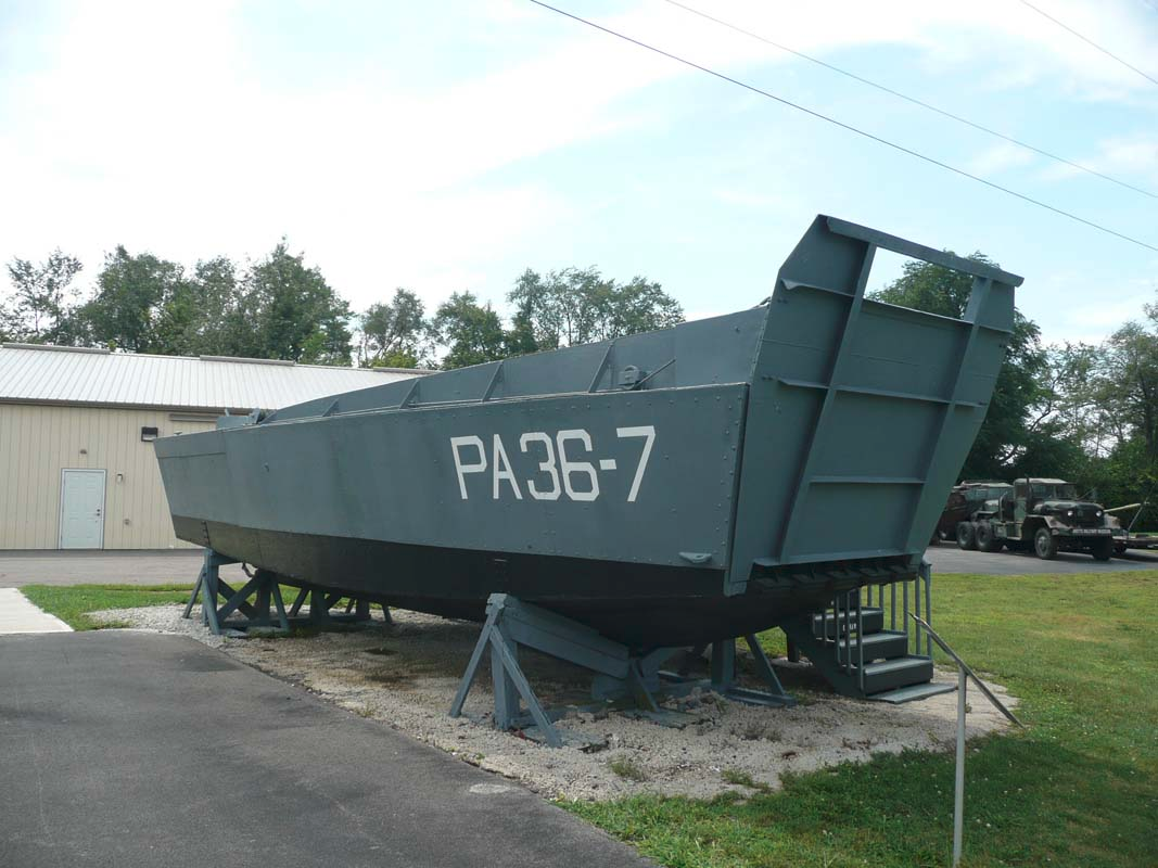
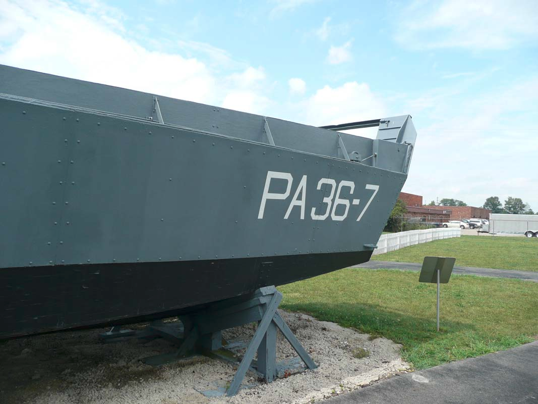
Texture references for the Higgins Boat.
Completed Textures
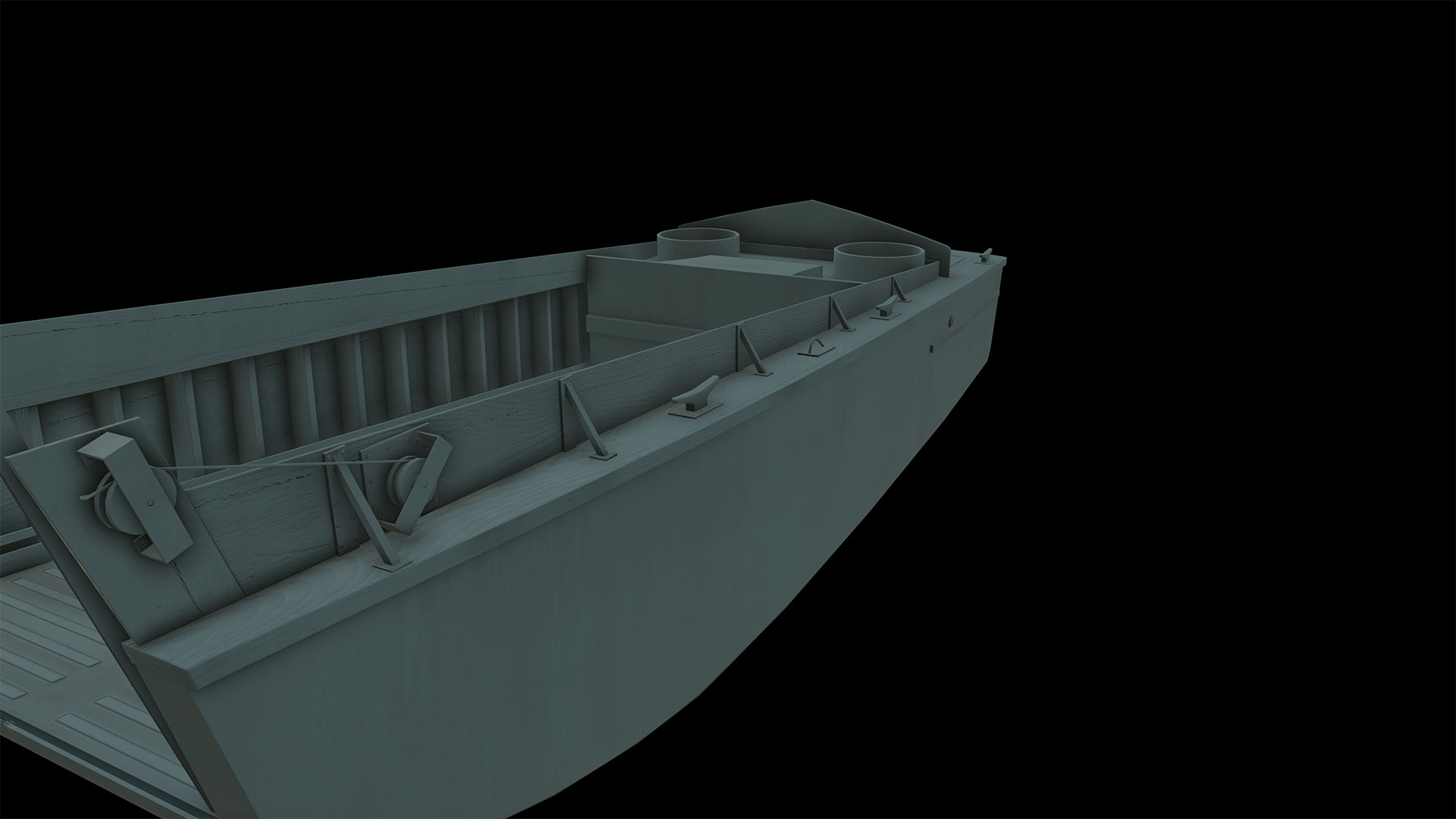
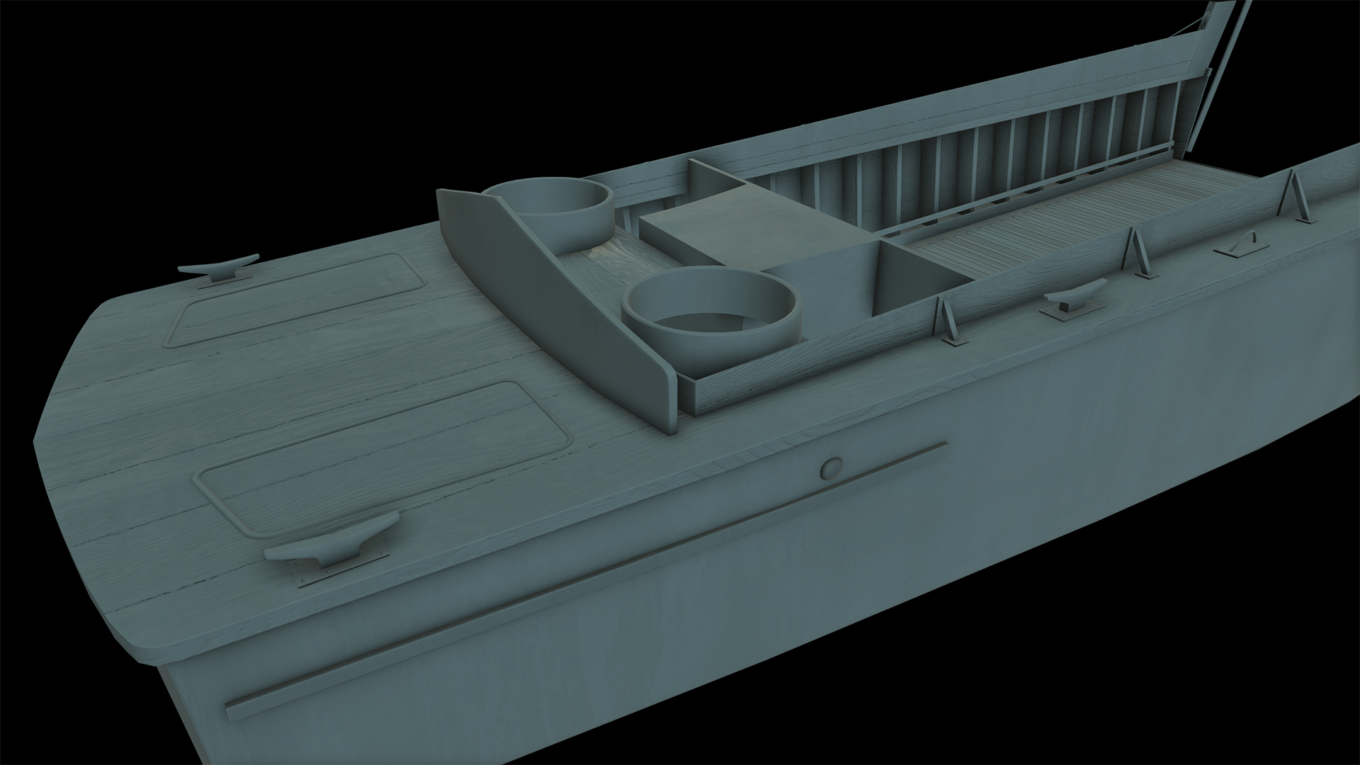
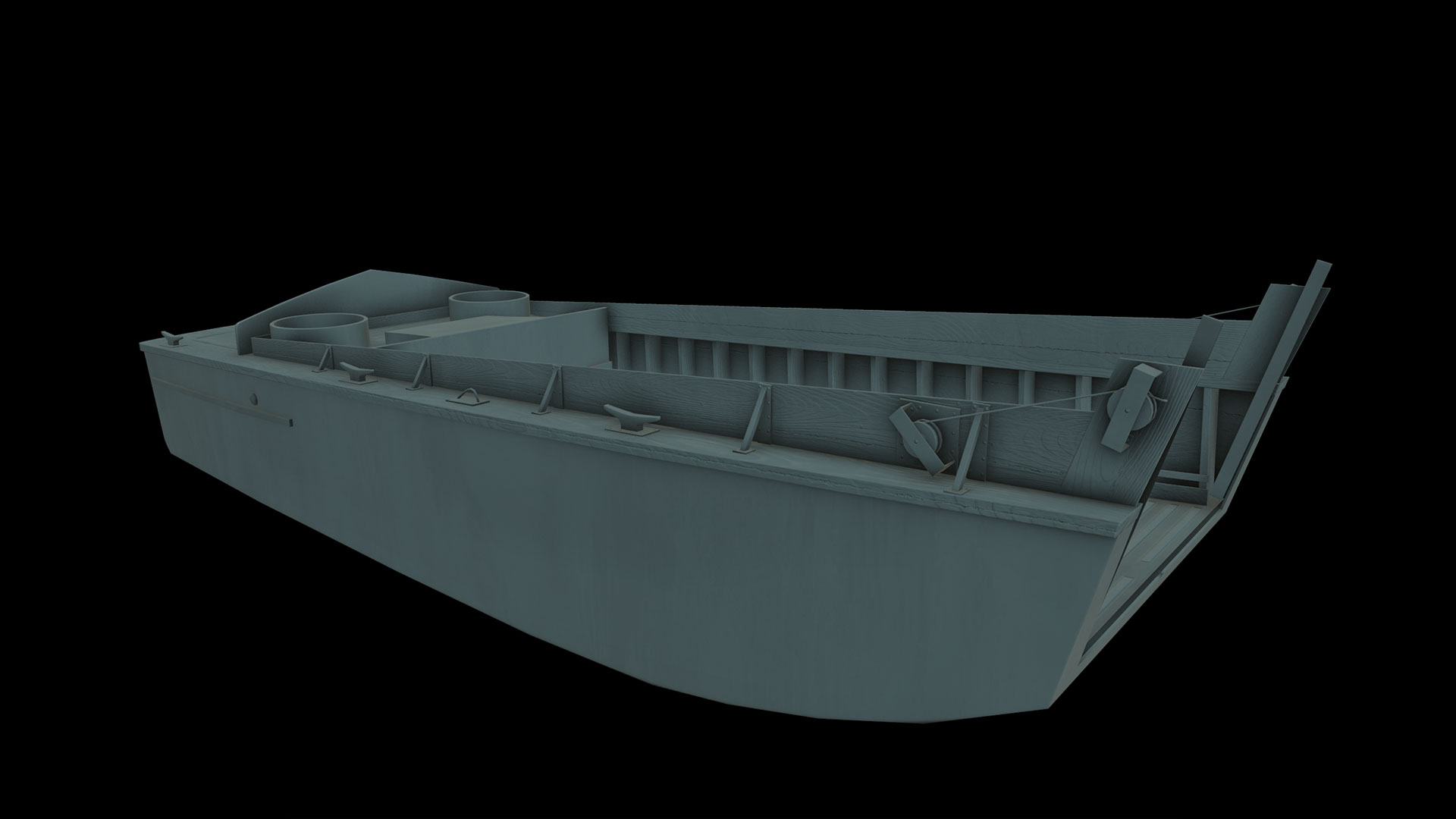
SO THE PROBLEM
For some reason I feel like my textures are looking really bland. I'm not fishing for complements because I am working really hard to improve myself with this piece and I'm really feeling down because my end result isn't really popping for me.
Do you guys have any suggestions or ideas for what I can do to make it look a little more dynamic? Or have I done a good job of representing the boat and more importanty its materials and I'm just being overly paranoid.


Blueprints references for the Higgins Boat.


Texture references for the Higgins Boat.


Completed Textures


SO THE PROBLEM
For some reason I feel like my textures are looking really bland. I'm not fishing for complements because I am working really hard to improve myself with this piece and I'm really feeling down because my end result isn't really popping for me.
Do you guys have any suggestions or ideas for what I can do to make it look a little more dynamic? Or have I done a good job of representing the boat and more importanty its materials and I'm just being overly paranoid.
Replies
For the rest of it, I would download some metal texture patterns from www.cgtextures.com and integrate the details with your texture using a low opacity overlay blend in photoshop. It just needs more variation to look right.
The Higgins boat is a very bland model to begin with in real life. To make it look good, you really need to pay attention to details.
The boat is painted metal, so the material that you see is actually paint broken up by rust, with very little actual metal.
I you are working with anything resembling PBR (which you should) the roughness/glossiness map will be doing most of the work.
Plus, it's always gonna look bland if you don't light it in an interesting way.
right, but those rust/scratched areas would still show reflection would they not ?
The Higgins boat is painted metal so if I used metallic map it should be black, meaning no metallic map is needed. Am I wrong in thinking about it this way? Am I missing something? Because it's painted metal would the kind of roughness/metallic maps still be needed?
This is supposed to be also supposed to be PBR.
It depends if any of the metal is exposed, like St4lis said the roughness/glossiness map will be doing most of the work.
I'm going to add the rivets and the line on the bottom right now.
Also, you don't have to wear it down much, but your really should figure out some detail work to emphasize some of the edges and creases. Perhaps just some dirt gathering in creases from the people walking around on it when building it?