Sword of War - Cold Fury
Hello fellow digital Ironsmiths. I've been making a new weapon skin,for the Knight's Sword of War. The name brings to mind a solid ,well built 2 hander. Made for one thing,killing and nothing else.There is nothing beautiful in the act of killing men so why make a sword that is well decorated? Black leather and cold steel.
Still working on diffuse and blood mask,but the design is about what you see. What do you guys think?
High poly.
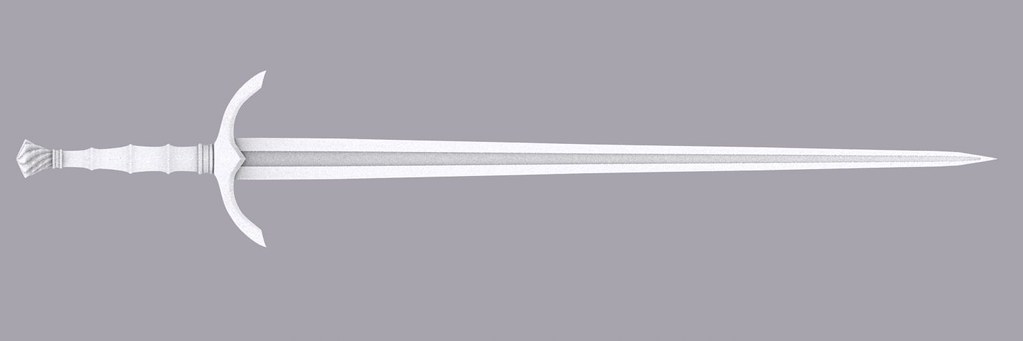
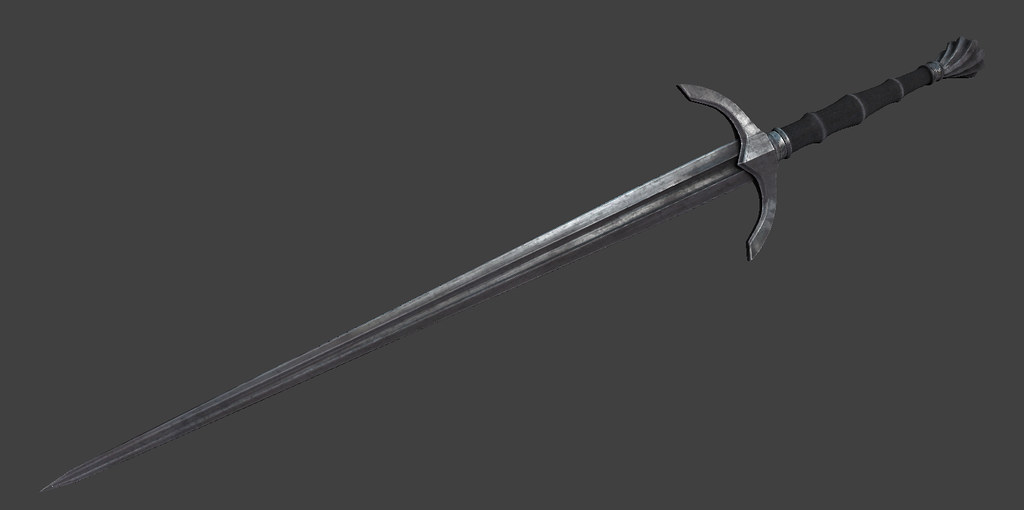
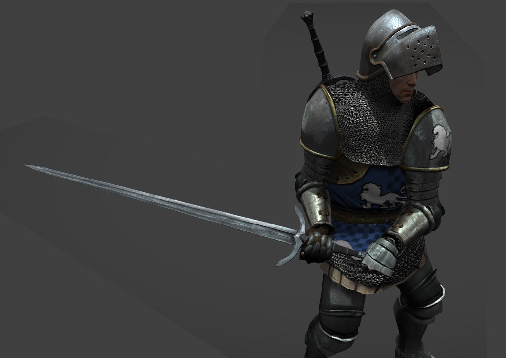
Still working on diffuse and blood mask,but the design is about what you see. What do you guys think?
High poly.


Replies
That's the plan tomorrow:) That and blood.
The sword is up on the Workshop, please upvote or comment or both if you like it.
http://steamcommunity.com/sharedfiles/filedetails/?id=434517850
Just got a rush of inspirational juices,combined with free time.
Check it out in action.
[ame]
Best part is when you load in the weapon for the first time and give it a go versus bots
Got this great screen cap firt time around
Would you mind telling me how you controlled the level of sheen to counteract the environment map of the default weapon material? My weapon is extremely reflective.
Thank you! The idea was to make a simple well designed looking sword that is made to simply just kill. So the Ironsmiths would not even bother to any sort of decoration or embellishments. It would be a sword that gets lost amongst the other CMW weapons.
Well the textures tend to multiply in effect the lighter they are , so if you make the diffuse too bright ,by the time the specular comes into play in their material,it can be too shiny. So I keep the diffuse looking real dark and I do not go too overboard on the spec. The spec if used multiple times in the material so if it's too bright it can make the sword look overly bright.