The BRAWL² Tournament Challenge has been announced!
It starts May 12, and ends Oct 17. Let's see what you got!
https://polycount.com/discussion/237047/the-brawl²-tournament
It starts May 12, and ends Oct 17. Let's see what you got!
https://polycount.com/discussion/237047/the-brawl²-tournament
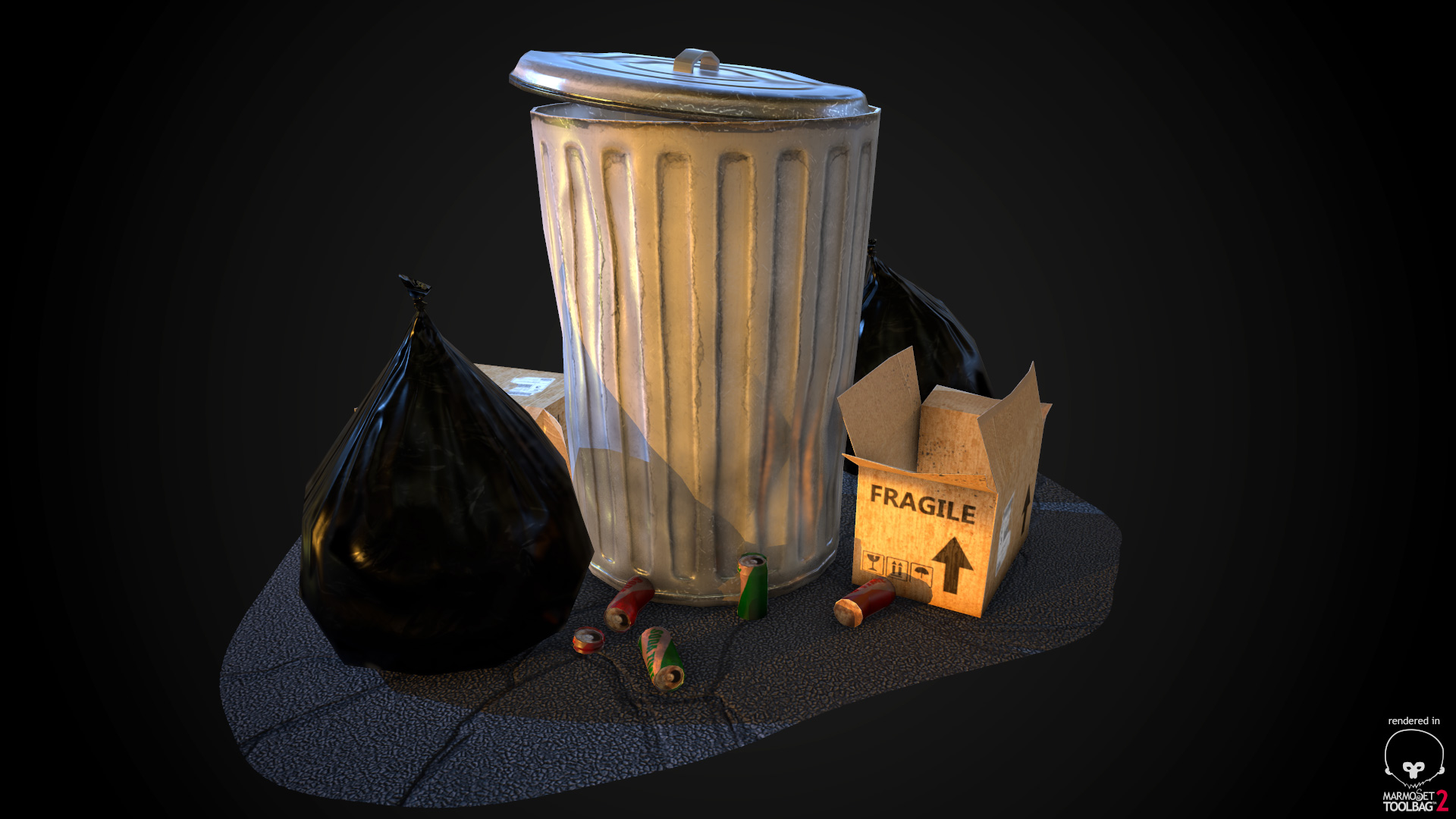
Low poly game prop practice: trassssshh!
Hey all -
Just want to post something I was working on today. Practicing making some low poly game props. Used basic maps overall.
Trash can - Albedo, Spec, Normal
Boxes/Cans - Albedo
Trash Bags - Normal, Spec
Concrete - Albedo, Normal, Occlusion
Working towards making things more realistic, so really going to try to dive into texturing and materials in a more complex way soon.
But thought I'd share these as they are pretty straight forward. Let me know if you have any critiques!
Thanks guys


Replies
https://s-media-cache-ak0.pinimg.com/236x/98/c7/2d/98c72dc984408ec8655fd47ea76b8f6f.jpg
The trash can sculpt/normals look great. The cans on the ground look a bit blurry though. Overall, good job!
Edit: on a third look, I would suggest putting some more focus on the cans. Either it's missing normals, or the edges are way to hard. Up the texture resolution as well.
Hey thanks!
Yeah I didn't put any normals on the cans. You're right though, they look a little strange.
Also, the mask is feathered for the floor, but I couldn't get it to work right in Marmoset 2. "Dither" looked strange and still showed my hard edges in some spots. So I ended up using "Cutout" and got the result you see above. It was easy in Marmoset 1. Any idea the best way to do this in M2?
Thanks for all the feedback guys. Gonna make some changes.
- Painted in some more scratches and rust to the trash can to make it more old and worn looking.
- Added a normal map to the cans to fix some of the hard edges
- Fixed the garbage bags so they sit more natural
- Added some different lighting to the scene to show off some of the normals for the trash can
I still can't figure out how to feather the edge of the concrete. I have my feathered mask in my diffuse map, but Marmoset is only giving me a hard edge like this. Any ideas?
I do have one comment on the can itself- most cans of that style are galvanized steel, which seems to wear/corrode a bit more uniformly. The style of wear you've got going on seems to give more of the illusion of rust underneath where an outer layer like paint has chipped away.
I'd probably tone back the color a little bit to something more neutral if you're looking to mimic the slow, uniform corrosion of galvanized materials. Or, if you want to give the illusion that it's a chipping painted surface, then actually try to push the contrast a bit more to differentiate that outer layer from the rusting material underneath.
I took out a lot of the rust, added some more corrosion and oxidizing. Here's my results:
Spent a little more time on the spec/normal map for the trash can and also worked on getting the cans to look better. Added a trash bag in the actual trash can.
If anyone knows how to feather the concrete ground layer, that would be awesome. I can't figure it out in Marmoset 2! Was easy in Marmoset 1. I have my alpha feathered...but it won't feather in M2...