The BRAWL² Tournament Challenge has been announced!
It starts May 12, and ends Oct 17. Let's see what you got!
https://polycount.com/discussion/237047/the-brawl²-tournament
It starts May 12, and ends Oct 17. Let's see what you got!
https://polycount.com/discussion/237047/the-brawl²-tournament
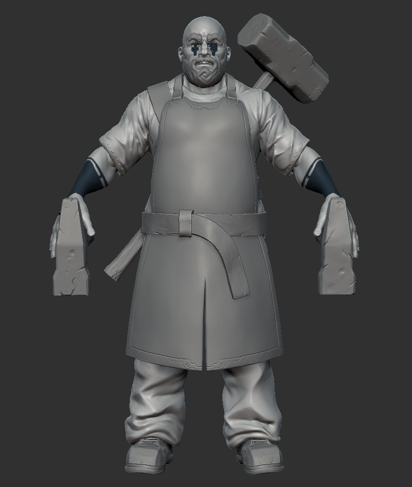
Blacksmith!
Hey all!
This is a new piece i have started working on over the weekend as a break from work!
Im trying to emulate the style of the upcoming Fable Legends, as a massive fable fan for years hopefully i can do it justice with this fan art.
Gonna try and doodle up some awesome tattoo work to come run up from his arms so any ideas would be much appreciated.
C&C WELCOME!
(UPDATED!!) PROGRESS SO FAR:


Replies
His arms look a bit thin!
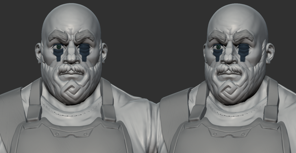
And could we get a closeup of his face? It's hard to see exactly what's going on with it right now.
@nickcomeau I am away from the PC at the moment but once I'm back I'll grab you a closeup of the face!
The shoes are meant to be rugged old boots with externally fitted steel toe caps. I think the toe caps look pretty horrible at the moment and are making it hard to read so I will have to rework them.
I definately agree with you about the trousers.
I think I might go back to the base mesh for them and start again.
Do you have any reference you could recommend on the trousers?
Cheers guys
(Blacksmith reference)
(Jeans reference)
Il try and work them over again from scratch this week and see where I end up.
Heres the close up on the head you wanted:
C&C Welcome as always!
Any tips guys?
Also, for the facial hair, I realized why it was looking a bit off to me. Right now the flow of the mustache just does straight out to the sides. I would think hair that short would probably just fall downwards (like the hair on the beard).
Heres my progress:
Reworked the trousers to make them a bit more puffy and believable but im still struggling a little. I have also reworked the forearms some to try and make the anatomy a bit more realistic!
C&C welcome as always!
i know its girls but it may give you an idea how a bit stiffer and wide cloth would behave in certain poses.
also its super nice to look up stuff like that instantly... what do i need? wide stiff cloth trousers--> google "wide jeans" oder "wide trousers" will give some nice results
same things going on at the shirt,... theres too many folds going on
Is this going in a better direction do you think?
REF:
UPDATE:
A bit fix for the lower part of the arm, a bit too blob-like for now.
Good work man
I'm open to ideas!
@3dShay thanks for the critique dude I will definitely try and sort out those areas the next time.
I do always struggle on my arm anatomy where the forearm joins the upper arm so I will go back to my reference and have a rework.
Thanks again guys please share if you have any more critique as always
@trousers looking a lot better, but give them a bit harder edges the fabric is stiff to an extent and wont flow so it kind breaks instead of behaving like dropped spaghetti
yes, absolutely, make it a hammer or an anvil or something.
looks pretty awesome otherwise, love what you did with the beard btw.
Quick tests tonight havent had much time to play around but i was thinking of doing something like a coat of arms / shield.
Heres a few quick options but i am not really feeling either of them yet.
This image shoes some abadements which knights had put on their shields after they commited a crime or did something unknightly.
I want to use these to give him a dark mark in his history which changed him from being a chivalrous knight into the local beefcake blacksmith.
Input welcome as always!
Thanks for all the tips I am just beginning to rework the shirt so that it looks lighter and will then move on to give the trousers some more stiff peaks so they appear correctly.
Everyone else has the other areas covered.
that would accent the eyes nicely and not break the form so much like this... what about just tattooing one eye? super perfectly syymetrical tattoo looks unrealistic....
Heres an idea i had using the gusset sinnister abatement fill shape. I think it looks pretty cool and a I like the idea of adding some asymmetry with a tattooed eyeball.
Thoughts? If anyone fancies doing a paintover please dont be shy!
Cheers Guys
Thanks dude glad you like it more
On the eyeball thing, I had a google before making the changes and found some nutters in prison who had done it. Not exactly a normal thing to stumble upon but google is dangerous :P
I think for my Blacksmith it will be more a sign of the pain/ punishments he recieved in the past rather than something to show off.
Check it out :
Hopefully im starting to get the folds to look a bit more natural for the short sleeve shirt i am trying to go for.
Im not sure whether to give it a thick pattern or weather to make it out of a finer cloth when i finally get around to texturing this bad boy
C & C Welcome & Needed as always guys!
Think I am gradually starting to improve but there is a lot further to go!
Just adding a quick close up on the current shirt detailing
Here's a close up of my updated face detailing and an overall shot:
C&C Welcome as always!
Thanks for the support so far guys.
would love to see some more like the stylized stuff in the beard on other parts of the sculpt though.
What parts of you think i could stylise more so? I am going to use the planar cut brushes to go over the hammers and sharpen off the edges a bit more so hopefully that may add to that stylised look but I'm not really sure what else to do.
I agree that at the moment the rest of the body/ clothing doesnt quite fit with the beard & face. Maybe polishing up a a lot of the soft looking edges on the clothing may help?
Thanks again dude! glad your liking it more so now!