Home 3D Art Showcase & Critiques

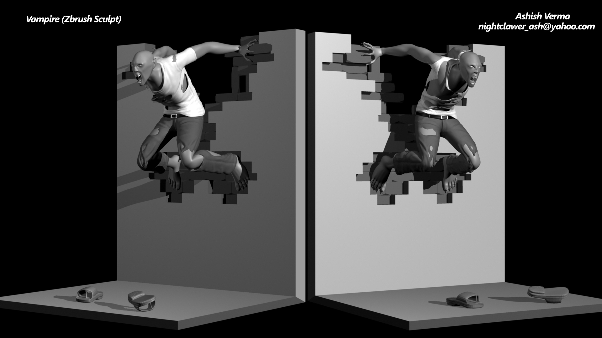
Zbrush sculpt Vampire

polycounter lvl 8
Offline / Send Message
Pinned
AshishVerma polycounter lvl 8
Update (a little changes in facial features and the bloody arm from the earlier version)

turntable of the same
https://www.youtube.com/watch?v=IwAD5NrYdhs
Hi,
Need your feedback on a mid detailed model sculpted and posed in zbrush and rendered in mentalray maya. vampire_zbrush_by_hellboyashish-d8q7qhgjpg
Replies

  • AshishVerma
    Offline / Send Message
    AshishVerma polycounter lvl 8
    Turntable of the model.
  • snrch445
    The damage on the wall and the pose appear very symmetrical, the two images just looked like you flipped in in Photoshop. Also, for the wall, what is the material supposed to be? It appears there's plaster with brick inside, if that's the case, the plaster looks like someone just cut shapes in to it, and the plaster would be to thick. Also think how was the wall damaged, was it from him jumping on the wall, or something hitting it? If you plan on showing the back of the wall, like in the turntable, change the the damage affect, which, going back to how was it damaged, which side was the damage caused from, the point of damage to nearby affected areas is going to be different. I'm not a character artist, but it looks like her could use a bit bigger cranium, and the ears feel to far back, although that could be from maybe having a small cranium.
  • nickcomeau
    Offline / Send Message
    nickcomeau polycounter lvl 4
    Interesting piece. My comments on the pose would be that I would have his hands holding onto the back of the bricks instead of pushing against the front, and the feet to be actually pushing up against the corners of some bricks so they look nudged in if that makes sense. Also, having his feet at different heights/not symmetrical would feel more natural as well.

    This will be a lot of fun to make :)
  • AshishVerma
    Offline / Send Message
    AshishVerma polycounter lvl 8
    @ snrch445, First of all thanks a lot for your comment and I agree that the pose is very symmetrical but the damage on the wall is asymmetric if you look closely, same goes with the two images if it is flipped in Photoshop then the tee shirt and jeans should look like mirror reflection and the two images have different light source clearly indicated by the shadows in both the sides. As long as the wall goes it was a work in progress or someone was working on it and left it that way for sometime that's why it has very well defined edges and unfinished brick work. Coming to the Creature, it is not anatomically accurate as his arms are longer than what it should be from an anatomical point of view same goes with his big feet's and other features. We character artist's call it "Artistic liberties" where we change few things to make a character more appealing but I guess it doesn't worked well in my case and About the pose, the character is in mid of his transformation when someone sees him and it is trying to scare that person off. While in the process of transformation he is retreating back on the wall I thought that his scattered footwear will indicate something what I was going for.
  • AshishVerma
    Offline / Send Message
    AshishVerma polycounter lvl 8
    @nickcomeau thanks for the comment and I can see that the pose looks very symmetrical, I hope not to repeat this in future. All these mistakes will make me better as we all learn from our mistakes and i thank you all for pointing it out . :)
  • snrch445
    Hey AshishVerma, I can tell that the damage on the wall is asymmetrical, but its not that far off from either side and it pretty much outlines the character near perfect on each side. My comment about the flipping of the image was pointing out the pose and wall, I can tell the clothes are asymmetrical, and of course the light source is a giveaway, I guess my main point there was if I'm looking at it from another angle i'm hoping for something that gives me more detail or a different feel, and the characters silhouette doesn't feel like it changes. Back to the wall, what is the material used to build it? I can't recall ever seeing a wall built in pieces like that. For your commits about the characters anatomy, I only mentioned the cranium looked a bit small which possibly made the ears feel off. I understand it's a vampire, it's not a real thing and the anatomy can be played with, I have no problem with that at all, in fact I prefer that when it comes to creatures and what not.

    I feel like you took some of my critique pretty harsh, and I wasn't trying to bash you at all. Everyone is going to have a different opinion, isn't that why you are posting here looking for feedback to make your work better. You have the choice to listen to others or not. I feel like this could become a really good piece, but the symmetry is holding it back.
  • AshishVerma
    Offline / Send Message
    AshishVerma polycounter lvl 8
    @snrch445, Its nothing like that (may be a little on the flipped part frankly) but you took my explanations wrong, all I wanted to do is to explain my part on what I was going for while working on this sculpt. As I am saying again I totally agree on most of what you said and on a Final note I CAN'T THANK YOU GUYS ENOUGH & I APPRECIATE YOU ALL for taking the time to comment on my work.
  • AshishVerma
  • snrch445
    Nice update, feels more like an action moment frozen in time. One thing the sticks out a bit would be the left arm looks like it has lost some of it's shape, almost looks tubular. Also, changing the background color might help the piece stick out a little more, I could be wrong but it looks like some of the blood is being lost due to the black background. Are you planning on doing more with this piece?
  • AshishVerma
    Offline / Send Message
    AshishVerma polycounter lvl 8
    Naah! I'll probably leave this one as it is, As i'll be starting to work on a personal project, but I'll keep all valuable suggestions in mind and try not to repeat the mistakes over again. Thanks again for replying.

    (P.S. incase you like to see some more of my work i'll post the links below)

    http://www.polycount.com/forum/showthread.php?t=147994
    http://www.polycount.com/forum/showthread.php?t=152310
    http://www.polycount.com/forum/showthread.php?t=151841
  • snrch445
    No Worries. I need to get back in to the game, started working on a bust of the character Kane from Poltergeist, but been to busy to work on it lately. I'll have to post a thread for some feedback since my character skills are lackluster.

    Keep up the good work!
  • AshishVerma
    Offline / Send Message
    AshishVerma polycounter lvl 8
    thanks and I wish you good luck on whatever you planning to do.
  • AshishVerma
    Offline / Send Message
    AshishVerma polycounter lvl 8
    latest update on the top page
Sign In or Register to comment.