Unity 5: post-apocalyptic house interior
I'm attempting a project for my portfolio of a post-apocalyptic environment after playing games such as 'State of decay' and 'DayZ'. My goal is to produce something quick and quite tightly budgeted in terms of triangle count.
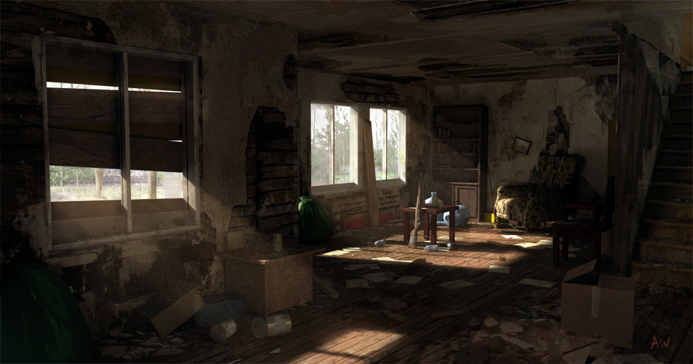
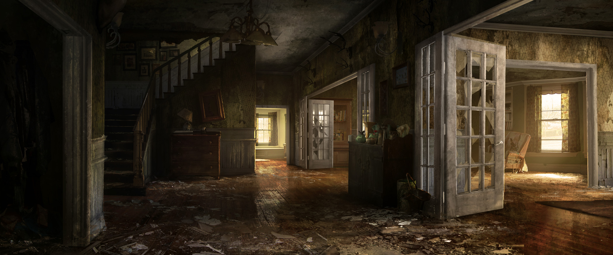
Here's some reference images I've based the project on:

Concept by Aaron Wilkerson

Here's what I have so far:


If anyone has any feedback, I would greatly appreciate it.
Here's some reference images I've based the project on:

Concept by Aaron Wilkerson

Here's what I have so far:


If anyone has any feedback, I would greatly appreciate it.
Replies
Jokes aside you're on the right track. Proportion wise everything looks a little 'chunky' e.g. the wide frame that leads into the room with the two blue couches - on the concept it's a lot thinner. Same thing with the door to the right of the stairs, the tea table and the radiator, all look chunky. Check your references, and maybe get a human-scale model in the scene to check as well
From a texture standpoint it needs to be way, way dirtier, but you're probably aware of that. Some peeling wallpaper, smashed glass and rubbish/glass/dust on the floor and in cracks would complete the theme
Same thing with the chairs, which could be beaten up with the stuffing popping out, the lampshade, which could be wonky and damaged, and the picture frames, which for some reason are perfectly straight instead of angled or lying on the ground. Pick up some more reference of actual deserted houses if you can, but overall go through and rough up everything, make it decrepit but in a beautiful way
Wall paper could be peeling, some heavy stains maybe?
Good luck.
Thanks for highlighting the scaling issues. I hadn't noticed them before.
I've started to add decals, I always struggle with them, my workflow is a bit messy with decals but I intend to add some more mould and exposed bits of wall.