The BRAWL² Tournament Challenge has been announced!
It starts May 12, and ends Oct 17. Let's see what you got!
https://polycount.com/discussion/237047/the-brawl²-tournament
It starts May 12, and ends Oct 17. Let's see what you got!
https://polycount.com/discussion/237047/the-brawl²-tournament
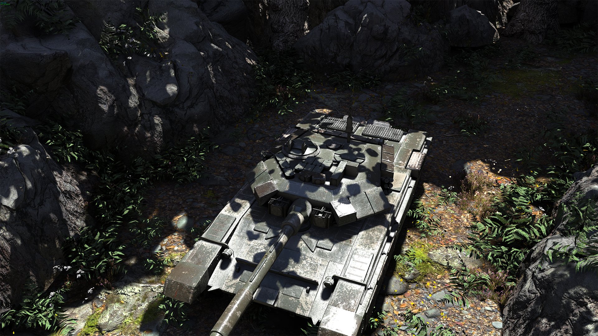
T-90 Tank & Organic Environment
[vv]125206026[/vv]
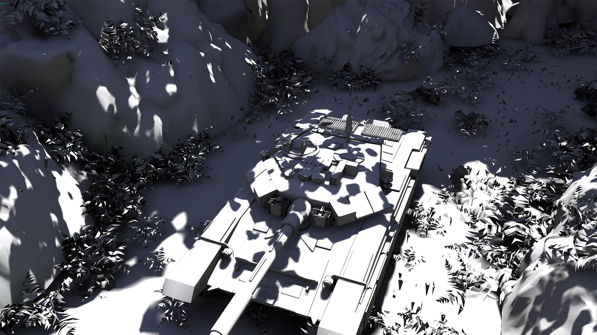
Modeling : Autodesk Maya, Pixologic Zbrush, SpeedTree
Texturing : Quixel NDO & DDO, Adobe Photoshop, SpeedTree
Lighting & Rendering : Epic Games Unreal Engine 4
Render Resolution : HD1080 [ 1920 X 1080 ]
You can see more information and projects on my website.
WWW.GUMA3D.COM
SungWook Jang
Environment Artist
E-Mail = guma3d@gmail.com
Homepage = WWW.GUMA3D.COM
Replies
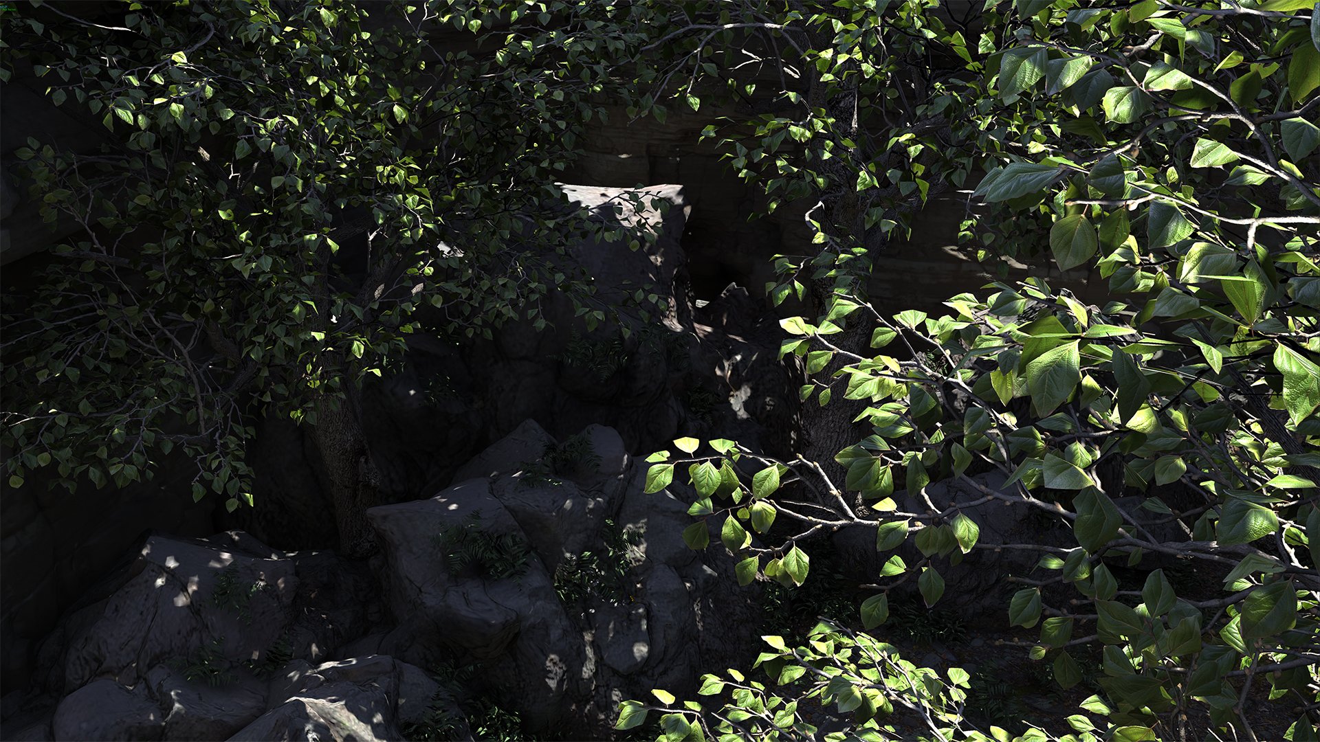
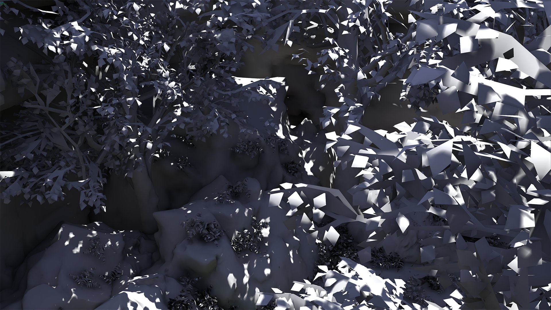
Look into making some nice, high-poly branches and baking them down to shaped planes. This wil help a lot with making your vegetation assets much more practical for in-game use.
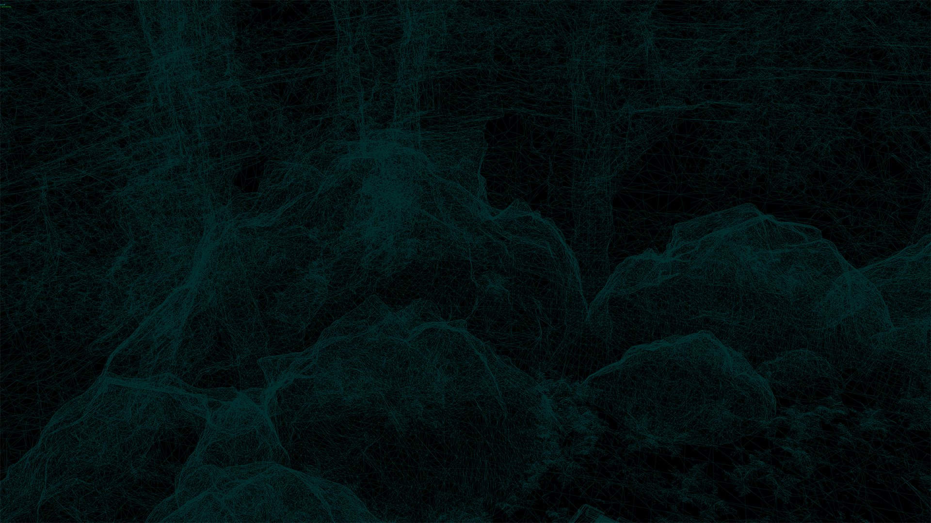
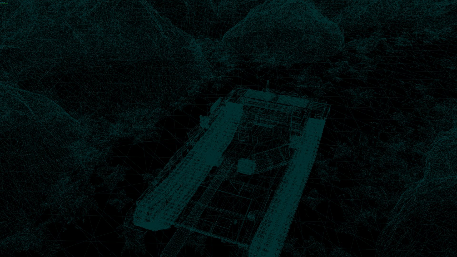
Secondly, your wireframes are totally unreadable. Aside from switching to the wireframe view in U4, I would recommend actually doing individual asset wireframe breakdowns. I have no idea from looking at your wireframe if you are using your geometry intelligently or not, and from a hiring point of view this is crucial.
Thirdly, I would really recommend expanding the environment slightly. You already have the assets, so you can get some compositionally pleasing shots rather easily if you wanted to, but you are limiting yourself to basically one shot.
Also, I cannot see much of the tank except for the top of it. When viewing the reel on your website, I wanted to see more of the tank, and I wanted to see it a bit closer. It was hard to see any detail that may or may not have been anywhere but the top. Adding some more even lighting to the scene could also help with this, coupled with better shots.
I realize I didn't have a lot of good stuff to say. The vegetation looks good! Just needs to be more reduced to be practical for in-game use.